Zoom
Trash

y1 brief 9 protest poster. CHALLENGE WORDS. Beauty Is in the Street. Pleasure, leisure, protest, propaganda. While electronic reproduction has become the key to communication in our epoch, the poster has not lost its special role.
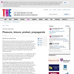
This is the view of Margaret Timmers who has curated the Victoria and Albert Museum's first major display of posters since 1931 (on show until 26 July). She sees the poster as a product whose aim is to publicise and to persuade the public. It has acquired a new and more universal importance because the poster can appeal to a broader spectrum of "passing trade" than television and satellite advertising. To select 330 posters for the current exhibition - 200 are illustrated in this book - from the museum's vast archive of 10,000 was difficult.
The aim was not to present a history of the poster but to focus on its functions. The opening section groups theatre and cabaret advertising from "Gay Nineties" Paris with British theatre posters of the same period. Type and protest. Dada is against the future, Dada is dead, Dada is idiotic, Long live Dada!
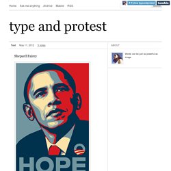
The perfect place to begin when exploring typography and protest is with the Dada Movement. Beginning in Zürich, Switzerland by a small group of artists in 1916 and tapering off by 1920, the Dada movement rejected modern art, World War I, European society, blind faith in technological advances, and inadequacy of religion in conventional moral codes. The Dadaists strove to create pieces that had no meaning, and sought to reject traditional art and aesthetics.
The primary media used was photomontage, and their technique was better than most designers’ Photoshop skills. The Dadaists also wrote nonsensical poems, creating them by first cutting out letters and words from newspapers and then arbitrarily arranging random words, phrases and letters. The following are some great examples of how typography was used in the Dada movement. John Hartfield created this anti-Nazi propaganda poster. Sources: Aesthetico – Adbusters Media Foundation. A brief history of the "clenched fist" image. Note: This document is a work in progress, originally generated for the "Battle Emblems" exhibit at San Francisco's Intersection for the Arts February-March 2006.
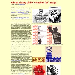
I would especially like to thank Michael Rossman of the AOUON archive, exhibit organizer Kevin Chen, and illustrator Frank Cieciorka for their invaluable contributions to this research on our cultural history. Beauty Is in the Street: the power of protest posters. Three years ago the media marked the 40th anniversary of the May 1968 Paris uprising with a wave of nostalgic reminiscence.
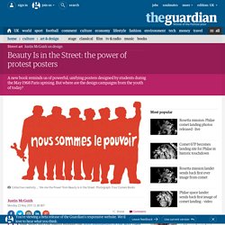
There may have been a nice round number to celebrate, but that was about all there was connecting us to the spirit of '68. Three years later, following a banking-triggered recession and the election of a right-wing government, that spirit seems to have been exhumed. We've seen students occupy universities across the UK, and hundreds of thousands march against government spending cuts.
In many ways this is a more propitious moment to release a beautiful volume of the posters created by the Atelier Populaire, and Four Corners Books has done just that. While their fellow students engaged in pitched battles with the police and millions of workers went on general strike, students at the École des Beaux Arts in 1968 occupied the printing studios and converted them into the uprising's very own propaganda machine.
History of protest posters. A History of Graphic Design: Chapter 60: Posters in Social Protests. Vietnam war The 1960’s era is defined by the Vietnam war and social unrest throughout the world.

For many people, including the American intellectuals the war was cruel, unnecessary and tragic. In January 1968 North Vietnamese regular forces and Communist guerrillas launched an offensive on the cities of South Vietnam.
EGNMy1HB2013. ActivitiesYouHaveNoRight. The Funniest Protest Signs Of 2009 (PHOTOS) Why the Activist Poster is Here to Stay: Design Observer. Dignidad Rebelde, USA, 2011 As a supposedly antiquated form of media, the poster is regularly pronounced to be on its last legs as a means of communication and of marginal relevance now.
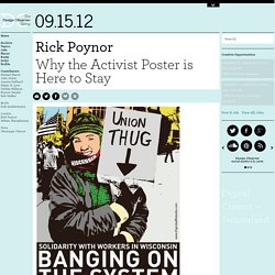
I have written pieces myself saying much the same thing. No one doubts that posters used to be highly effective as both advertising and propaganda, but from the moment people in wealthy economies started buying TVs and watching commercials, the role of the street poster began to decline (the billboards still flourishing like an infestation at the roadside are another matter). The arrival of digital communication and then social media appeared to leave the poster spluttering for life, and when it came to the protest poster, the prognosis looked just as gloomy. If ordinary posters aren’t much needed now, why should posters expressing dissenting views fare any better? Now I’m not so sure. Rich Black, USA, 2011 Michael Thompson (Freestylee), Jamaica/USA, 2011.