
Transition. The transition property is a shorthand property used to represent up to four transition-related longhand properties: These transition properties allow elements to change values over a specified duration, animating the property changes, rather than having them occur immediately.
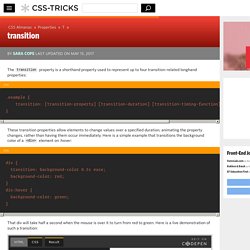
Here is a simple example that transitions the background color of a <div> element on :hover: That div will take half a second when the mouse is over it to turn from red to green. Here is a live demonstration of such a transition: You can specify a particular property as we have above, or use a value of "all" to refer to transition properties. In this above example, both background and padding will transition, due to the value “all” specified for the transition-property portion of the shorthand.
You may comma separate value sets to do different transitions on different properties: For the most part, the order of the values does not matter -- unless a delay is specified. Related Properties Other Resources Browser Support. A Complete Guide to Flexbox. Background The Flexbox Layout (Flexible Box) module (a W3C Candidate Recommendation as of October 2017) aims at providing a more efficient way to lay out, align and distribute space among items in a container, even when their size is unknown and/or dynamic (thus the word “flex”).
The main idea behind the flex layout is to give the container the ability to alter its items’ width/height (and order) to best fill the available space (mostly to accommodate to all kind of display devices and screen sizes). A flex container expands items to fill available free space or shrinks them to prevent overflow. Most importantly, the flexbox layout is direction-agnostic as opposed to the regular layouts (block which is vertically-based and inline which is horizontally-based). While those work well for pages, they lack flexibility (no pun intended) to support large or complex applications (especially when it comes to orientation changing, resizing, stretching, shrinking, etc.).
Basics & Terminology display. Media Queries for Standard Devices. If you think responsive's simple, I feel bad for you son.
We got 99 viewports, but the iPhone's just one. —Josh Brewer, March 10, 2010 A major component of responsive design is creating the right experience for the right device. With a gazillion different devices on the market, this can be a tall task. We've rounded up media queries that can be used to target designs for many standard and popular devices that is certainly worth a read. If you're looking for a comprehensive list of media queries, this repository is a good resource. If you're reaction to this is: you should never base your breakpoints on devices!! Phones and Handhelds iPhones Galaxy Phones Google Pixel HTC Phones Nexus Phones Windows Phone Tablets iPads Galaxy Tablets Nexus Tablets Kindle Fire Laptops Media Queries for laptops are a bit of a juggernaut. Wearables Yes, we're going there.
Apple Watch @media (max-device-width: 42mm) and (min-device-width: 38mm) { } Moto 360 Watch. Controlling CSS Animations and Transitions with JavaScript. The following is a guest post by Zach Saucier.
Zach wrote to me telling me that, as a frequenter on coding forums like Stack Overflow, he sees the questions come up all the time about controlling CSS animations with JavaScript, and proved it with a bunch of links. I've had this on my list to write about for way too long, so I was happy to let Zach dig into it and write up this comprehensive tutorial. Web designers sometimes believe that animating in CSS is more difficult than animating in JavaScript. While CSS animation does have some limitations, most of the time it's more capable than we give it credit for! Not to mention, typically more performant. Coupled with a touch of JavaScript, CSS animations and transitions are able to accomplish hardware-accelerated animations and interactions more efficiently than most JavaScript libraries.
Let's jump straight in! Quick Note: Animations and Transitions are Different In this article we will cover each of them separately. Manipulating CSS Matrixes. Logic in Media Queries. Just in case you have brain farts about this constantly like I do.
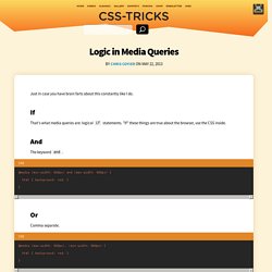
If That's what media queries are: logical if statements. "If" these things are true about the browser, use the CSS inside. And The keyword and. Or Comma separate. Technically these are treated like two separate media queries, but that is effectively or. Not Reverse the logic with the keyword not. Just doing not (max-width: 600px) doesn't seem to work for me, hence the slightly funky syntax above. Exclusive To ensure that only one media query is in effect at time, make the numbers (or whatever) such that that is possible.