

FreeMind Mobile User Experience 2: Usability Week 2011 Conference #-#Used to track user’s interaction with embedded content. Maximum Storage Duration: SessionType: HTML Local Storage __Secure-ROLLOUT_TOKENPending Maximum Storage Duration: 180 daysType: HTTP Cookie iU5q-!O9@$Registers a unique ID to keep statistics of what videos from YouTube the user has seen. LAST_RESULT_ENTRY_KEYUsed to track user’s interaction with embedded content. Maximum Storage Duration: SessionType: HTTP Cookie LogsDatabaseV2:V#||LogsRequestsStoreUsed to track user’s interaction with embedded content. Maximum Storage Duration: PersistentType: IndexedDB remote_sidNecessary for the implementation and functionality of YouTube video-content on the website. ServiceWorkerLogsDatabase#SWHealthLogNecessary for the implementation and functionality of YouTube video-content on the website. TESTCOOKIESENABLEDUsed to track user’s interaction with embedded content. Maximum Storage Duration: 1 dayType: HTTP Cookie YSCRegisters a unique ID to keep statistics of what videos from YouTube the user has seen.
Treemaps for space-constrained visualization of hierarchies Started Dec. 26th, 1998 by Later updates by Ben Shneiderman and Catherine Plaisant - Last update Sept 2014 Our treemap products: Treemap 4.0: General treemap tool (Free demo version, plus licensing information for full package) PhotoMesa: Zoomable image library browser (Free demo version, plus licensing information for full package) Treemap Algorithms and Algorithm Animations (Open source Java code) A History of Treemap Research at the During 1990, in response to the common problem of a filled hard disk, I became obsessed with the idea of producing a compact visualization of directory tree structures. Tree structured node-link diagrams grew too large to be useful, so I explored ways to show a tree in a space-constrained layout. My initial design simply nested the rectangles, but a more comprehensible design used a border to show the nesting. My excitement about treemaps was great and like many innovators I thought millions of users would be using this tool within a few years.
Tony Buzan's iMindMap Here’s why our customers love iMindMap. Get started today to unlock your full potential. “Your Mind Mapping software has transformed our business & become a part of our cultural DNA.” Wheaton Wealth Partners, USA “iMindMap’s Mind Mapping software is the most creative piece of technology I’ve ever used.” Graham Cullen, Head Teacher, Porchester School, UK “It helps me immeasurably at work, and keeps me focused managing risks for the international space station.” Trent Keeble, International Space Station, USA “iMindMap is one of the most useful organisational tools that I use on a daily basis. Neil Quiogue, PopCap Games, Ireland “iMindMap gives a professional edge to a creative and fun process. Alison Jones, Accountancy Lecturer, UK “No other Mind Map software affords the ability to quickly gather thoughts, brainstorm, develop and flesh out new ideas. Tom McDermott, UCD Michael Smurfit Business School Here’s why our customers love iMindMap. Wheaton Wealth Partners, USA
Application Usability 1: Usability Week 2011 Conference #-#Used to track user’s interaction with embedded content. Maximum Storage Duration: SessionType: HTML Local Storage __Secure-ROLLOUT_TOKENPending Maximum Storage Duration: 180 daysType: HTTP Cookie iU5q-! LAST_RESULT_ENTRY_KEYUsed to track user’s interaction with embedded content. Maximum Storage Duration: SessionType: HTTP Cookie LogsDatabaseV2:V#||LogsRequestsStoreUsed to track user’s interaction with embedded content. Maximum Storage Duration: PersistentType: IndexedDB remote_sidNecessary for the implementation and functionality of YouTube video-content on the website. ServiceWorkerLogsDatabase#SWHealthLogNecessary for the implementation and functionality of YouTube video-content on the website. TESTCOOKIESENABLEDUsed to track user’s interaction with embedded content. Maximum Storage Duration: 1 dayType: HTTP Cookie VISITOR_INFO1_LIVETries to estimate the users' bandwidth on pages with integrated YouTube videos. Maximum Storage Duration: PersistentType: HTML Local Storage
37 Data-ish Blogs You might not know it, but there are actually a ton of data and visualization blogs out there. I'm a bit of a feed addict subscribing to just about anything with a chart or a mention of statistics on it (and naturally have to do some feed-cleaning every now and then). In a follow up to my short list last year, here are the data-ish blogs, some old and some new, that continue to post interesting stuff. Data and Statistics By the Numbers - Column from The New York Times visual Op-ed columnist, Charles Blow, who also used to be NYT's graphics director.Data Mining - Matthew Hurst, scientist at Microsoft's MSN, also the co-creator of BlogPulse.Statistical Modeling - We might disagree on certain things, but Andrew's blog is one of the few active pure statistics blogs.The Numbers Guy - Data-minded reporting from Carl Bialik of the Wall Street Journal.Basketball Geek - Like statistical analysis and basketball? Statistical/Analytical Visualization Maps Design & Infographics Others Worth Noting
Boxes and Arrows: The design behind the design Humanized Interested in Web Analytics? | Web Analytics Demystified | Dedic Search engine visibility Search engines have become a part of our lives. When we want to know something we turn to the search engines. People search the Internet when they want to find a company, product, service, cause or idea. Most people who search use generic, descriptive words to search online - not brand names or terms. In the mind of the searcher, the web sites that show up in the first half of the first page are the major players in that field. Optimize your web site content. Start with keyword research. find out what words people use when they look for a company like yours. Send out optimized press releases based on these same keywords. This is the quick fix. See the case studies on optimized press releases > Send out an e-newsletter full of useful information. Help your public to understand how your product or service works and what it can do for them. Write articles. Write articles for other web sites and magazines and newspapers. Start a corporate blog. Syndicate Your Content in News Feeds
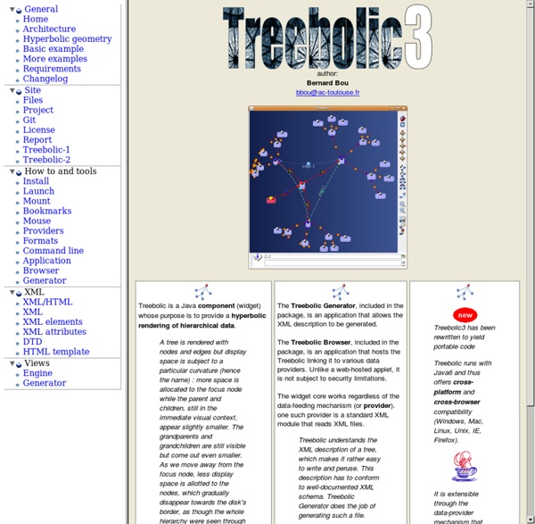
Xerox developed this UI as the future to hierarchical lists. It was purchased by SAP and locked away. It's a beautiful concept of Focus and Context that maps a large site onto a hyperbolic web that you can drag around and quickly survey everything. by pauljacobson Apr 6