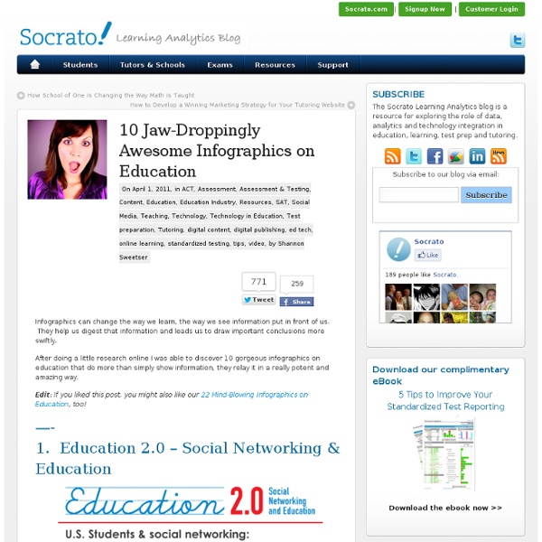
10 Jaw-Droppingly Awesome Infographics on Education
Infographics can change the way we learn, the way we see information put in front of us. They help us digest that information and leads us to draw important conclusions more swiftly. After doing a little research online I was able to discover 10 gorgeous infographics on education that do more than simply show information, they relay it in a really potent and amazing way. Edit: If you liked this post, you might also like our 22 Mind-Blowing Infographics on Education, too! 1. 2. 3. 4. 5. 6. 7. 8. 9. Credit: 10. featured image by pfaff SAT vs ACT: Choosing the Right Test [NEW EBOOK] Download this free 20-Page Ebook for Tutors Now! Our free 20-page ebook is a step-by-step guide on how to select the right test for your student.
Knewton Infographic: STEM Education
Then vs. Now: How much did kids change in a generation (1982-2012)
Share this infographic on your site! <a href=" src=" alt="Then vs Now: How Things Have Changed from 1982 to 2012" width="500" border="0" /></a><br />From: <a href=" Embed this infographic on your site! <a href=" src=" alt="Then vs Now: How Things Have Changed from 1982 to 2012" width="500" border="0" /></a><br />From: <a href=" Education Degrees</a> Then vs. Those kids today... you may be the parent of a teenager and wondering what you've gotten yourself into. The typical teenager in the early 1980s was rocking a Walkman and had just seen E.T. Music 1982: Olivia Newton-John, Survivor, Joan Jett and the Blachearts Movies Video Games
Pictogram graph
Pictogram Graph Handling data --- Data --- Pictograms --- Graphs --- Mean, median, mode --- Sorting Fill in the graph title and a description per line. To enter data, click on the right place in the line, or click on + or -, or enter a value. Choose picture and colour: You can have different pictures or colours for different lines. How to use this webpage Farm animal pictogram © Jo Edkins 2007 - Return to Numbers index
The Origins of Electricity, Tesla vs. Edison
More Infographics on Good
Not a Drop to Drink
More Infographics on Good
Are the Richest Americans Also the Best Educated?
More Infographics on Good
Educating the Workforce of the Future
More Infographics on Good
Vaccination Nation
Vaccines have been a topic of debate for quite some time. Many parents opt out of vaccinating their children because of scientific rumors, some feel that ancient diseases no longer need vaccinations because of their rarity. Other parents vaccinate their children willingly and unvaccinated playmates cause parents to fear for their child’s health. The MMR (measles, mumps and rubella) vaccine has sparked controversy after a physician published a paper linking it to autism. This has been widely discredited both by government researchers and private researchers, but the publicity and effect carries on. As seen in the infographic, some parents are not following CDC suggested vaccine schedules. Parental reasons for straying from CDC recommended vaccinations vary, including more control over their child’s health, avoiding unnecessary vaccines, safety and side effects. Share This Infographic Get Free Infographics Delivered to your Inbox
Top 50 Christmas Toys of the Past Century
Have you started doing your Christmas shopping? You know there are only two weeks left, if you haven’t gotten out there time to get steppin friend. With only two weeks left in the shopping season people are beginning to feel the pressure of the oncoming holidays. It is hard to believe within the span of a century the most popular gifts given have gone from a teddy bear to such things as the xbox 360 and ps3. Click to enlarge Share This Infographic Get Free Infographics Delivered to your Inbox
Back-to-School Plastic Surgery: Going Too Far?
The number of teens and children getting plastic surgery in the last ten years has gone up 30%. Either parents are getting worse at making their children feel good about themselves, or our kids are getting uglier and I don’t believe the latter. Is giving your child plastic surgery a good idea? My opinion is no. Bullying has been a problem in schools since education’s inception. Share This Infographic Get Free Infographics Delivered to your Inbox
Related:
Related: