

CSS Shapes, clipping and masking – and how to use them The release of Firefox 54 is just around the corner and it will introduce new features into an already cool CSS property: clip-path. clip-path is a property that allows us to clip (i.e., cut away) parts of an element. Up until now, in Firefox you could only use an SVG to clip an element: But with Firefox 54, you will be able to use CSS shapes as well: insets, circles, ellipses and polygons! Note: this post contains many demos, which require support for clip-path and mask. Baseline - a designer framework by ProjetUrbain.com “Real” baseline grid on the web When I first started to design Baseline, I wanted to base the grid on the work of Josef Müller-Brockmann, unfortunately some missing CSS attributes — like type leading — kept me from implementing a true grid based approach. I then decided to another look at the basic grid used in print: the baseline grid. Most frameworks and examples of baseline grids simply put the type on a regular line-height, but one problem with this approach is that the text rarely lines up correctly between columns and headlines — H1 through H6. Baseline try to align to the font metric to correctly line up headlines, paragraphs, form labels and any other major elements on the page baseline, creating a harmonious layout.
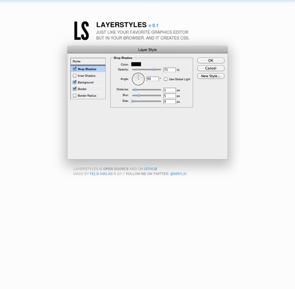
50 Useful CSS Tools And Generators for Developers - Noupe Design Blog Jul 11 2011 CSS tools are essential for web developers because they act like a sort of magic lamp that can simplify the job at hand. Most development tools are time savers that are there to help developers create stylish, functional and optimized websites with a few shortcuts. CSS tools and generators are available in such large numbers that a developer can choose from a range of them to make their projects go smoother. Here is the collection of around 50 useful and handy CSS tools and generators that every developer should know about. Enjoy! What You May Not Know About the Z-Index Property The z-index property in CSS seems simple enough, but there's a lot to discover beneath the surface if you really want to understand how it works. In this tutorial we'll clarify the inner workings of z-index, by looking at stacking contexts and a few practical examples. CSS provides three different positioning schemes for the layout of boxes:
Stylish CSS3 progress bars You've seen progress bars everywhere, they are those bars that display the current completion state for a process, such as a download or file transfer. Whether you're building a desktop or a web application, at a certain point, you may need to use this UI element. Having said that, in this article you'll learn how to create stylish and animated progress bars using CSS3. View demo The HTML The markup could not be simpler than that: How to Make Magic, Animated Tooltips With CSS Tooltips are a great way to enhance a UI when your users need some extra context for that fancy icon, or when they want some reassurance for clicking a button, or maybe an Easter Egg caption to go along with an image. Let’s make some animated tooltips, right now, with nothing but HTML and CSS. Here’s what we’re working towards:
Introducing CSS Scroll Snap Points By Sarah Drasner On Before this new CSS I'm about to introduce existed, locking an element into the viewport on scroll required rigging up some JavaScript. As you may know, JavaScript has a well-earned reputation to be tricky when paired with scrolling behavior. The new CSS Scroll Snap Points spec promises to help, allowing for this kind of behavior using very few lines of CSS. As happens with very new web tech, this spec has changed over time. Inner Shadows in CSS: Images, Text and Beyond Shadows in CSS are quick and easy, whether you’re slapping on a box-shadow or a text-shadow. But how comfortable are you with inner shadows? Can you pull off an inset box-shadow?
A Step by Step Guide to the Auto-Placement Algorithm in CSS Grid In this tutorial, I’ll be going over all the steps the auto-placement algorithm of the CSS Grid Layout module follows when positioning elements. These steps are controlled by the grid-auto-flow property. In Introducing the CSS Grid Layout and Seven Ways You Can Place Elements Using CSS Grid Layout, I gave an overview of the CSS Grid spec and explained all the different ways Grid lets you arrange elements on the web. However, in my previous articles I explicitly specified the position of just one element in the grid. As for the rest of the items, they got placed properly based on an algorithm. Here, I am going to show you how this algorithm works. Position any background image with offsets in all corners You can read and watch previous episodes here! What’s the problem? It’ll be an easy task if I told you to position a background image, 0.4em from the left border & 1em from the top border. Right ?
A Beginner’s Guide to Pure CSS Images – dailycssimages – Medium Update (1/6/17) We have since released our 50-day email challenge called Daily CSS Images which challenges you to create a pure CSS image every weekday. Hopefully, it is a great way to continue practicing. You can sign up here. Update (1/3/17): If you prefer listening, here’s a video that you can follow along to: What you’re getting into: 17 min read. A detailed explanation of how to creating pure CSS images. Breakdown of a calc() for a square grid by Lasse Diercks on CodePen Hey there! Today, I created this pen: It's one HTML element that turns every child into a square. In this post, I'd like to cover the calculation of the rows. --row-size: calc( ( var(--content-width) - (var(--gutter) * (var(--columns) - 1)) ) / var(--columns) );`