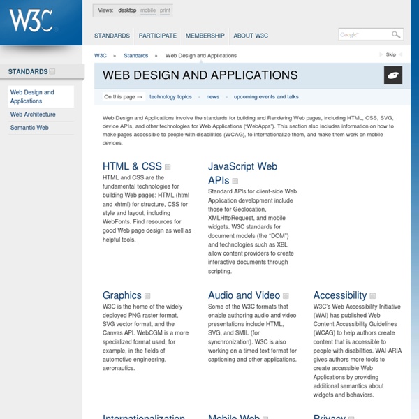
Web Design and Applications

Hypertext Preprocessor
The HTML Hell Page
"Hell is other websmiths." — Jean-Paul Sartre, updated Translations: GermanPolish blinking text Blinking text makes it nearly impossible to pay attention to anything else on the page. It reduces 87% of all surfers to a helpless state of fixated brain-lock, much like that of a rabbit caught in the headlights of an oncoming semi. This is not good. gratuitous animation With animations you get the all the wonderful injuries of the blink tag with the added insult of the graphics download time. marquees So, maybe you think the blink tag and cheesy animations are the worst abuse half-bright websmiths can perpetrate on your retinas? garish backgrounds The very next time we stumble across a page composed by somebody who thinks it's cool to use leaping flames or a big moire pattern or seven shades of hot pink swirly as a background, we swear we are going to reach right through the screen and rip out that festering puke's throat. unreadable text/background combinations brushscript headings Right. frames
Build a Killer Website: 19 Dos and Don'ts
I’m continually surprised by how many people call my design company with very firm ideas about what they want on their business website and yet, they haven’t thought through some of the most basic questions first. For this reason, our first question is always “Why do you need a site?,” not “What do you want on it?” At bottom your website is a marketing tool. For many businesses, it’s the only source of business. Here’s my quick-hit list of the top dos and don’ts before you get started: Do: Set smart goals. Don’t: Do it yourself.
Related:
Related:


