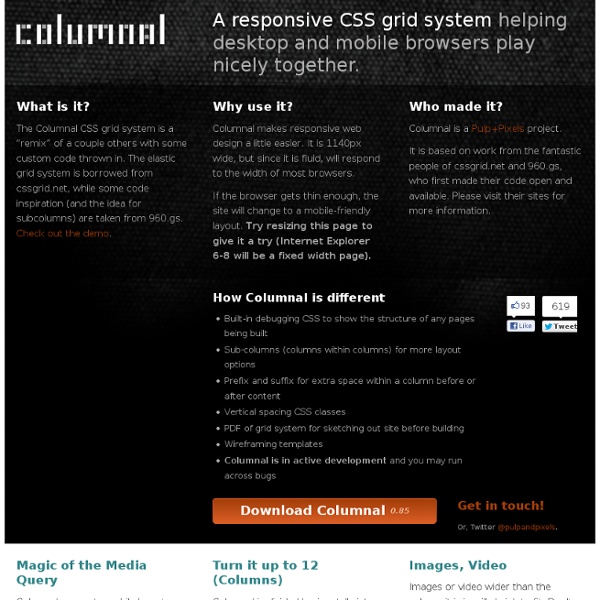


Fluid Baseline Grid - A sensible HTML5 and CSS3 development kit The Semantic Grid System CSS Smart Grid — A Lightweight, Responsive, Mobile First 960 Grid As a Grid System There's only one CSS file to include: smart-grid.css . Place that in <head> your own stylesheet. Wrap your page inside a <div class="container"> . Note that you can use more than one container if your need calls for it: <header id= "hd" > <div class= "container" > <h1> My Page Title </h1> </div> </header> <section id= "main" > <div class= "container" > <p> This is where my content goes. Column Markup Grid columns are achieved by adding a column class to any element. <div class= "container" > <div class= "row" > <article id= "main" role= "main" class= "columns two-thirds" > <p> The beginning of the best article in the history of humanity. If you only have one row of columns in a container, you can ommit the row: <div class= "container" > <article id= "main" role= "main" class= "columns two-thirds" > <p> The beginning of the best article in the history of humanity. Column Offsets Sometimes you need a blank column between content.
Skeleton: Beautiful Boilerplate for Responsive, Mobile-Friendly Development Golden Grid System GGS was my next step after Less Framework. Instead of a fixed-width grid, it used a fully fluid-width one, without even a maximum width. The resources it was published with are still available on GitHub. The idea was to take a 18-column grid, use the outermost columns as margins, and use the remaining 16 to lay elements out. On smaller screens the 16 columns could be folded into 8, 4 and 2. While the grid's columns were fluid — proportional to the screen's width — the gutters (spaces between the columns) were proportional to the font-size being used. GGS also contained a set of typographic presets, strictly to a baseline grid. Correctly setting all of these measurements is difficult, of course. When published, GGS gained a lot of attention, as the web design community was searching ways to work with fluid-width grids, which have always been troublesome, running counter to many graphic design principles. Later on I developed Frameless, the last entry in my early CSS grid system saga.
The Goldilocks Approach to Responsive Web Design 34 Responsive Grid System The Shapes of CSS Learn Development at Frontend Masters CSS is capable of making all sorts of shapes. Squares and rectangles are easy, as they are the natural shapes of the web. We also get the ::before and ::after pseudo elements in CSS, which give us the potential of two more shapes we can add to the original element. Square Rectangle Circle Oval Triangle Up Triangle Down Triangle Left Triangle Right Triangle Top Left Triangle Top Right Triangle Bottom Left Triangle Bottom Right Curved Tail Arrow via Ando Razafimandimby Trapezoid Parallelogram Star (6-points) Star (5-points) via Kit MacAllister Pentagon Hexagon Octagon Heart via Nicolas Gallagher Infinity via Nicolas Gallagher Diamond Square via Joseph Silber Diamond Shield via Joseph Silber Diamond Narrow via Joseph Silber Cut Diamond via Alexander Futekov Egg Pac-Man Talk Bubble RSS Feed via Kevin Huff 12 Point Burst via Alan Johnson 8 Point Burst via Alan Johnson Yin Yang via Alexander Futekov Badge Ribbon via Catalin Rosu Space Invader via Vlad Zinculescu TV Screen Magnifying Glass