
The Heads-Up Grid Responsive web design, as described/defined by Ethan Marcotte anyway, is the act of creating various forms of the same basic site design that are optimized for different ranges of browser window widths. Luckily, the way that I originally constructed the Heads-Up Grid made it relatively easy to adapt to the needs of responsive web design. You can quickly and easily define as many different grids as you need by way of basic JavaScript conditional statements. Even if you are not extremely comfortable with JavaScript, if you are ambitious enough to tackle responsive web design you will most likely have no problem figuring this out. Multi-Device Layout Patterns Through fluid grids and media query adjustments, responsive design enables Web page layouts to adapt to a variety of screen sizes. As more designers embrace this technique, we're not only seeing a lot of innovation but the emergence of clear patterns as well. I cataloged what seem to be the most popular of these patterns for adaptable multi-device layouts. To get a sense of emerging responsive design layout patterns, I combed through all the examples curated on the Media Queries gallery site several times. I looked for what high-level patterns showed up most frequently and tried to avoid defining separate patterns where there were only small differences.
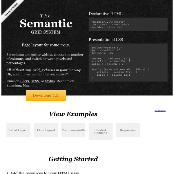
Grid (page layout) A grid applied within an image (instead of a page) using additional angular lines to guide proportions. In graphic design, a grid is a structure (usually two-dimensional) made up of a series of intersecting straight (vertical, horizontal, and angular) or curved guide lines used to structure content. The grid serves as an armature on which a designer can organize graphic elements (images, glyphs, paragraphs) in a rational, easy to absorb manner. A grid can be use to organize graphic elements in relation to a page, in relation to other graphic elements on the page, or relation to other parts of the same graphic element or shape. The less common printing term “reference grid,” is an unrelated system with roots in the early days of printing.
How I Chose A Grid Framework Last week I talked about my choice of a grid for this site. I walked you through my thought process, the constraint the grid is built on, and how I eventually settled on an 8 column grid. I even tossed in a few thoughts about setting up a baseline grid. Responsive Layouts, Responsively Wireframed Responsive layouts, responsively wireframed Made with HTML/CSS (no images, no JS*) this is a simple interactive experiment with responsive design techniques. Use the buttons top-right to toggle between desktop and mobile layouts. Using simple layout wireframes, this illustrates how a series of pages could work across these different devices, by simulating how the layout of each page would change responsively, to suit the context. Responsive layouts? Producing static wireframes to design layouts for websites, web applications and user-interfaces has worked well for a long time.
15 Responsive Navigation jQuery Plugins For the most of us, the most difficult aspect of building a responsive layout is the planning and coding of the navigation. As there is no truly tried and tested universal solution, the style of the menu you use will depend on the type of site you are building. If it is a small site, a <select> drop-down menu or a basic “three line” toggle menu will probably be suffice. But if it is a larger site (an e-commerce store for example) that relies upon a mega-menu for navigation on its desktop version, then a drawer-style navigation or an animated side panel menu will most likely help you.
How To Choose The Right Grid It’s easy enough to understand how grids are helpful in organizing your content. Not as easy is deciding what type of grid best suits your content and how to build it. Here’s how I made decisions about what grid to use for the redesign of this site. You may remember in redesign this site I created documents filled with design decisions that later became an online style guide. Last week I walked through the decisions in my typographic document. Today I’ll talk about the next document, the one I used to help me determine the grid upon which this site is built. 30+ Must Have jQuery Plugins & Responsive Tools for Web Developers jQuery, ‘the missing UI library for the web’ as they describe it, is an essential tool for designing modern web applications and interfaces. It provides a wide range of UI components and development tools that you can use to build rich web applications. Today we are featuring 30+ jQuery plugins, libraries and tools that we have found useful. Hopefully, you will find them valuable for your upcoming projects. If you know of any useful jQuery plugin that you have used or authored, do share in the comments section below. CSS3 and jQuery Filtering and Sorting Plugin – MixItUp
Golden Grid System GGS was my next step after Less Framework. Instead of a fixed-width grid, it used a fully fluid-width one, without even a maximum width. The resources it was published with are still available on GitHub. The idea was to take a 18-column grid, use the outermost columns as margins, and use the remaining 16 to lay elements out. On smaller screens the 16 columns could be folded into 8, 4 and 2.
The Hypnotic Effect of Parallax Scrolling and How it Impacts User Experience Parallax scrolling has become increasingly popular in web page design. Pages that employ it often create an impression of action through clever techniques that utilize page depth, animation, and movement. Owing its beginnings to the multiplane camera technique developed by early animators in the 1940’s, parallax scrolling was first popularized in the 1980’s as a way to add depth in 2D video games. These day’s though, you mostly hear about parallax scrolling as a way to improve user experience in web design. It works by having the foreground and background move at different speeds while the user is scrolling. This creates a hypnotic animated effect that can impress, engage, and direct the viewer’s attention toward whatever you desire.
The Infinite Grid Grid systems are a key component of graphic design, but they’ve always been designed for canvases with fixed dimensions. Until now. Today we’re designing for a medium that has no fixed dimensions, a medium that can and will shape-shift to better suit its environment—a medium capable of displaying a single layout on a smartphone, a billboard in Times Square, and everything in between. We’re designing for an infinite canvas—and for that, we need an infinite grid system. It’s common to think of responsive design as multiple layouts: mobile, tablet, desktop, etc. The problem is the “in-between” sizes tend to suffer, so we end up with layouts that look great at specific dimensions (320, 720, 960), but less than great for everything else.