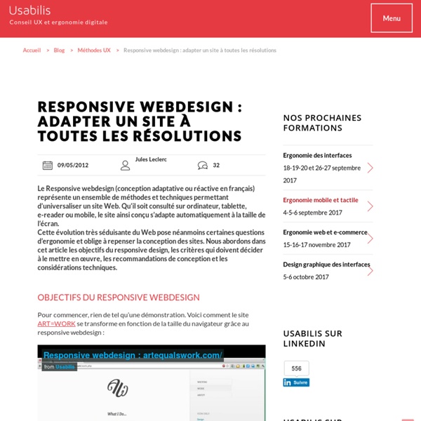


http://www.usabilis.com/responsive-webdesign-adapter-resolutions/
5 Useful CSS Tricks for Responsive Design Making the design to be responsive is very easy as shown in my Responsive Design in 3 Steps tutorial, but maintaining the elements to look aesthetically balanced on all breakpoint layouts is an art. Today I’m going to share 5 of my commonly used CSS tricks along with sample cases for coding responsive designs. They are simple CSS properties such as min-width, max-width, overflow, and relative value — but these properties play an important part in responsive design. View Demos
WebSockets in Tomcat 7 posted by fhanik on April 23, 2012 10:22 PM With the 7.0.27 release the Apache Tomcat team introduced a WebSocket implementation. WebSocket has received a lot of hype, and has been much anticipated by Tomcat users. Let’s take a quick look at what web sockets are, what benefits and limitations they have and how they are implemented in Apache Tomcat 7.
7 Essential Books on Responsive Web Design You Do Not Want to Miss For those of you who want to depeen your knowledge and development of Responsive Design technique, we recommend a selection of 7 reference books about it, which you can purchase via the Internet. Of course, the first one we would like to emphasize is the origin of Ethan Marcotte, "Responsive Web Design", published by A List Apart. Smashing Magazine has also undertaken, as always, a great job of editing and reporting with its fantastic collection of books on responsive design techniques. Finally, also noteworthy is Cristian Darie's guide to developing this technique for mobile applications with AJAX and PHP. Responsive Web Design From mobile browsers to netbooks and tablets, users are visiting your sites from an increasing array of devices and browsers.
Color Psychology of Consumer Decision Making What does color really mean to your customer, or how does color affect consumer behavior? Colors can have a powerful psychological effect, and there is a strong connection between color and feelings. Color can evoke emotions and therefore it can change our behavior too (a red sports car can create feelings of excitement, or a blue sea can create feelings of calmness). This is also supported by science, as color addresses one of our basic neurological needs for stimulation. Color triggers very specific responses in the brain and in the whole body (red raises blood pressure and heart rates, while blue lowers blood pressure, pulse, and respiration rates). For marketers, color differentiates the brand, suggests emotional benefits and can be a key to a brand’s identity.
Tablet Screen Dimensions for Responsive Web Design I’m in the process of teaching myself responsive web design as I redesign my portfolio site. If you don’t know, responsive web design is the concept that a website layout should respond to the size of the screen it is being viewed upon. That is, a website will look different on (and be optimized for) a cell phone or iPad than it would on a traditional laptop or desktop monitor. HTML5-Powered Web Applications: 19 Early Adopters HTML5, rumored as Flash killer, is a brand new web technology that raises a revolution lead by Apple in web application development. It contains canvas element for images and animation drawings, support video and audio embedding, and includes storage database for offline web applications. Most important of all, you don’t need a plugin to get all these features, your latest browser supports that. Sounds pretty cool, but what HTML5 can do actually? Well, this post is going to satisfy your curiosity about the power of HTML5 by showing you a series of practical HTML5-powered web applications such as drawing application, chart creating application and time management application.
Viewport : adieu width=device-width ? Bonus : summary in english : initial-scale=1.0 fits the viewport to the dimensions of the device (device-width and device-height values), which is a good idea because the size of the viewport fits the dimensions of the device regardless of its orientation.width=device-width size the viewport to always corresponds to the (fixed value) width of the device, and thus is distorted in landscape orientation because que right value should be “device-height” not “device-width” in landscape (and it’s worse on iPhone5 whose device-height value is 568px, compared to its 320px device-width). Therefore, I would rather recommend to always use initial-scale, alone or not, because width=device-width alone is problematic. More info : Apple doc "How to configure Viewport". Suite à des tests et des bugs découverts sur Windows Phone 8, la conclusion de cet article est remise en question.
Design Blog, Innovation Design Blog, Modern Design Blog, Product Design Blog 10 Type Rules for an Excellent User Experience When it comes to websites and apps, good typography is more than just a pretty typeface. Letting has to be highly readable – and scannable – while providing a solid visual... Web Design Trends 2016: How Cards Dominate Design Practical as they are visually attractive, card interfaces are more than just a trend. With 2014 marking the first time mobile internet usage exceeded desktop, web design is now... Understanding Immediate and Anticipated Emotions in Landing Pages Design is intertwined with psychology.