

10 Infographics That Will Teach You About Typography Typography is a crucial component of great designs involving text, so knowing as much as you can about it is an important step to becoming a great designer. This roundup of infographics will help you discover new and interesting things (as well as reinforce and reiterate stuff you already know) about typography. Click the Go to Source link under each infographic to navigate to the source of the infographic and to see the larger version provided by the creator of the infographic. 1. Identify a Font. Font and Typeface Identification tools. What font is that? Ever seen a typeface (font) you like but couldn’t identify it? I once knew an Art Director who was able to identify just about any typeface I showed him. However, in recent years, even he responds with, I don’t have a clue. So where to turn? Well, rather than publishing my Art Director friend’s email address here, I’ll introduce a few resources to get you started.
Font Springtime Here at Creative Bloq, we're big fans of typography and we're constantly on the hunt for new and exciting typefaces – especially free fonts. So, if you're in need of a font for your latest design or just like to keep a collection so you're prepared, we may be able to help out. Win clients & work smarter with our FREE ebook: get it now! Every day, we're running 'Font of the day', where we'll be posting the best free and paid-for fonts the web has to offer. Today's typeface of choice is Springtime, a beautiful, cursive design from the team at Font Zilla. Typeset In The Future Right from the opening scene, we're treated to Kubrick's love of bold, clean, sans-serif typography: This title card is set in Gill Sans, one of the all-time classic sans-serif fonts. Perhaps surprisingly, the zeroes in ‘2001’ appear to be set with the Gill Sans capital letter O (shown below on the left), rather than its zero character (shown on the right): After introducing us to Albertus, the Dawn Of Man turns out to be typographically unremarkable. So, let's skip forward a little, and join Dr.
Typographer's Glossary Serif: Serif's are semi-structural details on the ends of some of the strokes that make up letters and symbols. A typeface that has serifs is called a serif typeface (or seriffed typeface). Some of the main classifications of Serif type are: Blackletter, Venetian, Garalde, Modern, Slab Serif, Transitional, and Informal. Fonts in each classfication share certain similiar characteristics including the shape or appearance of their serifs. Serif fonts are widely used in traditional printed material such as books and newspapers. Choose a License This work is licensed under the Creative Commons LICENSE_NAME License. To view a copy of this license, visit LICENSE_URL. We are currently testing a new version of the License Chooser.
Top 50 Best Free Fonts Are you in love with the Free Fonts Section on UltraLinx? If you answered yes, then I believe this post will blow your mind. Today we round up the top 50 best free fonts for you to download. Did we mention they were free? A proposito delle Licenze Our public copyright licenses incorporate a unique and innovative “three-layer” design. Each license begins as a traditional legal tool, in the kind of language and text formats that most lawyers know and love. We call this the Legal Code layer of each license. But since most creators, educators, and scientists are not in fact lawyers, we also make the licenses available in a format that normal people can read — the Commons Deed (also known as the “human readable” version of the license). The Commons Deed is a handy reference for licensors and licensees, summarizing and expressing some of the most important terms and conditions.
Tuesday's Tech of the Week: Type & Color Edition Since the world of design is about to get quite a bit cloud-ier with the release of Adobe Creative Cloud, we decided to take today's tech roundup to pay homage to 10 websites, apps, and games that help designers become better designers. As purveyors of color, creativity, and tech innovation, our team refers to almost all of these sites on a weekly basis! First, the world of type. 1. Kern Type: A Kerning Game: This kerning game is great for helping designers practice the art of type kerning. If you don't know what kerning is, it is the art of making sure all the letters in a given word are evenly spaced.
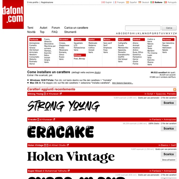
21 Fonts That Shouldn’t Be Free…But Are! 21 Fonts That Shouldn’t Be Free…But Are! 13 July 2009 by Jordan Hall Using the right type in your designs, both in type and web, is vital to an attractive and successful design. With so many free fonts out there (Da Font currently has over 9000 fonts to choose from) it’s hard to wade through the varying levels of quality available. We’ve picked out some great fonts that shouldn’t be free, but are! 1.