A Comprehensive Guide To Mobile App Design
About The Author Nick Babich is a developer, tech enthusiast, and UX lover. He has spent the last 10 years working in the software industry with a specialized focus on … More about Nick Babich … (This article is kindly sponsored by Adobe.) There are many things to consider when designing for mobile. We’re sure that this detailed guide will help you get rid of that headache when building apps.
The Relevance of User Experience: Using Every Opportunity to Impress Users
Is it possible to calculate the ROI of great design? What about the cost-per-acquisition of a customer who purchases software based on its user experience? There are no second chances for first impressions.
Accessibility
Screen readers may automatically announce a control’s type or state through a sound or by speaking the control name before or after the accessibility text. Search Search field Download over Wi-Fi only
Touchscreen Braille Writer Lets the Blind Type on a Tablet
One group of people has traditionally been left out of our modern tablet revolution: the visually impaired. Our slick, button-less touchscreens are essentially useless to those who rely on touch to navigate around a computer interface, unless voice-control features are built in to the device and its OS. But a Stanford team of three has helped change that. Tasked to create a character-recognition program that would turn pages of Braille into readable text on an Android tablet, student Adam Duran, with the help of two mentor-professors, ended up creating something even more useful than his original assignment: a touchscreen-based Braille writer.
Touch Target Sizes
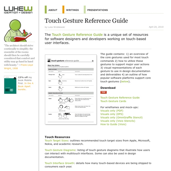
People interact with touch-based user interfaces with their fingers. So user interface controls have to be big enough to capture fingertip actions without frustrating users with erroneous actions and tiny targets. Ok, so how big? In the iPhone Human Interface Guidelines, Apple recommends a minimum target size of 44 pixels wide 44 pixels tall.
Touchscreens UX: Godsend or disaster?
Note: A guest post by Jesse Kunze – More details about Jesse after the post. Touchscreens have taken off – they have went from a rarity, to pressure based touchscreens such as on the Palm Centro, to mostly capacitive, multi-point touchscreens such as iOS products, or most Android devices. As a plus, they are fairly intuitive to use, so you may be wondering why I would ever even think to consider them a disaster in the UX area of design. In fact, you may think that touchscreens will soon take over the whole arena, and you will never get to use a button again.
Misused mobile UX patterns – Zoltan Kollin
If you are an experienced designer, you probably agree that being inspired by others is not stealing in UI design. It’s best practice research. It’s using design patterns. It’s following the guidelines. It’s making sure to use patterns that your users are familiar with to create usable interfaces. Some might say that sticking to the guidelines and following others will kill creativity and, at the end of the day, all apps will look the same.
How to use multitasking gestures on your iPad
A new feature to both the iPad (iOS 5.0.1) and the iPad 2 (iOS 5.0) is the ability to use multitasking gestures.Multitasking gestures allows users to simply swipe with four or five fingers to access the multitasking menu, swipe left or right to reveal open applications and pinch to return to the home menu.This may sound a little complicated however; it really is a time saver once you learn how to activate, operate and master the multitasking gestures. How to Activate Multitasking Gestures Even though the feature is available for both iPad and iPad2 it does not work without activating the functionality.To activate multitasking gestures go to Settings then select the General section then select ON under Multitasking Gestures (Fig 1a). How to use multitasking gestures
Hamburger menu alternatives for mobile navigation
If you’re working on digital products, you have already read dozens of articles describing how and why the hamburger navigation on mobile (and desktop!) hurts UX metrics due of its low discoverability and efficiency. (You can read some of best articles on the topic here, here, here, and here.) Luckily, more and more sites and apps are experimenting with alternative, more efficient solutions for this very problem. None of the ideas listed here is better than the others, their viability and performance obviously depend on the content and the context.


The guide may have missed one. The iPad entire hand finger open then closing together to return to home. by hfernety Nov 22