

10 Web Usability Tips - Just Fun 1. Motivate: Design your site to meet specific user needs and goals. Use motivators to draw different user "personae" into specific parts of your site. 2. User task flow: Who are your users? A Compilation of Vintage Textures for Designers Resources June 10, 2010 Textures are one of the most used resources in making great designs. They can accentuate your images to better portray the feel of the design you’re aiming for. Vintage textures, for instance, can add a classic or nostalgic touch to your work. Here at You the Designer, you need not blast to the past to get this brilliant effect. This Compilation of Vintage Textures for Designers features resources you can download for free. Palettes Log In Sign Up COLOURlovers
Alertbox: Jakob Nielsen's Newsletter on Web Usability 10 Usability Heuristics for User Interface Design April 24, 1994 | Article: 2 minutes to readJakob Nielsen's 10 general principles for interaction design. They are called "heuristics" because they are broad rules of thumb and not specific usability guidelines. When to Use Which User-Experience Research Methods October 12, 2014 | Article: 8 minutes to readModern day UX research methods answer a wide range of questions. To know when to use which method, each of 20 methods is mapped across 3 dimensions and over time within a typical product-development process. Usability 101: Introduction to Usability January 4, 2012 | Article: 4 minutes to readWhat is usability?
350+ Free Textures 17 scratched and scraped textures grab bag 40 random free textures 14 free high res slate textures Usability on the Web Usable Web sites are sites that work for your readers. A usable Web site encourages repeat visits. Find out what makes a usable Web site, and how to improve your own site. Learn how to do usability tests and create sites that your readers want to return to. What are Design PatternsDesign patterns are a useful tool to make sure that your site elements work as they are supposed to work. But if you don't know what a design pattern is, you can't use them.
Using Pantone swatches in Illustrator Using Pantone swatches in Illustrator. Scenario: As a designer, you will be required to use Pantone colors to create spot-color documents for multi-color print projects. About Pantone Colors When producing spot color files (which use specified ink colors other than CMYK) each color is selected from the Pantone swatch library. Each Pantone ink color is numbered. The commercial printer uses a specified mixing formula for each Pantone color to ensure accurate color matching. Designing Web Pages that are Color-Blind Friendly Can you read the image that is displayed on this page? Are the colors correct for what the words say? If you're color blind, chances are you can't tell. According to most statistics, color blindness is a problem for 8 to 12% of males of European origin and about half a percent of females. For these people, the words in my picture appear to be almost the same color.
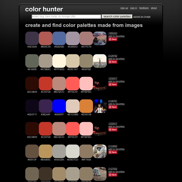
Excellent color tools that any graphic designer or artist will love Color is a crucial part of any creative artist’s work, but it’s even more evident in the field of graphic design, due to its multiple applications. The right or wrong color choice can have a huge impact on your work: even if you have created a very complex design (requiring many hours of work to achieve a well-crafted result), you still have to pay attention to the color palette for it to really pop out and look balanced. This can be, for some people, the hardest part of all! Thankfully, there are many color tools to help you make the best color choices.
Accessibility Validators - How to Use Accessibility Validators There are many HTML validators available to tell you if your HTML meets current standards or if it will look okay in a specific browser, but there is only one good validator that tells you if your page is accessible to people with disabilities: HiSoftware's CynthiaSays. Why Make Accessible Web Pages? Making your page accessible is more than just putting alt text on images (although that is a good start).
Low Vision Web Page Layouts - Zoom Layouts Did you know that most people who are legally blind can actually see? If you're like me, you imagine that blindness is something like putting black goggles on, but for a lot of blind people, it is actually more like looking through waxed paper. In fact, one of my best friends is legally blind and she's a technical writer and she doesn't use a screen reader to write. She just maginfies what she's reading enough so that she can read it. Why are website color schemes so important? Everything, every little detail that is a part of your website design is important and impacts the user experience in some way. One of the things that easily gets overlooked is the color scheme because people often underestimate it. Choosing the right website color schemes might not seem like much, but it can get you a long way. Cool color schemes will make the user feel more welcome and comfortable on your website while enhancing the overall user experience. For Amelia, we chose the calm and neutral blue color scheme with bright accents.