background preloader

CSS3 transitions, transforms and animations

CSS3 transitions, transforms and animations
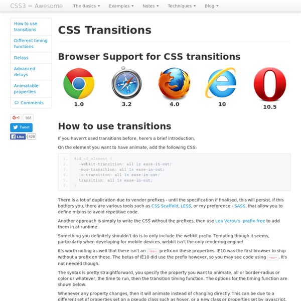
Browser Support for CSS transitions How to use transitions If you haven't used transitions before, here's a brief introduction. On the element you want to have animate, add the following CSS: There is a lot of duplication due to vendor prefixes - until the specification if finalised, this will persist. Another approach is simply to write the CSS without the prefixes, then use Lea Verou's -prefix-free to add them in at runtime. Something you definitely shouldn't do is to only include the webkit prefix. It's worth noting as well that there isn't an -ms- prefix on these properties. The syntax is pretty straightforward, you specify the property you want to animate, all or border-radius or color or whatever, the time to run, then the transition timing function. Whenever any property changes, then it will animate instead of changing directly. To see the difference in speed, have a look at the speed test. Different timing functions Delays The syntax for a CSS3 transition is of the form:

Animation Using CSS Transforms < CSS Tweet363 Shares Share0 Tweets37 Comments The examples on this page will work now in Firefox, Safari, Chrome, Opera and Internet Explorer 10. In older browsers you will see either no effects, or the transforms taking place without any animation. The animations presented below involve setting up a transformation to take place in response to a mouseover or other event. Then, rather than applying the effect instantly, we assign a transition timing function which causes the transformation to take place incrementally over a set time period. There are also other kinds of animation available, including @keyframes for perpetual motion, and requestAnimationFrame which gives complete control over the timing and path. Firefox and Opera now support these transforms with an almost identical syntax - just replace -webkit- with -moz- or -o- in the examples below. Internet Explorer 10 supports transitions with no prefix. To support all modern browsers, the following styles should be used for transitions:

Infinite Animated Photo Wheel < CSS Our first attempts at using CSS 3D Transforms to create an animated photo carousel were not entirely practical as they were limited to a small number of photos. We had more luck using CSS to layout the photos in 3D space combined with JavaScript to iterate through the available photos with our Photo Rotator, but it was a bit boring with no movement effects. So then we wondered what would happen if the two techniques were combined. The following examples are working in Safari, Chrome, Firefox and Opera 15. 1. The HTML is very similar to previous examples. The inline style attribute references the animation @keyframes below. 2. The CSS styles are used to position a number of photos by first rotating them about the y-axis (which runs vertically up the page) and then translating them outward radially (a la Stonehenge): The value of -81px is to move the photos left so that the forward facing photo is centred across the rotation axis. 3. 4. It's not clear why setTimeout is required here. 5. 6.

Bouncing Ball Animation < CSS Tweet10 Shares5 Shares0 Tweets6 Comments Following on from our introduction to CSS Transforms, and using lessons learned from implementing 3D Transforms and Animations, this article presents an animation of a bouncing ball - for now just in two dimensions, but it shouldn't be too much of a step to move to three. These animation will now work in Safari, Chrome, Firefox, Opera and Internet Explore 10. Not all browsers support 3D transformations so the effect can be less dramatic. 1. For this animation we're going to use two keyframes - one to translate the ball horizontally with a constant velocity and a second to apply a roughly parabolic vertical bouncing motion. The horizontal motion can be easily implemented using the following keyframe: This keyframe will be referenced later using the assigned name 'travel' and applied using a linear transition timing function that changes direction with each iteration. This keyframe has been named 'bounce' for future reference. 2. 3. 4. 5.

3D Transforms and Animations < CSS 3D Transforms were first implemented by the Safari/WebKit team ages ago. Support in other browsers is still variable, but getting better. CSS3 animation and 2D transforms have been implemented in Safari, Firefox, Opera and even Internet Explorer 10, but in this article we're taking it a step further using keyframes to set up perpetual animation effects in 3D space. These effects will work in WebKit (Safari/iPhone/iPad and Chrome) and Mozilla (Firefox) browsers. Some simpler effects will work in Internet Explorer 10, but they don's support the preserve-3d setting needed for proper 3D layouts. 1. What are keyframes? A @-webkit-keyframes block contains rule sets called keyframes. While this may sound complicated, and can be, we're starting with one of the most simple examples. In this example the keyframe has been assigned the name 'spinner' for later reference. 2. The 'stage' is the element in which our animation takes place. The next element is the one to which the animation is applied. 3.

Les transformations 3D en CSS3 L’une des innovations majeures apportées par le CSS3 est la capacité à “transformer” des éléments. Ces transformations, qui peuvent être effectuées en 2D (sur la plan de la page) ou en 3D, permettent d’enrichir l’expérience utilisateur avec de tout nouveaux types d’effets visuels. Les transformations combinées avec les transitions permettent en effet d’animer des éléments HTML en effectuant des rotations, des transitions ou des changements d’échelle. Nous allons aujourd’hui appliquer ces transformations dans l’espace grâce aux transformations 3D du CSS3 ! Ce tutoriel a été rédigé par Vincent De Oliveira, enseignant et développeur à l’ENSG. Introduction Vous avez déjà entendu parler des transformations en CSS, qu’elles soient 2D ou 3D? Quelles différences entre la 2D et la 3D sur le web? Pour l’affichage d’un site web à l’écran, nous travaillons en 2D: axe X : positif vers la droite de l’écran,axe Y : positif vers le bas de l’écran. Quels navigateurs sont compatibles? Les rotations Matrice

CSS3 : Transformations 2D CSS3 apporte les transformations en 2 dimensions à travers la propriété transform et une liste de fonctions prédéfinies. Voyons ensemble la prise en charge actuelle de cette propriété et des fonctions qui l'accompagnent. La propriété CSS transform permet de manipuler un élément HTML sur les axes X et Y (horizontal et vertical) grâce à des fonctions diverses de transformation graphique. Syntaxe La syntaxe est simple d'emploi. transform: function(value); Il est souvent nécessaire d'utiliser les préfixes vendeurs (-webkit-, -moz-, etc.) devant la propriété transform pour utiliser les transformations 2D sur les versions actuelles et passées de navigateurs. Il est également possible d'effectuer des transformations combinées en espaçant les fonctions d'un simple caractère blanc. transform : function1(value1) function2(value2) function3(value3); La propriété transform-origin La valeur initiale de cette propriété est le centre de l'élément, ce qui équivaut à la notation : transform-origin: 50% 50%;

Timing des animations et des transitions en CSS3 L'arrivée de CSS3 il y a quelques années a pour plusieurs d'entre nous grandement révolutionné la manière dont nous intégrions un site Web. D'abord, ce furent les propriétés purement graphiques (coins arrondis, ombres portées) qui frayèrent leur chemin jusqu'en mode production. Ces propriétés étaient les mieux supportées des différents navigateurs, et elles étaient facilement imitables sur les plus anciens grâce aux outils à notre disposition (Par exemple: Css3Pie, Selectivizr, Modernizr, etc). Aujourd'hui, l'étendue des possibilités auxquelles a accès un intégrateur est assez impressionnante. Le sujet des transitions et des animations a déjà été traité par maints auteurs. Avant de commencer, veuillez noter que le terme de transition s'appliquera aussi bien au module transition CSS3 qu'aux effets de timing des animations. Survol de l'utilisation des transitions et des animations Avant toute chose, débutons par un survol de l'utilisation des transitions et des animations. Transitions:

CSS3: The Multi Column Layout and How it Will Change Web Design What is strikingly odd about web design is just how difficult it can be to make a multiple column website. For the last 15 years we’ve been designing websites like newspapers and magazines, consisting of many columns, and it’s been working out pretty well. The tools we use, however, haven’t changed that much since then as regards layout. That’s why the CSS3 Multi Column Module is perhaps one of the most interesting and exciting things that has happened to CSS in a long time. Opera (Presto) is pushing ahead with support of this module. What it does Columns are a way of organizing content. So what we’re saying here is that the div will be separated into columns that will be 10em wide. Wide Screen Normal Screen Small Screen This is all automatic! So how exactly does all of this work? columns A short syntax for the column-count and column-width column-count The number of columns! column-width The optimal column width. column-gap The gap between columns. column-rule The rule (or line) between columns.

Getting Started - Google Web Fonts This guide explains how to use the Google Fonts API to add fonts to your web pages. You don't need to do any programming; all you have to do is add a special stylesheet link to your HTML document, then refer to the font in a CSS style. A quick example Here's an example. Then open the file in a modern web browser. Making the Web Beautiful! That sentence is ordinary text, so you can change how it looks by using CSS. You should now see a drop shadow under the text: And that's only the beginning of what you can do with the Fonts API and CSS. Overview You can start using the Google Fonts API in just two steps: Add a stylesheet link to request the desired web font(s): Style an element with the requested web font, either in a stylesheet: or with an inline style on the element itself: For a list of fonts you can use, see Google Fonts. Specifying font families and styles in a stylesheet URL To determine what URL to use in your stylesheet link, start with the Google Fonts API base URL: For example:

Introduction au CSS3 Cette introduction est destinée à ceux qui souhaitent avoir un aperçu global de ce qu’apporte le CSS3. Vous y découvrirez un ensemble conséquent de nouveautés, comment utiliser les préfixes propriétaires afin d’en tirer profit dès maintenant et nous discuterons du caractère non-critique de son utilisation. Il s’agit de la suite logique de l’Introduction à l’HTML5, mais elle peut être lue indépendamment. Sommaire Le CSS3 c’est quoi ? Le CSS3 est le nom employé pour caractériser l’ensemble des nouveautés depuis le CSS2.1. Mais le CSS3 c’est également un ensemble de nouveaux sélecteurs, de nouvelles manières de spécifier les couleurs, une détection des caractéristiques de l’appareil de l’utilisateur, des calculs dans les feuilles de style, des SVG en arrière plan… bref, le CSS3 est un généreux enrichissement des feuilles de style qui, en plus d’être profitable à l’utilisateur, l’est au développeur également ! Exemple pratique : Les bordures arrondies Et vous vous dites : Avec pour CSS : Non. à

An Introduction to CSS 3-D Transforms Ladies and gentlemen, it is the second decade of the third millennium and we are still kicking around the same 2-D interface we got three decades ago. Sure, Apple debuted a few apps for OSX 10.7 that have a couple more 3-D flourishes, and Microsoft has had that Flip 3D for a while. But c’mon – 2011 is right around the corner. That’s Twenty Eleven, folks. Where is our 3-D virtual reality? Granted, the capability of rendering complex 3-D environments has been present for years. Rationale Like a beautiful jewel, 3-D transforms can be dazzling, a true spectacle to behold. An entire application should not take advantage of 3-D transforms. Take, for instance, the Weather App on the iPhone. Flipping from details view to options view via a 3-D transition Also, consider slide shows. 3-D transforms are more than just eye candy. Current support The CSS 3D Transforms module has been out in the wild for over a year now. The support roadmap for other browsers varies. The choice is yours. Perspective

Hiérarchiser ses titres avec CSS - Utiliser les compteurs CSS pour créer un chapitrage automatique Les compteurs... Les compteurs peuvent s’avérer très utile en CSS, notamment dans le cas de cette démo : créer une hiérarchisation de titres au sein d’une page HTML. Je vous invite d’ailleurs à lire l’article sur les compteurs. Comment fonctionne cet exemple ? Pour fonctionner, il faut tout d’abord initialiser les compteurs que l’on veut incrémenter. Pour cela, on utilise counter-reset sur l’élément parent : ici je crée 3 compteurs. Ensuite, pour chaque titre présent dans la page, le compteur associé est incrémenté de 1 (par défaut). Puis à l’aide de la pseudo-classe ::before et de la propriété content, on ajoute le ou les compteurs avant chaque titres : Remarquez ici que l’on utilise les compteurs dans chaque titre concaténés à des chaines de caractères : "Titre" ou "." ou "-" ou autre. Pour plus de détails sur les compteurs, consultez l’article ici.

Quelques idées d’animations simples en CSS3 avec la propriété transition Depuis l’arrivée des animations en CSS sur les différents navigateurs du marché, de nouvelles possibilités sont offertes aux webdesigners. En comptant certaines propriétés de mise en style déjà reconnues par la plupart d’entre eux depuis des mois, il est facile d’imaginer de petites animations pour agrémenter vos sites et offrir une meilleure expérience utilisateur à vos visiteurs. Vous trouverez sur cette page de démonstration d’animations en CSS3, quelques exemples d’animations que je vais vous décrire ici, mais il n’y a rien de bien sorcier, il suffit de trouver l’idée. Les animations en CSS3 La base Dans un premier temps, lorsque vous devez animer un élément, il faut préciser dans quelles conditions (les paramètres) grâce à la propriété raccourcie transition de CSS3. Avec cette déclaration vous prévoyez une animation sur all pour une durée d’animation de 0,7 secondes sur un effet ease-out. Voici la structure de base que j’utilise : L’effet zoom L’effet de décollage La base L’animation

Related: