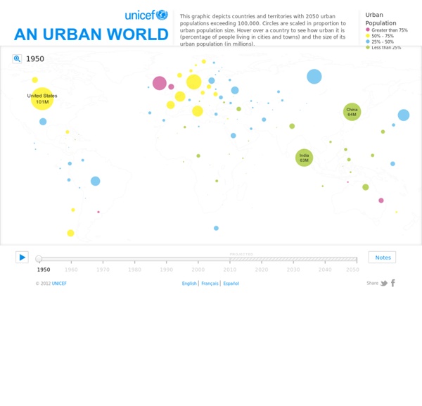
Urban Population Map

submap
Tell-all telephone | Data Protection | Digital
Betrayed by our own dataMobile phones are tracking devices that reveal much about our lives. One look at our interactive map of data provided by the Green party politician Malte Spitz shows why. Nuclear plants in your neighbourhoodHow many people live near a nuclear power plant in Germany? How many people lives within a radius of 20 kilometres? PISA based Wealth ComparisonHow do families live these days? ZEIT ONLINE analyzed and visualized the data OECD's comprehensive world education ranking report, PISA 2009. A United States of Europe?
Every death on every road in Great Britain 1999-2010
2 December 2011Last updated at 17:52 The image below shows the location of 2,396,750 road crashes in Great Britain from 1999 to 2010. Each light point is an individual collision which resulted in a casualty. The video below animates 12 years of road crash data.
Pulse of the Nation: U.S. Mood Throughout the Day inferred from Twitter
Click for high-resolution PDF version (11MB) Video A time-lapse video of the maps, cycled twice, is available below (best viewed at 720p): Mood Variations A number of interesting trends can be observed in the data. Similar variations were discovered independently by Michael Macy and Scott Golder, and first reported in the talk "Answers in Search of a Question" at the New Directions in Text Analysis Conference in May 2010. Weekly Variations Weekly trends can be observed as well, with weekends happier than weekdays. About the Data and Visualization The plots were calculated using over 300 million tweets (Sep 2006 - Aug 2009) collected by MPI-SWS researchers [1], represented as density-preserving cartograms. About Cartograms A cartogram is a map in which the mapping variable (in this case, the number of tweets) is substituted for the true land area. Who We Are We are researchers from Northeastern University and Harvard University, studying the characteristics and dynamics of Twitter. Coverage
Related:
Related:


