
CSS Refreshers: Borders Sure, we’re all familiar with borders. Is there anything new that could possibly be introduced? Well, I bet there’s quite a few things in this article that you never knew about! Not only can CSS3 be used to create rounded corners, but plain-ole' CSS can also be wrestled into displaying custom shapes. That’s right; in the past, before these techniques were discovered, we might have resorted to using absolutely positioned background images to display circles or arrows. Thankfully - as we gleefully take one more step away from Photoshop - this is no longer the case. The Basics You’re likely familiar with the most basic use of borders. The above code will apply a 1px border to an element. In addition to passing a specific value to border-width, three keywords may alternatively be used: thin, medium, and thick. Perhaps you need to change the color of a border when the user hovers over a specific element. A more elegant and DRY approach would be to specifically update the border-color property.
21 outils et générateurs CSS pour développeurs web Les générateurs et outils CSS sont de plus en plus nombreux sur la toile, et facilitent la tâche des développeurs web en leur faisant gagner un gain de temps considérable, en particulier ceux qui génèrent du CSS3. Voici une liste non exhaustive de 21 ressources CSS à connaître et à tester dès maintenant ! 1. Bear CSS Bear CSS est un service qui permet de générer une feuille de style à partir d’un code HTML en prenant en compte les éléments et le balisage de la structure du document (id et classes CSS). Ainsi, vous gagnerez du temps au démarrage de la conception du style CSS. 2. CSS Type Set est un service qui permet de gérer la mise en forme d’un texte dans une interface simple et intuitive. 3. Border Radius est un générateur déstiné uniquement à la propriété CSS3 border-radius qui permet de créer des coins arrondis sur un élément HTML. 4. 5. 6. 7. 8. 9.
The No-Pressure Introduction to CSS3 It's difficult to escape the hype surrounding CSS3 at the moment, yet it has created a divide in the community. If you read any blog post on the subject and it is flooded with comments by developers who feel they still cannot use CSS3 in their work. Rather than being encouraging the responses from the experts in our community can appear as aggressive and superior. Although they are correct in saying CSS3 can be used now, the decision must still fall to the individual, even if their opinions are based on inaccurate assumptions. In this article I'll try to cover some of the more widely adopted CSS3 advancements, showing you not only how to use them but also the support you will likely expect from the major browsers. Why We Can Use CSS3 Now The arguments as to why we cannot use CSS3 include such things as the specification not being finalised or that some elements of CSS3 are either poorly supported or not supported at all. Vendor Prefixes Vendor prefixes that are in use today are : Examples
CSS3 Responsive Slider / Carousel Using Radio Buttons Select catcher Created by Ian Hansson (@teapoted) Art from Brendan Zabarauskas (@bjzaba_). Icons from the iconSweets set. Browser Support: Best In Test: Firefox (transition performance) Full Support: Chrome, Firefox, Opera, Safari (latest versions of all browsers) Partial Support: IE9 (Functional, but does not support transitions) *No JavaScript Functionality (1 compatability fix though) iOS devices don't handle labels properly. You can view this page without the js iOS fix here. How Does It Work? The actual slider is much like any JavaScript slider. To save our input we are using radio buttons. We put the radio buttons at the top so when they are :checked we can use a general sibling selectors (~) to change our slider. That is all the essential CSS, the other gaff is just styling and animation. Created by Ian Hansson (@teapoted), Feb 2012.
Une feuille de styles de base pour bien démarrer vos projets Avec cette astuce, je vous propose un outil et une méthodologie pour partir du bon pied lorsque vous attaquez les styles CSS d'un nouveau projet. Un outil? → une feuille de styles CSS qui corrige ou définit les styles des principaux éléments de vos pages. (Yay, du code à copier-coller!) Une méthodologie? → explorer ce code, se l'approprier, le modifier pour son projet. Quels objectifs? Utiliser une feuille de styles de base, quelle qu'elle soit, répond à deux objectifs principaux: Gommer certaines différences entre les styles par défaut des navigateurs. Notre feuille de styles de base Le code CSS suivant constitue la partie "reset" de la feuille de styles que nous utilisons chez Alsacréations pour nos projets professionnels. L'ensemble de ce projet de "framework CSS" minimaliste se nomme KNACSS est est disponible en libre téléchargement. Rappel : n'employez pas ce reset CSS sans avoir parcouru au minimum les indications laissées dans le code complet commenté. Où placer ces styles? Bonus
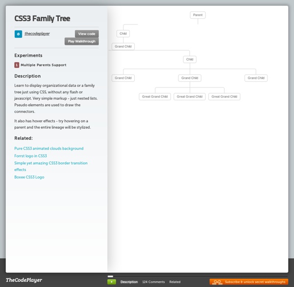
50+ Useful CSS3 Tutorials to Enhance Your Skills People in the web design community now has been talking about the wonders brought about by CSS3. Obviously, it is does not only control the styling of the web page as what CSS2 does, but also the behavioral attributes of the design. This novel technology certainly makes it convenient for you to add animations and transitions right on your stylesheet. Although it is hoped to be the technology that can perform a multi-faceted role in web designing, CSS3 unfortunately is not yet a w3C standard. When the newest stylesheet language however reaches its full potential, it will surely change the way we do things in the industry. CSS3 Tutorials on Sliders, Carousels, Galleries and Accordions Responsive CSS3 Slider Without Javascript The actual slider is much like any JavaScript slider. How to Create a Content Accordion in Pure CSS3 In this tutorial you will learn how to create a pure CSS3 content accordion. Image Accordion with CSS3 Fullscreen Slit Slider with jQuery and CSS3 CSS3 ordered list styles
CSS Tools: Reset CSS The goal of a reset stylesheet is to reduce browser inconsistencies in things like default line heights, margins and font sizes of headings, and so on. The general reasoning behind this was discussed in a May 2007 post, if you're interested. Reset styles quite often appear in CSS frameworks, and the original "meyerweb reset" found its way into Blueprint, among others. The reset styles given here are intentionally very generic. In other words, this is a starting point, not a self-contained black box of no-touchiness. If you want to use my reset styles, then feel free! Previous Versions v1.0 (200802) Acknowledgments Thanks to Paul Chaplin for the blockquote / q rules.
KNACSS, un framework CSS minimaliste qui claque sous la dent ! Créer un menu horizontal centré en CSS (sans JavaScript) - CSS / CSS3 Cet article a 3 années. Il commence à dater, lisez-le donc en gardant son âge en tête ! Merci publié le Lu 93 383 fois. C’est une chose qui peut paraître très simple à faire, mais sur laquelle beaucoup de personnes se sont cassés les dents. Solution avec li en inline Vous savez sous doute que l’affichage des éléments de liste se fait par défaut en display: list-item;, qui procure à la liste ce comportement particulier, notamment l’attribution de puces de liste. Considérons le code HTML suivant : <ul id="nav"> <li><a href="#">Accueil</a></li> <li><a href="#">Services</a></li> <li><a href="#">À propos</a></li> <li><a href="#">Contact</a></li> </ul> Les commentaires HTML entre chaque élément de liste permettent de supprimer l’espace blanc (white-space) indésirable, visible sur certaines mises en forme. Il nous faut maintenant simplement annuler les styles par défaut de la liste pour obtenir des liens alignés sans puce de liste. Démonstration simple Démonstration stylée Écrit par Geoffrey Crofte