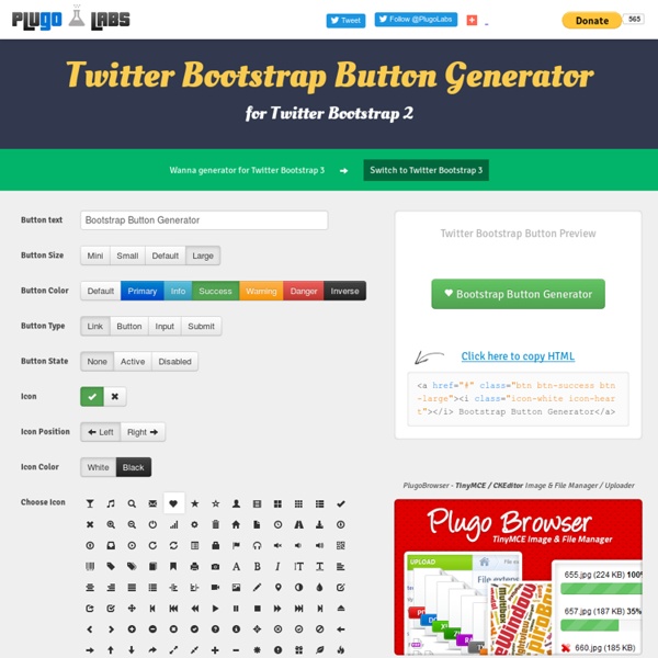
15 Great Twitter Bootstrap Resources Twitter Bootstrap is a great front-end framework that lets you quickly prototype new web projects. Here is a list of great resources that gives even more power to the Bootstrap framework. Fuel UX extends Twitter Bootstrap with additional lightweight JavaScript controls. Other benefits include easy installation into web projects, integrated scripts for customizing Bootstrap and Fuel UX, simple updates, and solid optimization for deployment. This library allows you to create editable elements on your page. Extends Bootstrap’s native modals to provide additional functionality. Bootswatch is a collection of free themes for Twitter Bootstrap. Prototype Bootstrap-based apps using your favorite presentation tool. This date range picker component for Twitter Bootstrap creates a dropdown menu from which a user can select a range of dates. The iconic font designed for use with Twitter Bootstrap. The easiest way how to set up your buttons based on Twitter Bootstrap in a seconds.
Hamburgers by Jonathan Suh Table of Contents Usage Using Hamburgers for your site is easy (well, that was my intention anyway). Sass .scss source files are available if you use Sass as your CSS precompiler. Hamburgers is available via npm, yarn and Bower.npm install hamburgers yarn get hamburgers bower install css-hamburgers Also available as a Ruby gem to use within your Rails application—see below for more information. * Be sure to run the CSS through Autoprefixer since the Sass doesn’t account for vendor prefixes. Install for Ruby on Rails Add Hamburgers to your Gemfile.gem 'hamburgers' Run bundle install. ** More information on why Sass’s native @import + why you should ditch Sprockets directives altogether. Customization To override default settings, declare them before importing Hamburgers: $hamburger-padding-x: 20px;$hamburger-padding-y: 15px;$hamburger-types : (collapse); @import "hamburgers"; @import "hamburgers-settings"@import "hamburgers"; $hamburger-padding-x : 15px ! ems or rems Not satisfied? Accessibility
How to use Twitter Bootstrap to Create a Responsive Website Design "Welcome to the responsive web!" In the last year or so this term has been thrown around everywhere, so often that even a lot of my clients are asking for a responsive design from the get go. This, to me, is really interesting because they never asked for a mobile or tablet version back in the day. One would argue that mobile wasn't so mainstream and everybody was trying to imitate the IOS interface on the web, and I agree, it was bad, but that's not the only reason why clients are asking for responsive!? Somehow they think we turn responsive design on or off as we please and that it's just normal to have, so the price should stay the same. How to use Twitter Bootstrap to Create a Responsive Website Design Responsive web design is an approach, I often call it a mindset, because you have to change the way you think when you're going responsive. The idea of responsive design relies on CSS3 media queries that target specific screen resolutions and sizes. Twitter Bootstrap - Your New BFF Misc
Ti-Ta-Toggle - Bootstrap awesome toggle buttons Using awesome toggle buttons without Javascript or any other logic, other than plane form elements. The Pattern is the same as Twitter-Bootstrap. So it can be implemented without a breeze. Browser support: Internet Explorer 9/10/11, Edge, FireFox, Safari, Chrome, Safari Ios, Stock Android browser 4.2, Chrome Android Version 1.0.0 of TitaToggle has support for Bootstrap v3.x.x Intro The only difference between default Bootstrap checkbox is the structure. Bootstrap 4 The Bootstrap 4 default way of generating checkbox looks a like this: <div class="form-check"><input class="form-check-input" type="checkbox" value="" id="defaultCheck1"><label class="form-check-label" for="defaultCheck1"> Default checkbox </label></div> Ti-Ta-Toggle awesomenes .checkbox-slider you get this result: <div class="form-check checkbox-slider--default"><label><input type="checkbox"><span>TiTaToggle</span></label></div> Note: Don't forget to add the span after the input Slider default checkbox-slider--default Sizes Indicator Howto
Building Responsive Layouts in Liferay with Twitter Bootstrap - Xtivia Blogs Twitter Bootstrap is a popular, easy-to-use front-end framework that not only allows for rapid prototyping, but also comes with a robust set of features that let you easily implement a responsive design. If you're building a site from scratch, all you have to do is include the Bootstrap CSS and JavaScript, and you're off to the races! When you're working with Liferay, though, it's a bit more complicated than that. Of course, it is possible to create a new theme, drop the big bundle of Bootstrap files in there, and start running with it; but there are a lot of Bootstrap UI features that conflict messily with default Liferay styles, especially the Dockbar and Control Panel. For the sake of simplicity, we're going to build a two-column layout with a main content column and a sidebar; but the possibilities are endless. The Layout Template Creating bootstrap-2-column-sample-layouttpl gives us a blank slate. We'll start by duplicating the usual layout template scaffolding: The Theme Notes
27 packs de textures et motifs gratuits pour vos prochaines créations Cette nouvelle sélection de motifs et textures est idéale pour avoir des arrières-plans originaux sous la main à utiliser dans vos créations ou bien pour ajouter de la matière à vos créations. Les 27 packs rassemblent plus de 195 textures, la plupart disponibles au format AI, EPS, PNG ou JPG. Vous souhaitez vous former en matière de graphisme ? 1. 2. 14 arrière-plans wireframes Spacetime (JPG) Il est nécessaire de s’inscrire pour télécharger le freebie. 3. 4. 10 textures Bitmap « Grit » (TIF) 5. 5 textures tableau (JPG) 6. 20 textures noires (JPG) 7. 8. 9. 6 textures abstraites vectorielles (AI, EPS, PNG) 10. 11. 12. 6 motifs répétables Atmosphère (AI, EPS, PNG) 13. 14. 6 motifs répétables en 3 styles (EPS, PNG) 15. 10 motifs style Memphis (EPS, PNG, JPG) 16. 12 motifs réparables monochromes et 3 textures dorées (EPS, JPG, PNG) 17. 18. 16 textures vectorielles spray (EPS, PNG) 19. 8 textures Arctic Frost (JPG) 20. 21. 5 textures encre noir (JPG) 22. 5 textures béton réalistes (JPG) 26.
Help with Twitter Bootstrap - Using LESS and Twitter Bootstrap Les effets graphiques (très) avancés en CSS Vincent De Oliveira · Kiwiparty 2012 t.co/Vw9tDej Vincent De Oliveira Les effets (presque) courants Quoi de plus? Trois fois rien... Commençons par la poudre aux yeux! Background and Borders border-corner-shape: curve | bevel | scoop | notch Au sein de CSS4, pas de support actuellement border-clip: 10px 1fr 10px Au sein de CSS4, pas de support actuellement Quoi de neuf dans la gestion des textes? font-variant · font-feature-settings Contrôle de l'affichage des glyphes Ligatures, crénage, fractions, variantes styllistiques, etc. font-variant Propriété raccourcie Aucun support actuellement font-feature-settings font-feature-settings Ligatures standards: efficaceefficace Ligatures optionnelles: AbbayeAbbaye Chiffres elzéviriens: 482482 Fractions: 1/3 1/41/3 1/4 Ordinaux: 13th13th Attention, fonctionne avec Firefox 4+, IE10 · Police Contenu Book Display Regular Variantes styllistiques: ArbreArbre Variantes contextuelles: ArbreArbre Crénage: WAVEWAVE Petites capitales: CapitalesCapitales Ornements: abcabc
11 Reasons to Use Twitter Bootstrap The popularity of Twitter has helped it cross over from the realm of user-managed social networking to a place where developers sink their teeth into heavy duty code and make the world spin as a result. The Bootstrap framework is the latest innovation to hit the design and development arena, making the creation of websites and apps easier, faster and better in general. If you’re not using Twitter Bootstrap yet, it’s time you took a look. Bootstrap is like a candy store for developers full of a multitude of tools. So why should you use Bootstrap? 1. With Bootstrap, the first thing you do is cash in on a lot of time. 2. A great aspect of Bootstrap is that you can make it your own. 3. The Grid Speaks Creating page layouts requires a decent grid. LESS is more LESS has in reality gone ballistic within development circles. JavaScript Bootstrap comes equipped with JavaScript libraries that go above and beyond basic structural and styling. 4. 5. 6. 7. Bootstrap is responsive. 8. 9. 10. 11.
Werbeagentur in Ingolstadt Material Design Color Palette Generator - Material Palette material design palette More Material Design chevron_right check more_vertarrow_back Palette preview Full Palette colors below grade Your Paletteexpand_lessfile_downloadDOWNLOADshareTWEET Dark primary color#d32f2f Light primary color#ffcdd2 Primary color#f44336 Text / Icons#FFFFFF Accent color#9e9e9e Primary text#212121 Secondary text#757575 Divider color#BDBDBD