How Do You Create A Culture Of Innovation?
This is the third part in a series by Scott Anthony, author of The Little Black Book Of Innovation. It sounds so seductive: a “culture of innovation.” The three words immediately conjure up images of innovation savants like 3M, Pixar, Apple, and Google--the sorts of places where innovation isn’t an unnatural act, but part of the very fabric of a company. While culture is a complicated cocktail, four ingredients propel an organization forward: the right people, appropriate rewards and incentives, a common language, and leadership role-modeling. The Innovator’s DNA Has Four Components If you ask most people what makes a great innovator, the most common response is innate gifts from parents or a higher power. At the core is what the professors call “associational thinking.” Questioning: Asking probing questions that impose or remove constraints. Most organizations have people who follow these behaviors--even if they aren’t immediately obvious to senior leadership. Then it dawned on me.
Creators - Dedicated to inspiring designers, inventors & the creative spirit in all of us.
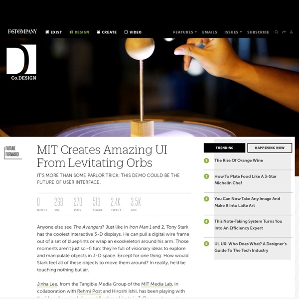
August 22, 2013 Artist’s Work Paints a Beautiful Picture Animations Tyrus Wong, a 102-year-old artist’s work influenced the visual direction of Bambi in 1941. An exhibition at the Walt Disney Family Museum in San Francisco will be held to celebrate Wong’s work. According to the Disney Museum site, the drawings felt different from what is commonly known for Disney animation and this is what caught Walt Disney’s eye. Copyright Davison 2013 Sources: August 20, 2013 Hope “Floats” for those with Carpal Tunnel Product Innovation This levitating wireless computer mouse was invented by Vadim Kibardin of Kibardin Design, in order to help prevent and treat the contemporary disease, carpal tunnel syndrome. The levitating mouse consists of a mouse pad base and a floating mouse with a magnet ring. Source: August 15, 2013 Pin It
Great Resume Designs that Catch Attention–and Got People Hired
Inspiration June 21, 2011 When applying for a job, you have no choice but to do your best to outshine competition. Even before winning an interview, your qualifications (or in some instance, your character) are already judged by the resume you’ve submitted. It is then important to make your resume or CV as honest, concise, and striking as possible. Take a look at how other designers compose their creative resumes. View Source View Source View Source View Source View Source View Source View Source View Source View Source View Source View Source View Source View Source View Source View Source View Source View Source View Source View Source View Source View Source View Source Author: Cadence Wu Cadence is You The Designer's senior blogger, and the most jack-of-all-trades of the staff.
Aerial Data Visualisation Reveals Life In The United States
PBS is exploring the hidden patterns and rhythms that make America work. They are taking this data and visualizing it in a series being called, “America Revealed.” Visualization of internet distribution The pinpointed distribution of the unemployed Domino’s Pizza’s raw ingredients’ delivery routes in the Northeast U.S. electricity network routes The New York pizza delivery path of one Domino’s employee on a Friday night New York’s public transportation paths Patterns of planes’ flight paths Traced paths of deceased bodies being transported to their hometowns U.S. imports and exports of beef All the people in America’s towns and cities Single food outlet of a nationwide chain, such as fast food resturants, supermarkets or grocery stores, bakeries, gourmet shops and restaurants. From The Web Leave a comment comments Tags: infographic
Lesson Plan for Making a Speaker Laboratory
©1995 The Regents of the University of California by Regan Lum Introduction: A speaker is a device that converts an electronic signal into sound. figure 1 Purpose: In this laboratory, you will explore how a speaker works. Materials: 1 permanent magnet 2 feet of wire 1 pencil tape or glue 1 Styrofoam or paper cup 1 signal source (tape player) 1 plug with alligator clips for tape player Procedure: Assemble material as shown in figure 1. Leaving about 10 centimeters on the end, wrap the wire around a pencil to make a wire coil and tape or glue it to the bottom of the cup. Conclusion Does the volume control on the tape player work on your speaker? Return to CEA Science Education Home Page
LED Lights Make Augmented Vision a Reality | Elemental LEDucation
LED Lights Make Augmented Vision a Reality Okay, this is just freaky. We know LED lights are versatile enough to be used for practically anything, but LED contact lenses? Really?! Once miniature green LEDs are developed (and they’re in the works, as of now), full color displays will be possible. Lead researcher Babak Parvis comments “You won’t necessarily have to shift your focus to see the image generated by the contact lens,” it would just appear in front of you and your view of the real world will be completely unobstructed when the display is turned off. Ah, the real world. Thanks to Extreme Tech for the quote and Trendhunter for the images. By the way, these freaky LED contact lenses may still be a product of the future, but a lot of cool LED products are of the present!


