
50 Great Examples of Data Visualization Wrapping your brain around data online can be challenging, especially when dealing with huge volumes of information. And trying to find related content can also be difficult, depending on what data you’re looking for. But data visualizations can make all of that much easier, allowing you to see the concepts that you’re learning about in a more interesting, and often more useful manner. Below are 50 of the best data visualizations and tools for creating your own visualizations out there, covering everything from Digg activity to network connectivity to what’s currently happening on Twitter. Music, Movies and Other Media Narratives 2.0 visualizes music. Liveplasma is a music and movie visualization app that aims to help you discover other musicians or movies you might enjoy. Tuneglue is another music visualization service. MusicMap is similar to TuneGlue in its interface, but seems slightly more intuitive. Digg, Twitter, Delicious, and Flickr Internet Visualizations
Crafting Stories with Google Earth | Digital Is ... I remember two things about 7th grade Texas American History - the maps hanging on my teacher's wall and the flour & water topographical map we constructed at home. Yes, there was something about the Alamo, Sam Houston, and the fact that the original Six Flags amusement park in Arlington, Texas was named after the historical influence six different countries have had on Texas, but what I really remember is the maps. As I look back on any history class from middle school through college, I believe the maps hanging on each teacher’s wall have probably provided to me just as much content as the instructor. Maps have always fascinated me - the geography, the landmarks, the relationships between communities and their landscape depicted in a multimodal fashion. As a result, it should probably come as no surprise that I was completely enamored the moment I originally explored Google Earth. After this initial experience, I kept imagining ways teachers could use Google Earth in their classroom.
Starfall's Learn to Read with phonics 15 Stunning Examples of Data Visualization Data Visualization is a method of presenting information in a graphical form. Good data visualization should appear as if it is a work of art. This intrigues the viewer and draws them in so that they can further investigate the data and info that the graphic represents. In this post there are 15 stunning examples of Data Visualization that are true works of art. Click on the title or image for a larger view of each visualization. The Strengths of Nations Here’s an image that discusses the variations in how different nations pursue science. Madrid.Citymurmur CityMurmur tries to understand and visualize how media attention reshapes the urban space and city. Genome Jules & Jim This visual represents the relationship between characters in the movie Jules & Jim. One Week of the Guardian This is one day in a series that takes the news from one week of the Guardian newspaper, and visually represents it as a series of static visualisations. One Week of the Guardian Leisure & Poverty Stock Data Related Posts
Avec Tripline, chaque voyage devient une aventure interactive Vous revenez d'un voyage inoubliable ? Dans ce cas, vous pouvez commencer dès aujourd'hui à trier et télécharger vos centaines de photos et autres petits films afin de partager vos aventures lointaines avec vos amis et les membres de votre famille. Mais qui veut encore d’un album de vacances classique ? Avec Tripline, vous réaliserez des diaporamas (ou des lignes du temps) interactifs mêlant une carte de votre voyage, du texte, des photos et de la vidéo. La plupart des utilisateurs de Tripline créent une carte sur laquelle ils indiquent les différentes haltes de leur périple. D'autres internautes utilisent Tripline pour planifier leur voyage en faisant des recherches dans les comptes-rendus postés. Tripline est totalement gratuit et tire ses revenus des voyages sponsorisés. Pascal Laureyn
Calculator Mortgage, Mortgage Calculator, Loan Calculator, Tax Calculator A Beautiful Poster Packed With a Year of Global Weather Data | Wired Design The Weather Radials poster is about as much meteorological data as you can cram onto a single sheet of paper. Raureif GmbH Each day of 2013 is represented by a single line. The bottom is the low temp; the top is the high. The color is dictated by the average. Reykjavik looks fairly miserable year round. Mumbai is always hot. Look at Sydney's spiky winter. Seattle's reputation as a rainy city bears out with its steady band of blue, from roughly September to May. An unseasonably cold spell in December brought the first snow Cairo had seen in a century. 2013 was a wet year for Berlin. <div class="slide" data-slide-id="631549" ><img title="" alt="" width="650px" src=" data-image-width="1400" data-image-height="1050" /><p class="caption">The Weather Radials poster is about as much meteorological data as you can cram onto a single sheet of paper. Weather apps are something of a designers’ playground.
4 maneras de usar UMapper para crear mapas en línea UMapper es una herramienta freemium para crear mapas en línea que pueden ser incrustados en sitios web. Sus características únicas hacen que se distinga de herramientas parecidas. 10,000 Words comparte estas cuatro maneras de usar UMapper: 1.Para crear un mapa que se pueda incrustar rápidamente. UMapper hace que sea fácil y rápido hacer un mapa que contenga un número de puntos o marcadores. Es posible añadir textos, imágenes, audio, y más a los marcadores. 2. 3. 4.Para mostrar el clima.
pas mal pour les photos avant/après by sophiecommunication Nov 28
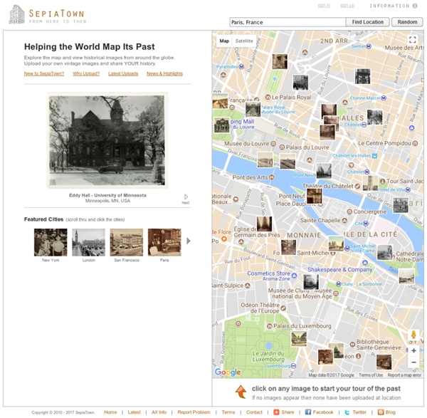
Mapped historical photos, film, and audio. by markbillson Aug 14