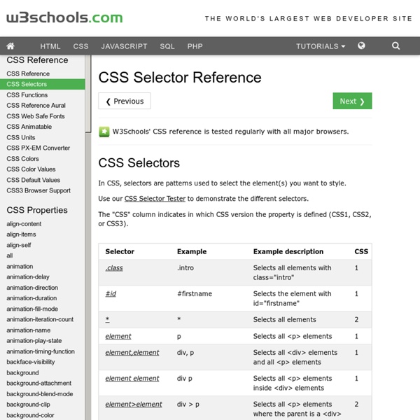


http://www.w3schools.com/cssref/css_selectors.asp
CustomSortOrder in SharePoint 2010 TermSets Be careful in using CustomSortOrder in SharePoint 2010 TermSets! TermSets terms can be ordered in custom way using the specific user inteface feature in Site Settings -> Term Store Management. That can be also used in code because Term class expose the CustomSortOrder property that’s a string where are listed all the term CLSID separated by “:”.
CSS Style Guides As we wrap up our recent poll on ordering CSS properties, it brings up the larger issue of CSS style guides. Ordering properties is just one choice you have to make that makes up a complete styling strategy. Naming is a part of it. Sectioning is a part of it. Commenting, indentation, overall file structure... it all makes up a complete CSS style guide. Let's round up some existing ones.
How nth-child Works There is a CSS selector, really a pseudo-selector, called nth-child. Here is an example of using it: What the above CSS does, is select every third list item inside unordered lists. That is, the 3rd, 6th, 9th, 12th, etc. But how does that work? And what other kinds of things can you do with nth-child? CSS media queries: width versus device-width width versus device-width In CSS media the difference between width and device-width can be a bit muddled, so lets expound on that a bit. device-width refers to the width of the device itself, in other words, the screen resolution of the device. Lets say your screen's resolution is 1440 x 900.
Ewen's Files, Ewen Elder; jQuery JavaScript PHP CSS xHTML MySQL Developer Setting the fixed width of a <select> element in Internet Explorer will cause all of the select options that are wider than the select's set width to be cropped. This jQuery plugin proposes a work around. Applying this plugin makes the select element in Internet Explorer appear to work as it would work in Firefox, Opera etc... As of 17th June 2010, it is confirmed to work in Internet Explorer versions 6, 7 and 8. CSS Specificity Some people are confused by CSS Specificity, especially with all of the (not-so) new CSS3 Selectors. The image below may help make sense of CSS Specificity. Download the PDF
12 Fun CSS Text Shadows You Can Copy and Paste Typography is everyone’s favorite toy in web design. One particularly fun tool that CSS gives you to play with your type is text-shadow, which seems simple enough at first but can be used to create some remarkable effects with a little ingenuity and creativity. Today we’re going to run through several text-shadow examples that you can copy and paste for your own work. The Basic Shadow CSS: fonts Font families After the color, the font is probably the most basic property of a page. On this page I won't show any "tricks," but I will show the range of font variations that CSS allows. visual-studio-sharepoint-project-template - Visual Studio Project Template for SharePoint 2010 SharePoint Project Template is a predefined solution template for C# and VB with general classes and API's which is used in SharePoint projects which can save developer's effort to create solutions, writing base functionality and common methods Who benefits from using SharePoint Project Template? Using SharePoint Project Template benefits all of the following: SharePoint Application Developers – Application developers can create predefined SharePoint solution in seconds.
A Comprehensive Guide to CSS Resets This guide examines the infinite-like variety of CSS resets created by web developers and designers across the world. While almost all of these CSS resets are generally provided free for public use (many through Creative Commons licensing), it is incumbent upon you to check the terms of use before putting them to use in your projects. This guide follows Part 1, where the history of CSS resets was discussed; you’re advised to read that before this one to get the most out of this guide.
Selectutorial: CSS selectors Selectutorial - CSS selectors Selectutorial - CSS selectors Selectors are one of the most important aspects of CSS as they are used to "select" elements on an HTML page so that they can be styled. Find out more about selectors including the structure of rules, the document tree, types of selectors and their uses. Securing Communications with SSL and the .NET Compact Framework Netscape developed SSL in 1994 as a result of the growing concern about security on the Internet. SSL was later converted to a standard called Transport Layer Security (TLS). Devices running Windows Mobile Professional and Windows Mobile Standard support SSL version 2.0, SSL version 3.0, and SSL version 3.1. SSL version 3.1 is most commonly known as TLS version 1.0 (RFC 2246). The primary use of the technology was (and still is) to secure the communication between a browser and a Web server (by using HTTP), which also is the focus of this article, but this primary use has been combined with many other technologies for email messages (SMTP), file transfers (FTP), newsgroups (NNTP), and so on. Today, SSL is an accepted standard that is endorsed by the major credit card companies (such as Visa, MasterCard, and American Express) and many other leading financial institutions.