Zoom
Trash
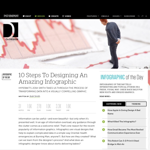
Related: Infographics

40 Useful and Creative Infographics Six Revisions Menu Main Categories CSS HTML JavaScript Web Design WordPress Web Development Design Inspiration UX Design UI Design Freebies Tutorials Tools Links About Contact Advertise RSS Twitter Facebook 40 Useful and Creative Infographics By Jacob Gube Information graphics (or infographics) are graphical depictions of data and information. In this collection, you’ll find forty beautiful and educational infographics, displaying the uncommon spectacle of "art meets science". 1. The proportion of ingredients for popular coffee drinks and their pronunciation keys. 2. This infographic showcases the history of the Swine Flu, starting from 1976. 3. 4. 5. The top breweries and beers in the U.S. 6. 7. 389 Years Ago A rundown of the historic events in African-American culture. 8. 9. 10. 11. An illustrated guide at how the Global Warming phenomenon works. 13. A packed visual piece on tobacco chemicals and tobacco trade worldwide. 14. 15. 16. A graphical representation of consumer spending across the globe. 17.
dafont.com 15 New Extremely Creative Infographics With the help of evolution and progress, people’s lives become easier day by day. Today everything is simpler than it used to be in the past. Let’s take information for example. Infographics are graphic visual representations of data and information and it is the best way to visualize an idea or a thought. But don’t be discouraged – with some practice and yet some practice again, anyone willing to achieve something will definitely achieve it. Magnolia – Infographics & Data Visualization Elements Pack How Would You Like Your Graphic Design? Infographic Facts about Struggling Countries around the World Is it good to be single? The history of Apple’s iPod An infographic Identity Theft Facts and Figures Holiday Shopping Infographic Facebook vs Twitter Infographic Cloud Computing Stats Infographic Breakdown of the Blogosphere The (Visual) Evolution of the Batmobile The Seven Types of Iphone Owners Infographic The Biggest Shift Infographics Twitter Territory The History of Online Video
20 Free and Useful Adobe Illustrator Scripts You have a unique opportunity to expand the functionality of Adobe Illustrator. There is nothing easier than using Illustrator scripts, just select the object and run the script you need! The scripts presented in this post will save you plenty of time and will make your work more pleasant and efficient. Believe me, it is worth your attention. All the scripts have been tested in Illustrator CS3 and CS4. Installing Scripts To save the necessary script to your hard drive, it is desirable to keep them in the same place, for example in the Scripts folder. Now open the folder with the scripts and run the necessary script. Adjust Dashes (offset) Created by Hiroyuki Sato Go to Download (download will start automatically) This script adjusts dashed lines in the selection to the center of the anchor points. Arc Correction Go to Download (download will start automatically) This script corrects free-hand arc-like paths in the selection. Arrow-A, Arrow-V Go to Download (download will start automatically)
Learning Visually | Living the Dream Infographics work in the classroom because they grab students and allow an entry point to learning — and because they sum up pages and pages, even chapters, of information that would take a reader hours to process. Interactive infographics make kids want to immediately start clicking around to see what’s what. For a teacher who prioritizes an inquiry-driven classroom, that’s a great starting point. Infographics and Data visualization are not just for consumption though, teachers and students can also challenge the learning process by creating original graphics for themselves. Go here –> Consuming the information is one portion of the equation when discussing data visualization. There are elements of design to evaluate as well as functionality/clarity of purpose. … classroom examples of consumption graphics … classroom examples of interactive consumption graphics Tools for creation… Data to play with…
"Size By Luminance" a.k.a. Halftones!!! Download:SizeByLuminance.jsx Want to make halftones in illustrator? You could go the auto trace route, or you could go with a plug-in from Phantasm. First off, if you don't know about the "Mosaic Filter" in Illustrator, read this quick article. I will review the steps, but the above link is a detailed and well illustrated walk-through of how to turn an embedded image into an "object mosaic". So, first of course you need to find an image. The image I'm using here is iStock_000008518543.jpg from iStockPhoto.com. Note: You'll get a better result if you "pre-pixellize your image in Photoshop, but if you're just goofing around with this tutorial, you could just skip that step and embed your image directly into illustrator and apply Filter>Create>Object Mosaic.Be sure to actually embed the image, and not just link to it, or this step won't work. (The script doesn't actually add the background, it just reverses the dot sizing, see the images: This is the same image but processed inversely. Tada...
15 Useful Infographics For Designers And Developers Writen by Bogdan / Comments Off on 15 Useful Infographics For Designers And Developers Information graphics or infographics are graphic visual representations of information, data or knowledge. These graphics present complex information quickly and clearly,[1] such as in signs, maps, journalism, technical writing, and education. With an information graphic, computer scientists, mathematicians, and statisticians develop and communicate concepts using a single symbol to process information. In this article you will find 15 useful infographics for designers and developers. The evolution of web design Server Headers Infographic Why Websites Speed Really Matters Photoshop Etiquette Manifesto Cloud Computing Landscape Understanding Google PageRank Hackers: How they get, and got in Anatomy of a WordPress Theme The anatomy of a perfect landing page Visual Guide to SEO The Evolution of Typography Computer Programming Languages Chart HTTP Headers Status Diagram Periodic Table of the Perl6 Operators
The Anatomy Of An Infographic: 5 Steps To Create A Powerful Visual Information is very powerful but for the most bit it is bland and unimaginative. Infographics channel information in a visually pleasing, instantly understandable manner, making it not only powerful, but extremely beautiful. Once used predominantly to make maps more approachable, scientific charts less daunting and as key learning tools for children, inforgraphics have now permeated all aspects of the modern world. I designed a couple of infographics back in college, the need arising especially around the time Soccer World Cup fever spiked. Infographics can appear daunting to some with the sheer amount of data they present, but designed in the right manner and step by step, they can actually be one of the most fun things you will ever create. Today I am going to walk you through the anatomy of an infographic, its different levels and sub-levels and a 5-step process to ensure that your infographic is not only conceptually sound, but accurate and easily understood. Anatomy Of An Infographic