background preloader

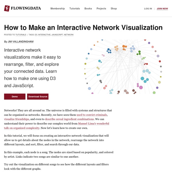
How to Make an Interactive Network Visualization

How to Make an Interactive Network Visualization
Networks! They are all around us. The universe is filled with systems and structures that can be organized as networks. Recently, we have seen them used to convict criminals, visualize friendships, and even to describe cereal ingredient combinations. We can understand their power to describe our complex world from Manuel Lima's wonderful talk on organized complexity. Now let's learn how to create our own. In this tutorial, we will focus on creating an interactive network visualization that will allow us to get details about the nodes in the network, rearrange the network into different layouts, and sort, filter, and search through our data. In this example, each node is a song. Try out the visualization on different songs to see how the different layouts and filters look with the different graphs. Technology This visualization is a JavaScript based web application written using the powerful D3 visualization library. jQuery is also used for some DOM element manipulation. Functions

Perceptual Edge’s 2012 Dashboard Design Competition A few weeks ago I mentioned in this blog that I would soon announce the 2012 Perceptual Edge Dashboard Design Competition. Today, the competition officially begins. This will be the most challenging event of this type to date resulting in the most esteemed award for dashboard design (in my not-so-humble opinion) since I judged a similar competition for the B-Eye-Network back in 2006. A showcase for the current state of expert dashboard design.An opportunity for me to use the submissions to teach best practices by critiquing several of them on this website and in the second edition of the book Information Dashboard Design, which I am currently writing.An opportunity to provide sample dashboard designs that could actually be used to improve the quality of education in schools, for this competition involves the design of a dashboard that could be used by teachers to monitor the performance of their students. Here are the basic facts: Take care,

More on Horizon Charts #look at steps in constructing a horizon plot version #of #do horizon of percent above or below 10 month / 200 day moving average require(lattice) require(latticeExtra) require(quantmod) #since we are focused on the horizon plot, let's just look at one stock tckrs <- "VTI" getSymbols(tckrs, from = "2006-12-31") #do horizon of percent above or below 10 month or 200 day moving average prices <- get(tckrs[1])[,6] #remove comments below if you would like to look at more than one symbol #for (i in 2:length(tckrs)) { # prices <- merge(prices,get(tckrs[i])[,4]) colnames(prices) <- tckrs #set n to desired moving average width; we'll do 200 n=200 ma <- runMean(prices, n = n) colnames(ma) <- paste(tckrs, ".MovAvg", sep = "") xyplot(merge(prices,ma), col = c("black", "red"), lty = c(1,3), screens = 1, scales = list(tck = c(1,0)), xlab = NULL, main = "VTI and 200-day Moving Average") #but for timing system more interested in whether above or below #get percent above or below

Twitter analysis of air pollution in Beijing One of the air pollution detection machine in Beijing (at the American Embassy) is connected to Twitter and tweet about the air quality in real time. By default the machine in Beijing output the 24hr summary PM2.5 air pollution information. What is PM2.5 is define here Next will be to compare the pollution level between different cities such as LA and Beijing. But it turns out the air quality data for California are not so easy to get programmatically. Here is the code I used to produce this analysis:Read more » To leave a comment for the author, please follow the link and comment on his blog: R Chronicle. R-bloggers.com offers daily e-mail updates about R news and tutorials on topics such as: visualization (ggplot2, Boxplots, maps, animation), programming (RStudio, Sweave, LaTeX, SQL, Eclipse, git, hadoop, Web Scraping) statistics (regression, PCA, time series, trading) and more...

Bio7 1.6 for Windows and Linux released! (This article was first published on » R, and kindly contributed to R-bloggers) Finally i released a new version of Bio7 with many improvements and new features. Updated tutorials are available, too. New Features: Bio7 General - Bio7 1.6 is now based on Eclipse 3.8.0. - The option “Always run in background” is now selected by default. - Integrated new Bio7 grid file format to import or export formatted spreadsheet data (for images and fonts, etc.). - Updated the integrated Java Libraries. - Added the application API from “Processing“ (a few programming examples are available in the examples for Bio7 1.6). - The main “Processing” panel can be embedded in the “Custom” view of Bio7 for integration (see screenshot below)). - Updated WorldWind to the latest version. - Integrated more syntax coloring options for the editors of Bio7. - Now fonts for selected syntax types can be adjusted in the Bio7 editors, too. - Added drag and drop text support for the different Bio7 editors. - Fixed some bugs. ImageJ

R training: Visualization, Big Data, Data Mining, and Marketing Analytics Revolution Analytics is hosting several live and online courses over the next couple of months that will be of interest to R users looking to hone their skills: Visualization in R with ggplot2. Garrett Grolemund and Winston Chang instruct how to use the ggplot2 package to make, format, label and adjust graphs using R. Click the links above for full course descriptions and pricing and registration information. To leave a comment for the author, please follow the link and comment on his blog: Revolutions. R-bloggers.com offers daily e-mail updates about R news and tutorials on topics such as: visualization (ggplot2, Boxplots, maps, animation), programming (RStudio, Sweave, LaTeX, SQL, Eclipse, git, hadoop, Web Scraping) statistics (regression, PCA, time series, trading) and more...

Emergent Futures Mapping with Futurescaper Futurescaper is an online tool for making sense of the drivers, trends and forces that will shape the future. As a user interface system, it still needs development. As a tool for analyzing and understanding complex systems, it works very well and does something I have yet to see anything else be able to do. Several people asked me about this after my last post, so here is some more detail. Following the logic of collective intelligence (as part of my my PhD), I broke up the the scenario thinking process into discrete chunks, came up with a system for analyzing and relating them together, and then distilled them into key outputs for helping the scenario development process. Emergent Thematic Maps One of the coolest things about Futurescaper is how it translates simple input into complex analysis, and then back again into simple insights. To demonstrate this, I tested the system using data from an International Futures Forum project on international climate change impacts for UK Foresight.

Gephi Toolkit Tutorial The Charts That Should Accompany All Discussions of Media Bias - James Fallows They are the ones presented this morning by John Sides, drawing on Pew analyses of positive, negative, and neutral press coverage of all Republican candidates and of President Obama through this past year. Here's the trend in coverage of Mitt Romney. The solid line means "positive" stories (in Romney's case, about his business record or primary-election successes); the dotted line means "negative" stories (for Romney, about Bain-related layoffs or campaign-trail gaffes); and "neutral" stories are left out. Main theme: Romney endured slightly-to-somewhat more negative-than-positive coverage in much of 2011, during the intense primary debates and negative ads, but has had much more positive-than-negative coverage through this year. Now, here is comparable coverage of President Obama: Main point: President Obama has always had more negative-than-positive coverage through the past year. Here is how the two charts look when combined: One more chart from Pew:

FF Chartwell: Make cool graphs by simply typing Designed by Travis Kochel, FF Chartwell is a fantastic typeface for creating simple graphs. Driven by the frustration of creating graphs within design applications and inspired by typefaces such as FF Beowolf and FF PicLig, Travis saw an opportunity to take advantage of OpenType technology to simplify the process. FF Chartwell (Pies, Lines, Bars) was originally released in 2011 under the TK Type foundry. In 2012, it was added to the FontFont library with the addition of four new chart styles, the Polar Series as well as Bars Vertical. The Polar Series (Rose, Rings, and Radar) is a set of new designs, which take on the form of more experimental charts. In an effort to make the charts smarter and more dynamic, each design reacts not only to the data entered, but the number of values. FF Chartwell Radar with FF Meta Serif Find out how to use FF Chartwell and download the User Manual.

Useful scripts to plot charts in web pages In this post I want to suggest you a list of some interesting scripts you can use to plot easily charts (line, area, pie, bar...) in your web pages using jQuery, MooTools, Prototype and other JS frameworks.Any suggestion? Please add a comment! 1. Flot Flot is a pure Javascript plotting library for jQuery. It produces graphical plots of arbitrary datasets on-the-fly client-side. 2. JS Charts is a free JavaScript based chart generator that requires little or no coding. 3. 4. 5. The YUI Charts Control visualizes tabular data on a web page in several possible formats including vertical columns, horizontal bars, lines, and pies. 6. ProtoChart is an opensource library using Prototype and Canvas to create good looking charts. 7. EJSChart supports mouse tracking, mouse events, key tracking and events, zooming. 8. fgChartingfgCharting is a nice jQuery plug-in which allows you to plot easly charts. 9. Related Content

What we can learn about charts from The WSJ Guide to Information Graphics | Carl V. Lewis Although geared primarily toward the production of static graphics for print publications, Dona M. Wong’s The Wall Street Journal Guide to Information Graphics (2010) provides a wealth of salient and time-honored tips and guidelines that any student of data visualization would be well-advised to follow. At the heart of Wong’s book is the notion that data integrity trumps all else, and no matter how aesthetically pleasing or visually powerful an information graphic may be, if it doesn’t communicate clear and accurate data to the reader/user, it doesn’t do its job. In the first two chapters of The WSJ Guide, Wong, a former student of data viz extraordinaire Edward Tufte, addresses the topic of charting. From a theoretical standpoint, Wong lays out four principle steps to the charting process: Regarding the finer points of charting, Wong does an excellent job at pointing out the various dos and don’ts of the presentation process.

How to Pick a Chart for Your Dashboard As Dashboard Spy readers know, dashboard chart selection is fraught with peril and the subject of many books and blogs. I’ve written at length about the relative merits of different chart types and stress how the decision of which chart to use should not be made frivolously nor at random. To help you (or perhaps to confound you further), I present the “Chart Chooser” or aka “Chart Selections Thought Starter” from www.extremepresentation.com. Take a look at this screengrab of the graphic and I’ll give you a higher resolution pdf link below the chart. For a larger pdf, use this link: Chart Suggestions – A Thought Starter Here’s an excerpt from the author: Choosing a good chart: Here’s something we came up with to help you consider which chart to use. By the way, the chart chooser is step 7 in the 10-step Extreme Presentation method for designing presentations that drive action.

R, Octave, and Python: A Follow-Up In my recent article posted on May 16, I compared functionalities for R, Octave and Python at a very high level. The article received many insightful comments. I wanted to share what the commenters had to say—this follow-up is to clarify or expand upon some of the points raised. I will focus on two hot discussion points here: Whether Python should be listed as a powerful analytical tool alongside with R, and whether R functions well with big data. Is Python a legitimate data analysis tool? Quite a few readers questioned Python’s position as an analytical tool. “It is a programming language, … roughly akin to Perl, Java, Ruby, and other scripting and rapid application development languages. …” I realized that I need to differentiate “Python by itself” and Python with packages, thanks to comments from Dingles, HuguesT and tb()ne: My passion with Python started with its natural language processing capability when paired with the Natural Language Toolkit (NLTK). Start the analysis:

Related: