
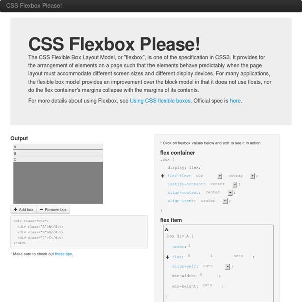
Using CSS flexible boxes - Web developer guide The CSS3 Flexible Box, or flexbox, is a layout mode providing for the arrangement of elements on a page such that the elements behave predictably when the page layout must accommodate different screen sizes and different display devices. For many applications, the flexible box model provides an improvement over the block model in that it does not use floats, nor do the flex container's margins collapse with the margins of its contents. Many designers will find the flexbox model easier to use. Child elements in a flexbox can be laid out in any direction and can have flexible dimensions to adapt to the display space. Positioning child elements is thus much easier, and complex layouts can be achieved more simply and with cleaner code, as the display order of the elements is independent of their order in the source code. Note: Though CSS Flexible Boxes Layout specification is at the Candidate Recommendation stage, not all browsers have implemented it. Flexible boxes concept Flex container or
CSS3 . Info - All you ever needed to know about CSS3 Using CSS animations - Web developer guide CSS animations make it possible to animate transitions from one CSS style configuration to another. Animations consist of two components, a style describing the CSS animation and a set of keyframes that indicate the start and end states of the animation's style, as well as possible intermediate waypoints along the way. There are three key advantages to CSS animations over traditional script-driven animation techniques: They're easy to use for simple animations; you can create them without even having to know JavaScript. Configuring the animation To create a CSS animation sequence, you style the element you want to animate with the animation property or its sub-properties. The sub-properties of the animation property are: animation-delay Configures the delay between the time the element is loaded and the beginning of the animation sequence. animation-direction animation-duration Configures the length of time that an animation should take to complete one cycle. animation-iteration-count Examples
Using CSS flexible boxes | CSS The CSS3 Flexible Box, or flexbox, is a layout mode intended to accommodate different screen sizes and different display devices. For many applications, the flexible box model is easier than the block model since it does not use floats, nor do the flex container's margins collapse with the margins of its contents. Many designers find the flexboxes easier to use than boxes. Popular layouts can thus be achieved more simply and with cleaner code. Flexible Boxes Concept The defining aspect of the flex layout is the ability to alter its items' width and/or height to best fit in the available space on any display device. Block layout is vertically-biased; inline layout is horizontally-biased. Flexible Boxes Vocabulary Instead of talking about horizontal (inline) and vertical (block), flexible boxes use the terms main axis and cross axis. Flex container The parent element in which flex items are contained. Flex item Each child of a flex container becomes a flex item. Axes Directions Lines Dimensions
CSS3 Multi-column Layout Consectetur adipiscing elit. Nunc libero magna, venenatis quis aliquet et, rutrum in augue. Donec vel tempor dolor. Donec volutpat fringilla porta. Suspendisse non nulla tortor. Quisque commodo ornare mi, sit amet aliquet justo bibendum non. Code GitHub - vadimyer/Ecligrid: Flexible Mobile First Grid System Based on Flexbox. CSS you can get excited about in 2015 CSS is a constantly evolving language, and as the new year begins it’s a great time to take a look at some of the emerging features that we can start to experiment with. In this article I’ll take a look at some newer modules and individual CSS features that are gaining browser support. Not all of these are features you’ll be able to use in production immediately, and some are only available behind experimental flags. However you’ll find plenty of things here that you can begin to play with — even if only during a prototyping stage of development. CSS Selectors level 4 The level 3 selectors specification is well implemented in browsers and brought us useful selectors such as nth-child. The negation pseudo-class :not The negation pseudo-class selector :not appears in level 3 but gets an upgrade in level 4. In level 4 of the specification you can pass in a comma separated list of selectors. The relational pseudo-class :has The matches-any pseudo-class :matches CSS Blend Modes Using mix-blend-mode
Rundown of Handling Flexible Media When you take the responsive web design route, part of the deal is fluid grids. That is, container elements set in percentage widths. Just one example: an <article> that holds a blog post might be 320px wide on a small screen device and 690px wide on some large screen. Text can be resized and will flow nicely to fill a container. That's not too hard. But media - images, video players, and audio players - demand a bit more attention (e.g. a video that sticks off the edge of the screen == bad). Flexible Images If you're comfortable with IE 7 and up support. If you are caring about IE 7 support (I hope not, but I understand there are scenarios in which you must), use this to make sure the images survive the scale-down: See here for more on that. If you need to care about IE 6 (again...) this Ethan Marcotte article has a JavaScript solution. A shift in thinking There was a time in which resizing images was quite the taboo. However the bandwidth thing is still a (big) issue. Flexible Video
How to Use steps() in CSS Animations I am guessing that many of you have found steps() to be confusing when using it in CSS animations. I wasn’t sure how or why to use it at first and searching seems to produce two main examples: A typing demo by Lea Verou and an animated sprite sheet by Simurai. These examples are genius and really helped me begin to understand this special little timing function, but they are such prominent references that it was hard to imagine how to use steps() outside of the context of each demo. SEE ALSO: Creating a Scalable SVG Infographic So, I really got into steps() and built a few animated demos to help those that might be as confused as I was in tackling this elusive beast. Intro to Steps steps() is a timing function that allows us to break an animation or transition into segments, rather than one continuous transition from one state to another. steps(<number_of_steps>, <direction>) The second parameter defines the point at which the action declared in our @keyframes will occur. Here’s a visual:
GitHub - philipwalton/flexbugs: A community-curated list of flexbox issues and cross-browser workarounds for them. Rendera - Online HTML5 Editor Initializr: With Great Templates Comes Great Responsivity! | @verekia's blog Today I'm proud to announce that a "Responsive template" is now available on Initializr! It will help you dealing with all the various devices used to display your site. Mobiles, tablets, netbooks, laptops, desktop monitors, HUGE desktop monitors... About responsive web design For those who have been living in a cave for the last few months (understand: for those who have a life and don’t spend days reading tweets and blogs) you probably need a short update about what a "responsive" design is. To design a responsive layout, we have to forget about the usual static 960px width layouts and go fluid with percentage widths and media queries. A fluid layout with percentage widths The first thing our page needs is a "fluid" layout. Mobile-first approach media queries Media queries are a cool way to specify different styles depending on the device used (by aiming particular screen resolutions or orientations for example). The mobile view The intermediate view The wide view The maximum-width view