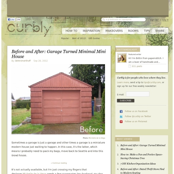
Before and After: Garage Turned Minimal Mini House
Sometimes a garage is just a garage and other times a garage is a miniature modern house just waiting to happen. In this case, it's the latter, which means I probably need to pack my bags, move back to Seattle and into this (now) house. It's not actually available, but I'm just crossing my fingers that designer Michelle de la Vega needs a few roommates (my husband, my dog, and I) in her fully functional 250 square foot space. We can all fit in there, right? In all seriousness though, this remodel is really incredible. Michelle custom built most of the furniture and salvaged old fixtures for the project as well. For more photos of this remodel, click here. Tagged : before and after, Makeover, remodel Design Style : minimalist
9 hours (9h) Designer Capsule Hotel Review - Kyoto, Japan
I’ve been lucky enough to stay at some very nice hotels over the past couple of years but in Japan I was on a tight budget and determined to try something a little different. Originally created for businessmen who worked too late to catch the last train home, capsule hotels (カプセルホテル) have developed as an economical alternative to normal hotels in a country where space comes at a premium. Consisting of a large number of extremely small coffin-like “rooms” big enough for a single person to sleep in, Japan’s first capsule hotel made its appearance in Osaka in 1979. They have a bit of a grim reputation for their chicken-coop approach to habitation but in 2009 Tokyo-based Cubic Corp decided to take a fresh approach to this uniquely Japanese mode of accommodation. Upon arrival the first thing you do is place your shoes in a numbered locker and give the key to reception while checking-in; I doubt they get many people running off without paying the bill! Map Data Map data ©2014 Google, ZENRIN Map
A Cathedral Made from 55,000 LED Lights
The Luminarie De Cagna is an imposing cathedral-like structure that was recently on display at the 2012 Light Festival in Ghent, Belgium. The festival was host to almost 30 exhibitions including plenty of 3D projection mapping, fields of luminous flowers, and a glowing phone booth aquarium, however with 55,000 LEDs and towering 28 meters high the Luminarie De Cagna seems to have stolen the show. ( via stijn coppens, sacha vanhecke, sector271)
20 design landmarks everyone should see before they die
When looking for design inspiration, it’s common to look at other people’s work. You can find inspiration in anything from pencil drawings and sketches through to vintage posters. But sometimes it’s good to mix things up a bit. Have you ever been hit with a bolt of creative inspiration just by walking down the street? In this article we pay tribute to 27 of the most beautiful, unique, weird and wonderful design-related landmarks around the world. 01. Location: Paris Designed by Italian architects Renzo Piano and Gianfranco Franchini, and British architect Richard Rogers, the Pompidou Centre, with its exposed plumbing, ducting and wiring setting it well apart from the more traditional and conservative surrounding buildings, wasn't initially a hit with the people of Paris. 02. Location: Islamabad, Pakistan When it was completed in 1986, Islamabad's Faisal Mosque was the largest mosque in the world and remained so until 1993. 03. Location: Rotterdam, Netherlands 04. 05. 06. 07. 08. 09. 10.
Related:
Related:


