Edward Tufte’s “Slopegraphs”
After you read this post, you’ll probably want to check out the follow-up, A Slopegraph Update. Back in 2004, Edward Tufte defined and developed the concept of a “sparkline”. Odds are good that — if you’re reading this — you’re familiar with them and how popular they’ve become. What’s interesting is that over 20 years before sparklines came on the scene, Tufte developed a different type of data visualization that didn’t fare nearly as well. It’s curious that it hasn’t become more popular, as the chart type is quite elegant and aligns with all of Tufte’s best practices for data visualization, and was created by the master of information design. In this post, we’re going to look at slopegraphs — what they are, how they’re made, why they haven’t seen a massive uptake so far, and why I think they’re about to become much more popular in the near future. The Table-Graphic In his 1983 book The Visual Display of Quantitative Information, Tufte displayed a new type of data graphic. Tufte, Edward.
Good typography
Building Books with CSS3
While historically, it’s been difficult at best to create print-quality PDF books from markup alone, CSS3 now brings the Paged Media Module, which targets print book formatting. “Paged” media exists as finite pages, like books and magazines, rather than as long scrolling stretches of text, like most websites. CSS3 allows us to style text, divide it into book pages, and set the page structure as a whole. You can dictate the size of the book, header and footer content, how to display cross references and tables of contents, whether to add guides and bleeds for commercial printing companies, and more. With a single CSS stylesheet, publishers can take XHTML source content and turn it into a laid-out, print-ready PDF. You can take your XHTML source, bypass desktop page layout software like Adobe InDesign, and package it as an ePub file. XML, XSL, XHTML, and PDF processors#section1 Article Continues Below Cost is a factor in adopting this kind of workflow. Building a book#section2 We get this:
A history and some revival fonts < The Fell Types
The Fell Types took their name from John Fell, a Bishop of Oxford in the seventeenth-century. Not only he created an unique collection of printing types but he started one of the most important adventures in the history of typography. You will find here a non-exhaustive history and a modern digitization of some of them.
8 Simple Ways to Improve Typography In Your Designs - Smashing Magazine
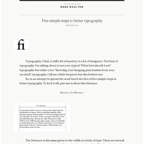
Advertisement Many people, designers included, think that typography consists of only selecting a typeface, choosing a font size and whether it should be regular or bold. For most people it ends there. These details give the designer total control, allowing them to create beautiful and consistent typography in their designs. 1. The measure is the length of a line of type. A simple way to calculate the measure is to use Robert Bringhurst’s method which multiples the type size by 30. I’m using px because it makes the math easier but this also works with em’s. 2. Leading is the space between the lines of type in a body of copy that plays a big role in readability. Many factors affect leading: typeface, type size, weight, case, measure, wordspacing, etc. This takes some finessing to get the right spacing but here is an example of what the code would look like: 3. Hang quotes in the margin of the body of text. This is achieved very easily with CSS using the blockquote element: 4. 5. 6. 7. 8.
The Ministry of Type
50 Inspiring Typographic Artists … and me | Moonsail design | Branding, graphic design, typography and web design
I put the call out on Facebook and Twitter recently to see which typographers and calligraphers were inspiring people at the moment. The results were interesting, because very few of them were “typographers” in the true sense of the word, in that, they don’t “arrange typefaces for print”. What they do, is actually use typographic forms in an artistic, or “illustrative” way. In fact, I was interested to see there are very few recognisable typefaces amongst the works of these artists at all, most of them preferring to hand draw their own letterforms from scratch. I’m sure lots of talented people have been missed out, so feel free to add your inspirations in the comments section down below—I’m sure there will be a part 2 to this list pretty soon. Please be aware that the copyright of all these amazing works belong to the artists who made them. 1. Alex is a widely respected typographer, illustrator and designer from Spain with a very impressive list of clients. 2. 3. 4. 5. 6. 7. 8. 9. 10.
Web Design is 95% Typography
by Oliver Reichenstein 95% of the information on the web is written language. It is only logical to say that a web designer should get good training in the main discipline of shaping written information, in other words: Typography. Back in 1969, Emil Ruder, a famous Swiss typographer, wrote on behalf of his contemporary print materials what we could easily say about our contemporary websites: Today we are inundated with such an immense flood of printed matter that the value of the individual work has depreciated, for our harassed contemporaries simply cannot take everything that is printed today. With some imagination (replace print with online) this sounds like the job description of an information designer. Macro-typography (overall text-structure) in contrast to micro typography (detailed aspects of type and spacing) covers many aspects of what we nowadays call “information design”. Typography has one plain duty before it and that is to convey information in writing. Too few fonts?
Sex Drugs & Helvetica 10 alternatives to Helvetica
The League of Moveable Type
Vox-ATypI classification
In typography, the Vox-ATypI classification makes it possible to classify typefaces in eleven general classes. Devised by Maximilien Vox in 1954, it was adopted in 1962 by the Association Typographique Internationale (ATypI) and in 1967 as a British Standard, as British Standards Classification of Typefaces (BS 2961:1967), which is a very basic interpretation of the earlier Vox-ATypI classification. Originally a ten-part classification, Vox revised his original proposal within months to a more compact nine-part scheme. This classification tends to group typefaces according to their main characteristics, often typical of a particular century (15th, 16th, 17th, 18th, 19th, 20th century), based on a number of formal criteria: downstroke and upstroke, forms of serifs, stroke axis, x-height, etc. Classicals[edit] The classicals can be broken down into humanist, Garald and transitional categories, and are characterized by triangular serifs, oblique axis and low stroke contrast. Humanist[edit]
Typography Daily