
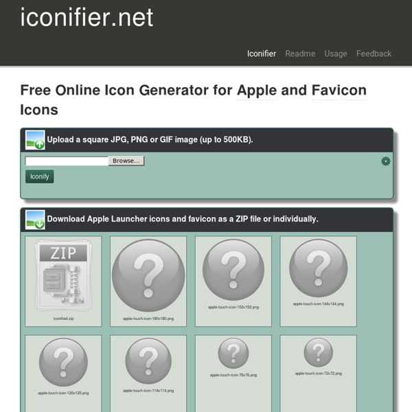
Jonathan T. Neal | Understand the Favicon When Alec Rust asked the HTML5 Boilerplate project to switch to a HiDPI favicon, I realized how little I knew about favorite icons, touch icons, and tile icons. When I decided to dive in a little deeper, things got interesting. The classic favicon.ico is a 16×16 ICO file, often served in either 16-color or 24bit alpha-transparency format. More recently, favicons have been served as 32×32, which is appropriately scaled down in all major and popular-legacy browsers. The rel attribute of a favicon is a product of evolution. The type attribute of a favicon is about as useful as the type attribute of a <script>. Good news, everyone! Bad news, everyone! This really depresses me, because Chrome, Firefox, Opera 7+, and Safari 4+ all accept the PNG favicon, but Chrome and Safari will opt to use the ICO favicon when both are presented, regardless of the order in which they are declared. How do these PNG-favicon-compatible browsers determine which favicon should be used? One. You. Related Articles
Responsive Image Breakpoints Generator by Cloudinary Créer une police d’icônes facilement à partir d’illustrations vectorielles Les polices d'icônes ou "font-icon" popularisées depuis Bootstrap sont de plus en plus utilisées sur le web. Certains services proposent de piocher des icônes dans différents packs pour se créer sa propre "police". Dans ce petit tutoriel nous verrons comment, grâce au service en ligne IcoMoon, il est facile de se créer sa propre police d'icônes à partir d'illustrations et fichiers vectoriels. Une fonte-icône est tout simplement une police d’écriture dont on aura remplacé certains caractères par des glyphes représentant les icônes que l’on veut utiliser. Très utiles dans le design d’interface lorsque l’on a besoin d’une simple petite icône monochrome, elles ont la flexibilité d’une police d’écriture : vectorielles, il est très facile d’en changer la taille et la couleur en CSS, voire d’y ajouter de l’ombrage avec text-shadow. Voir une petite démonstration en ligne : Icon Font are Awesome. ou... Exporter mes icônes au format SVG Quelques conseils sur les icônes pour un résultat optimal :
Designer's guide to DPI DPI or Dots Per Inch is a measure of spatial dot density initially used in print. It's the number of ink drops your printer can put in an inch. The more dots per inch, the sharper your image. This concept is applies to computer screens under the name PPI for Pixels Per Inch. Same principle: It counts the number of pixels your screen displays per inch. The name DPI is also used in screens. For a concrete and relatable example, Windows computers had an initial PPI of 96. Asking someone what the size of a pixel is is a good way to confuse him or her because it’s a trick question. Here’s an applied example: A Mac Cinema Display 27” has a PPI of 109, which means that it displays 109 pixels per inch of screen. As you might have noticed in my explanations, “Resolution” stands for PPI, in this case “109” but not “2560x1440”, like you might commonly see everywhere on the web. “2560x1440” is the pixel count, as referred in the first paragraph as “Pixel screen size”. 4K starts at 3840x2160 pixels.
40 nouveaux packs d'icônes flat design à découvrir Le flat design connaît un succès fulgurant au sein de la communauté du Web design. Le flat n'en est qu'à ses débuts et aucun indice ne préfigure un abandon soudain de ce courant faisant la part belle aux couleurs vives, à la typographie et à l’espace. Dans cet article, j’ai rassemblé une importante collection d’icônes flat pour la conception de vos futures interfaces graphiques. De plus en plus d’applications Web adoptent ce concept. L’emploi d’icônes originales, les variations de couleurs, l’utilisation harmonieuse de photographies et de fontes sont les seuls moyens à notre disposition pour sortir du lot. Un designer se doit d’avoir un certain nombre d’astuces pour effectuer en temps et en heures son travail. Pas la peine de culpabiliser, cette technique est très utile lorsqu’il s’agit de prototyper les premiers intentions graphiques. Icônes flat designées par Mike Clarke Icônes social media par Michael Reimer Icônes iOS par Miguelcm Icônes (PSD) par Pierre Borodin Icône horloge par Diego
Material Design Color Palette Generator - Material Palette material palette More Material Design chevron_right Palette preview Full Palette colors below Your Palette CSS SASS LESS SVG XML PNG POLYMER DOWNLOAD TWEET Dark primary color #ffa000 Primary color #ffc107 Light primary color #ffecb3 Text / Icons #212121 Accent color #ff5252 Primary text #212121 Secondary text #727272 Divider color #B6B6B6 A Minimalistic Look at Man’s Best Friend – Illustrations by Josh Brill Article by Hyathiz I love my dogs, reading books, and taking great pictures with my battered but still functional digital camera. Taking great pictures with a high end camera is almost too easy, producing fantastic images with an outdated one is an accomplishment by itself. By Hyathiz on February 17, 2013, in Illustrations Tags: Addo Novo, art, design, display, dog, Josh Brill, light, minimalist, New Media Art Director, New Media Design, portraits, prints, words Josh Brill graduated from Maine College of Art with a degree in New Media Design. You can take a look at more of his work here. Do you want more visual fun? You might also like
10 Best tools and resources for web and design professionals in 2015 Tools and resources for web and design professionals are available in abundance these days, unfortunately, not all those available are as useful as we’d like them to be. In order to help you weed out some of the tools that aren’t worth your time, we’ve compiled a list of what we think are the best tools and resources available right now. 1. Stamplia If you’re looking for a place to sell your email templates, then you’re looking for Stamplia. 2. Advertisement Created for UX people, designers, copywriters, project managers and even ad agencies, Notism will offer you a smoother communication path between you and your clients. 3. One of the most important contributing factors to the success of an eCommerce website is a quick and effective checkout process. 4. If you’re looking to create your very own Pinterest clone, Pintastic is the perfect software for you. 5. actiPLANS 6. IconBeast Pro offers some of the best iOS Tab Bar and Toolbar Icons available anywhere. 7. 8. 9. 10. actiTIME
Cikonss | Pure CSS Responsive Icons