
Infographies: 5 outils à découvrir Récemment, j’ai fait quelques recherches pour trouver un outil me permettant de réaliser facilement une infographie. Au fil de mes recherches, 5 outils ont retenu mon attention. Cet article vise à vous présenter sommairement chacun de ces 5 outils: Easel.ly, Venngage, Piktochart, Infogr.am, ainsi que 5 "templates" d’infographies élaborées dans PowerPoint. #1 : Easel.ly J’ai fait quelques tests avec plusieurs outils d’infographie afin de représenter mon offre de services de formations en 2014. C’est donc avec Easel.ly que j’ai dessiné l’infographie suivante, présentant mon offre de formations publiques en 2014. #2: Venngage J’ai beaucoup aimé Venngage mais je l’ai découvert un peu trop tard! #3: Piktochart Piktochart ressemble énormément à Easel.ly. #4: Infogr.am Dans Infogr.am, outre les possibilités de création au niveau des infographies, j’ai particulièrement aimé l’aspect convivial pour créer de jolis graphiques, comme le tachymètre suivant: #5 : Powerpoint Vous aimez cet article? Like this:
Comment créer une infographie efficace et viralisable E-Marketing – 18 juin 2014 Retrouvez l’infographie publiée sur E-marketing.fr, réalisée par l’agence d’infographie 1min30, vous trouverez tous les conseils pour acquérir « les 7 super pouvoirs d’une infographie qui claque ». Partant du principe que la vie est bien trop courte pour être gaspillée en pensums, des entreprises proposent de nouveaux services à leurs clients pour les remplacer dans ces tâches fastidieuses. Pour innover en marketing, rien de plus simple: mettez-vous dans des conditions telles que cela devienne naturel. Le premier Observatoire du parcours d’achat (Solocal Network – GroupM) met en avant 5 types de ropo caractérisés par 5 réalités d’achat distinctes. Le jeu-concours promotionnel, alors qu’il est soumis à de nouvelles restrictions, se réinvente grâce à des mécaniques innovantes, telles que le « shake and win » et le « scratch and win ». Comment utilisez-vous le reciblage publicitaire ? Posté par Gabriel Dabi-Schwebel
Instructional Design Tips Instructional Design Tips Finding Inspiration for eLearning Here are some great ways to find inspiration for your eLearning: Find a Role Model You can’t take a shot at something without something to aim for. Is there a creative or intellectual person you really look up to? Think how your hero might solve the problem and try... read more 5 eLearning Examples That Will Get You Thinking Outside the Box A good way to get unstuck from developing boring courses is to analyze good eLearning examples. 9 Vital Things You Are Forgetting Before Your eLearning Course Goes Live Nothing is more frustrating than sending off your finished eLearning course and wishing you could have done more to make the course even better. 5 Ways to Kill an eLearning Course We at eLearning Brothers do our best to teach you the best way of doing things. 5 Ways to Create Motivation Using eLearning Scenarios Scenarios are the proving ground of eLearning. How to Target the Right Generation in eLearning Guest post by Marie S.
Créer des infographies en ligne : outils et bonnes pratiques La visualisation des données offre aux professionnels une manière innovante de communiquer des informations. Éditeurs web et journalistes, services de communication d'entreprise, spécialistes du marketing -et plus généralement les professionnels amenés à faire des présentations publiques- recourent aux infographies pour mettre en valeur l'information, la vulgariser et la contextualiser. Si la création d'infographie est avant tout un métier, elle est aujourd'hui également accessible aux non-initiés. Bonnes pratiques Cerner l'objectif d'une infographie : traduire simplement des données complexes, pour comparer ou mettre en valeur des informations, dégager une tendance/évolution, dresser un bilan, etc. Enfin, penser à s'appuyer sur des outils existants : comme Microsoft Excel, qui permet de générer de manière très soignée une grande variété de diagrammes qui pourront ensuite être intégrés à l'infographie. Les grands types de diagrammes Chronologie Camemberts Graphes à barres comparées Tree maps
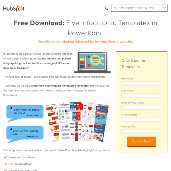
20+ Tools to Create Your Own Infographics A picture is worth a thousand words – based on this, infographics would carry hundreds of thousands of words, yet if you let a reader choose between a full-length 1000-word article and an infographic that needs a few scroll-downs, they’d probably prefer absorbing information straight from the infographic. What’s not to like? Colored charts and illustrations deliver connections better than tables and figures and as users spend time looking back and forth the full infographic, they stay on the site longer. While not everyone can make infographics from scratch, there are tools available on the Web that will help you create your very own infographics. Read Also: The Infographic Revolution: Where Do We Go From Here? What About Me? “What About Me?” Vizualize.me Vizualize.me allows you to create an online resume format that is beautiful, relevant and fun, all with just one click. Piktochart easel.ly Visual.ly Infogr.am Many Eyes Venngage iCharts Dipity Timeline JS StatSilk InFoto Free Photo Stats More Tools
eLearning Example: Captivate Bike Course Pages Navigation Menu Awesome eLearning Templates and eLearning Custom Development Categories Navigation Menu Home » Adobe Captivate Resources » eLearning Example: Captivate Bike Course eLearning Example: Captivate Bike Course Posted by Brother Shawn on Jul 6, 2012 in Adobe Captivate Resources, eLearning, Example Course, Graphic Design Resources, Portfolio, Resources | 0 comments Here is an example eLearning course developed to demonstrate our eLearning Templates in action. eLearning Template Products used: Click on the image below to view the example Captivate 6 course. Get Shareaholic for Firefox Leave a Comment Your email address will not be published. You may use these HTML tags and attributes: <a href="" title=""><abbr title=""><acronym title=""><b><blockquote cite=""><cite><code><del datetime=""><em><i><q cite=""><strike><strong> elearning templates Featured Testimonials "The people cut outs have been a great hit in our team. Featured Products and Services eLearning Templates Software Templates
5 applications pour créer sa propre infographie Esthétiques, claires, efficaces et surtout très virales, les infographies en tous genres envahissent la toile. Très sollicitées pour mettre en avant les chiffres clefs d’une études, les principales tendances d’un marché, elles sont utilisées par un panel d’acteurs : agences, cabinet d’études, blogueurs, médias, etc. Surfant sur cette tendance, plusieurs startups ont mis au point des web applications permettant à n’importe quel internaute de créer tout seul une infographie en ligne, en y insérant ses propres données. Pour l’heure, une majorité de ces services (en anglais) sont encore en version bêta et donc perfectibles. A moyen terme, ces plateformes pourraient néanmoins venir concurrencer les métiers de web designers ou tout au moins réinventer certaines collaborations. Tour d’horizon des 5 principaux outils actuellement disponibles. 1. En mars dernier, la plateforme de datavisualisation Visual.ly a lancé une nouvelle fonctionnalité baptisée Visual.ly Create. 2. 3. 4. 5.
How to make an infographic online: five essential free tools Given the popularity of infographics, you’d be wise to consider using them to help achieve your content marketing goals. They can be great for social sharing, blog fodder and inbound links. The last time I created an infographic I used – wait for it - Microsoft Excel. Thankfully there are now some far better options, and they're surprisingly easy to use. I have compiled five of online tools that will help you to create infographics. They’re all free, though some require registration (or to connect your Twitter or Facebook account) and most have the upgrade options. Hold on a moment! Before you begin, consider that many infographics are often – to quote Econsultancy Research Director Linus Gregoriadis – “high on graphics and low on information”. As such it is important to map out your story / message / goals before starting to work on the design itself. There’s a great post on the LEWIS PR blog that explains how to optimise an infographic, based around three key questions, which are: 1. 2. 3.