
Google Fonts CSS longshade Icon Google Fonts CSS longshade Icon LukyVj Related: /* Google Font flat longshade Icon in pure css Create with love by @LukyVj Inspired by so much people an works over the internet. @import url( body { -webkit-font-smoothing: antialiased; background: #333; overflow: hidden; .container { width: 245px; margin: 180px auto; div.icon { /*transform*/ -webkit-transform: scale(1); -moz-transform: scale(1); -ms-transform: scale(1); -o-transform: scale(1); transform: scale(1); float: left; height: 245px; margin: 5px; display: block; background: rgb(150, 150, 150); font-family: "Marck Script", sans-serif; text-align:center; font-size: 13em; WordPress Themes for $0.48 - 100% Satisfaction Guaranteed Or Your Money Back!
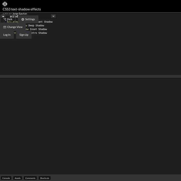
7 Great CSS based text effects using the text-shadow property - Midwinter Duncan Grant Time for a bit of fun with CSS!The following examples are all created using live text and the CSS text-shadow property. Apart from the Letterpress effect, all of the following examples make use of multiple shadows, and as such will only work on the following browsers. Firefox 3.1+ (Mac/Win/Lin)Safari 4+ (Mac/Win)Chrome (Mac/Win)Opera 9.5+ (Mac/Win/Lin) Unfortunately Internet Explorer (6/7/8) has no support for the text-shadow property. If you're not familiar with the text-shadow property here's a example and explanation: It breaks down like this: create a shadow below the h1 and offset it -2px horizontally, 2px vertically, blur it by 3px, and colour it pink. 1 Classic Letterpress Effect This is a very simple effect to achieve. 2 Cloudy Text Effect This effect relies on multiple text shadows and rgba colours. Basically, that's white in rgb, (255,255,255) at 50% transparency (0.5). 3 Embossed Text Effect To Create the Embossed look, I used 2 diagonally offset shadows. 4 City Lights Text Conclusion
HTML5, CSS3, JS Demos, Creations and Experiments | CSSDeck