
Where Are All The Women In Digital Media? “I walked into the cocktail reception and I swore I was at a bachelor party.” Elaine Kunda, CEO of The Grindstone’s parent company, B5 Media, said this in her description of the cocktail party for the recent Annual Digital Summit Conference hosted by Digiday, the media company and community for professionals who work in the digital media, marketing and advertising industry. Elaine said the conference, which was held in Bonita Springs, Fla., was overloaded with males. At the cocktail reception she said there seemed to be only 15 women mixed in with the 100-plus male attendees. Out of 38 speakers, Elaine was also the only female to have her photo appear in the speaker list for the three-day conference. This unbalanced attendee ratio led us to wonder, where are all the women in digital media? Women were absolutely not excluded from the event, according to the Digiday team. Despite the success of the panel, there were few other females on the stage – or the audience.
How to Create a Gritty Portfolio Layout – Tutorial How to Create a Gritty Portfolio Layout – Tutorial Already a member? In this tutorial, I will show you how to create a gritty portfolio layout. This is the final result. To start this tutorial you will need to create a new document. Create a new layer, and with brush tool ( with a big round brush tip ) add a single point in the middle of the layout. Change the blending mode for this layer to Overlay. In the middle of your portfolio layout you can create a shape with Rounded Rectangle Tool. Right under this shape i will create a new shape. On the footer of this portfolio layout i will create a new shape. here i will add some text with our copyright text, and if you want you can add also some social bookmarking icons. I will return to the first shape created in this tutorial, and i will go to Filter > Noise > Add noise. On top of this shape i will draw some white highlights. I will use Shape tool to create another area on the bottom of the layout. Now i will create the notebook spiral.
What Works Better: Positive Reinforcement or Negative Reinforcement? A couple of weeks ago I found myself in the middle of a heated debate with a small group of women leaders at a networking reception. No, the debate wasn’t about who should play Christian in the upcoming 50 Shades of Grey movie (although the subject was touched on). Rather, the discussion focused around the best way to motivate teams through feedback. Half the party was all about positive reinforcement while the rest swore up and down that negative reinforcement got the best results. When I first started managing a team, giving feedback was one of the toughest lessons to learn. As a manager, your responsibility is to establish a path for performance growth and improvement for each member of your team. Why Are Both Types of Feedback Important? If you had asked me this question three years ago, I would have been a major cheerleader for positive feedback. Providing negative feedback is an essential tool for growth and development. The Right Feedback Ratio A Symbiotic Relationship
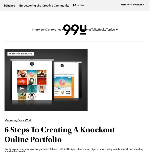
Cut the Clutter, How to Create a Professional Work Portfolio Creating a personal identity seems to be one of the most difficult tasks for a designer. For some reason, it is infinitely easier determining how others should project themselves. Unfortunately, this is no excuse to have an outdated, unorganized, or overall weak portfolio. Find out how to improve your portfolio at the jump. We are in a unique situation with current technology allowing us to advertise ourselves and our work to potentially anyone in the world. It would be a shame if we didn't take advantage of resources like Twitter, Facebook, Dribbble, LinkedIn, a personal website, Pinterest (Yes, I said Pinterest. You are Your Portfolio With current technology, your life is a lot more transparent. Update Your Portfolio Regularly Keep all your profiles up to date and consistent. You Will Always be Judged by Your Weakest Piece This simple bit of advice goes a long way. Include the Type of Projects you Wish to Receive Let Your Work be the Hero
On The Job Get VIP invites to recruiting events with popular employers! Sign up here. The Secret to Nailing That Interview and Getting the Job You Want Read » How to Pursue Your Passion Without Going Broke Read » How to Turn Your Big Idea Into a Profitable Business Read » Buck the Work-Life Balance Myth and Do This Instead Read » Syndication and Content Partners Brazen Life has partnerships with AOL Jobs, Business Insider, Lifehacker, Black Enterprise, Huffington Post, Levo League, Idealist, Media Jobs Daily, TalentCulture, Professional Women of Color Network, Tribune Media Services, Ragan and Trove. Click here to learn more about syndication opportunities. Spice Up Your Inbox! Get invites to exclusive career events, networking opportunities and top career advice. Archive On The Job Archives - Brazen Life How to Give Your Boss Constructive Criticism and Still Keep Your Job By Nicolas Gremion | 0 Comments | April 18, 2014 Telling off your boss isn’t necessarily a bad thing, as long as you have the right approach.
1stDelicious: Create A Simple Clean Portfolio Layout In Photoshop Hello there everybody and welcome to another PSD web design tutorial here at 1stwebdesigner! In this tutorial you will learn how to create a Simple Clean Portfolio layout in Photoshop. A few techniques discussed in this tutorial will include the use of proper spacing, typography and colors. We’ll be using really light color scheme and design is meant to be really minimal for portfolio type of website. Let’s get started – I hope you will make out together with me until successful finish together ! By the way in few days you’ll see also PSD TO HTML tutorial to this design – so keep up, design this template so you can immediately code it into live design!! *Updated – here is Detailed PSD to HTML tutorial Resources you will need to complete this tutorial: Here is what we will making, click on image for full preview: Step1: Working with Site Structure Before we get started download first 960grid system for easy Guideline creation. Open 960_download\templates\photoshop\960_grid_12_col.psd Drop Shadow
Job Tips: Dealing With a Personal Crisis at Work By Noël Rozny Web Editor and Content Manager As much as we’d like it to be, life isn’t always perfect. People we love and care about get sick, our relationships can become strained, our kids misbehave, and our finances take a hit. Sometimes these personal crises are under our own control, but oftentimes they are not, which makes them especially hard to deal with when you have to get up and go to work every day. If you’re going through a time of personal crises (and let’s face it, we all have them), there may be times when you have no idea how to get through the work day. Don’t React There’s nothing worse than getting the dreaded “bad news” phone call in the middle of the work day. If you do need to leave, make sure to notify HR and your boss of the issue. Tell Someone With so much pressure to “keep it professional,” a lot of us shy away from talking about personal issues at work.
Paper portfolios: 5 beautiful examples to inspire you | Portfolios Sadly, paper portfolios appear to be a bit of a rarity these days. But, thankfully, there are many designers who still recognise the power of print. Done properly, a handheld, printed portfolio can really make your work stand out and leave a long lasting impression. Subscription offer Therefore, we scoured the web to find some brilliant examples of paper portfolios. Italian graphic design studio Happycentro was behind this beautiful, handcrafted portfolio for modular merchandising systems company ALU. The result was this gorgeous book containing illustrations and typography made with paper cuttings. 02. US-based graphic designer Nathan Hinz developed this beautiful, handheld portfolio back in the days before everybody went online. Hinz comments on Behance: "It allowed for a quick overview and served as a rich presentation in one book. 03. Dyla Rosli is an intern graphic designer based in Kuala Lumpur, Malaysia. 04. 05. Another day is the graphic design studio of Yorick de Vries.
7 Signs Your Interview Went Well - On Careers (usnews.com) So you've had your job interview, and, as you wait to hear from the company, you keep replaying the interview in your mind and wondering how you did. But is there any way to know until you get an offer or rejection? No signs are 100 percent foolproof, but here are some indicators that the interview went well: 1. Related News How to Follow Up After an InterviewHow to Negotiate Your Way to Job SecurityUsing Facebook to Fire Up Your Career 2. 3. 4. 5. 6. 7. Again, none of these are foolproof. Alison Green is chief of staff for a medium-sized nonprofit where she oversees day-to-day management of the staff as well as hiring, firing, and staff development.