
Les bordures en CSS3 Nous verrons ici comment créer des bordures aux coins arrondis (border-radius), des bordures à partir d'image (border-image), des bordures aux couleurs dégradées (border-color) et enfin, des ombres portées aux boîtes (box-shadow). Et un petit bonus que je vous laisse découvrir par vous-même ! II-A. Généralités▲ Jusqu'à présent pour réaliser des boîtes aux coins arrondis, nous devions utiliser une ou plusieurs images à appliquer en arrière-plan dans des <div> imbriqués ou des tableaux à neuf cellules. Nous passions plus de temps à découper nos éléments en un coin en haut à gauche, puis à droite, recoller les morceaux parce qu'on a donné un coup de ciseau de travers… Eh bien tout ceci est terminé ! Avec le CSS3, il nous est possible de faire un angle arrondi via la propriété border-radius. Voici sa syntaxe : <valeur>{1,4} / <valeur>{1,4} Sa compatibilité : IE9+, Firefox 4+, Chrome, Safari 5+ et Opera 10.50+. Vous voyez, rien de plus simple. Heu...m'sieur l'arbitre ! II-B. II-C. III-A. III-B.
annyang! Easily add speech recognition to your site Go ahead, try it… Say "Hello!" Annyang! Let's try something more interesting… Say "Show me cute kittens!" Say "Show me Arches National Park!" Now go wild. That's cool, but in the real world it's not all kittens and hello world. No problem, say "Show TPS report" How did you do that? Simple. What about more complicated commands? annyang understands commands with named variables, splats, and optional words. Use named variables for one word arguments in your command. Use splats to capture multi-word text at the end of your command (greedy). Use optional words or phrases to define a part of the command as optional. What about browser support? annyang plays nicely with all browsers, progressively enhancing browsers that support SpeechRecognition, while leaving users with older browsers unaffected. It looks like your browser doesn't support speech recognition. Please visit in a desktop browser like Chrome.
Getting started Once you get the code of jVectorMap from the download page and one of the map from the maps page you can start experimenting with various features it provides. First of all let's create just a simple map with a world map with default parameters. Create an html containing the following: all JavaScript and CSS resources necessary to render the world map, initialization code, which tells the browser where to put the map and what parameters to use to render it, <div> element which will be a container for the map (note that map will be fitted according to the size of the container, that's why the container should have some non-zero width and height). <! If you open created page in a web-browser you should see something similar to this: Now when you created simple test map you can provide additional parameters to change the look and behavior of the map.
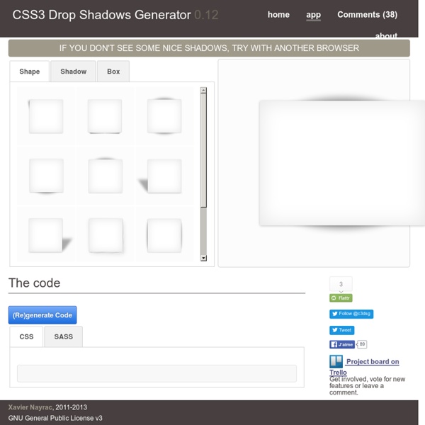
Créer des effets étonnants avec la propriété CSS3 box-shadow La propriété box-shadow permet d'ajouter différentes ombres (interne ou externe) sur les éléments de type bloc. Pour cela, vous devez préciser certaines valeurs : color, size, blur et offset. <shadow> = inset? De la science occulte ? Pas du tout, voici un exemple de base : box-shadow: 3px 3px 10px 5px #000; Cette déclaration va générer l'ombrage suivant : Vous pouvez aussi déjà regarder un exemple concret. Une valeur positive pour le décalage horizontal décale l'ombre vers la droite, une valeur négative vers la gauche. Mais cela n'est que de la théorie, si vous voulez aller plus loin, alors soyez les bienvenus et regardez les spécifications du W3C. Voyons maintenant comment vous pouvez mettre en œuvre cette formidable fonctionnalité CSS3 de façon élégante. Ajoutez de la profondeur au body▲ Exemple de référence. Ombres portées▲ Voici deux des articles qui m'ont inspiré : Ajoutez un peu de piment à vos ombres en utilisant le format de couleurs RGBa.
Keypress: A Javascript library for capturing input The first thing to do is include the JavaScript file in your page. Once you've got that loaded in, you'll want to start by instantiating a listener: var listener = new window.keypress.Listener(); Once you've done that you can register combos with that listener you've created. The simplest way to do that is using the simple_combo API. listener.simple_combo("shift s", function() { console.log("You pressed shift and s"); }); listener.counting_combo("tab space", function(e, count) { console.log("You've pressed this " + count + " times."); }); listener.sequence_combo("up up down down left right left right b a enter", function() { lives = 30; }, true); If you only want to use Keypress for some very simple keyboard shortcuts, that's all you need to know! If you want to use some of the more advanced features of Keypress, you can use the register_combo API and supply an object with any number of options described below. And here's a complete look at the Listener class' complete public API:
50 Useful CSS Snippets Every Designer Should Have With so many new trends advancing every year it can be difficult keeping up with the industry. Website designers and frontend developers have been deeply ingrained into the newer CSS3 properties, determining the ultimate browser support and quirky hacks. But there are also brilliant CSS2 code snippets which have been unrequited in comparison. For this article I want to present 50 handy CSS2/CSS3 code snippets for any web professional. These are perfect for storing in your development IDE of choice, or even keeping them saved in a small CSS file. Recommended Reading: 20 Useful CSS Tips For Beginners 1. Basic CSS browser resets are some of the most common snippets you’ll find online. 2. This clearfix code has been around the Web for years circulating amongst savvy web developers. 3. 2011 Updated Clearfix From what I can tell there isn’t a major difference in rendering between this newer version and the classic version. 4. Code Source 5. Code Source 6. 7. Code Source 8. Code Source 9. 10. 11.
Creating A Rocking CSS3 Search Box CSS3 is the next generation style sheet language. It introduces a lot of new and exciting features like shadows, animations, transitions, border-radius etc. Although the specifications have not been finalized yet, many browser manufacturers have already started supporting many of the new features. In this tutorial, we will explore some of these features like text-shadow, border-radius, box-shadows and transitions to create a rocking search field. The image below shows how the search filed looks like, or check out a working demo. The photoshop version of this search field was created by Alvin Thong and can be downloaded from here. Ready? 1. We’ll start with the HTML markup. This is followed by a <div> with an ID called #main. Here’s how the code looks like: <! <! 2. To create the big box around the form, we will add styles to the <div> with the ID of #main. The important piece of code here is the border-radius declaration and the box-shadow declaration. (Preview) 3. 4. The Complete (CSS) Code
iView Slider (jQuery) | Free PSDs & Resources for Web Designers by Hemn Chawroka iView has been stopped! iView has been stopped from update and support!You can use my new powerful mightySlider plugin. Go to mightySlider What is iView? iView is easy to use jQuery image slider with animated captions, responsive layout and HTML Elements like (Video, iFrame) slider. This jQuery plugin uses unobstrusive javascript to transform a block of simple HTML markup into a georgous elegant slider, which can be completely customized using HTML5 data attributes. This slider includes 35 transition effects which is completely configurable and compatible with all major browsers (including ie6 to ie9, Firefox, Chrome, Opera, Safari) and mobile platforms like iOS / Android. Multiple customized slider instances can happily live on the same page, and the slider offers a simple API to control the slider’s behaviour from within your custom scripts. Features Dont forget to follow me on twitter or like my page on facebook and take a look at my premium scripts too Changelog Version 2.0.1
Welcome to Jarallax.com What is jarallax?Web based parallax scrolling and much more! Jarallax is an open-source javascript library which makes adjusting css based on interaction easy.With Jarallax it's easy to create a parallax scrolling website. What to do next Follow Jarallax Support Jarallax Du flou gaussien en CSS3 J'adore CSS3. Chaque jour, j'en découvre un peu plus, et chaque jour, je suis surpris par de nouvelles utilisations intelligentes et un peu détournées des propriétés. Je suis retombé récemment sur cet article expliquant comment simuler un effet de flou gaussien sur du texte. Je suis sympa, vous pouvez recliquer sur le même lien pour désactiver le flou. Vous pouvez régler les 4 valeurs de la propriété text-shadow selon vos besoins. Comme d'habitude, cette propriété n'est supportée par aucune version d'Internet Explorer (même pas IE9, non non). filter: progid:DXImageTransform.Microsoft.Blur(pixelRadius=2); -ms-filter: "progid:DXImageTransform.Microsoft.Blur(pixelRadius=2)"; En bonus, vous pouvez créer une transition CSS3 pour donner un effet de flou progressif pour les navigateurs WebKit et Firefox 4 en ajoutant les déclarations suivantes dans votre règle CSS de floutage. -webkit-transition: all 2s ease-in; -moz-transition: all 2s ease-in; TA-DAM !
40+ Free Responsive WordPress Themes Not every blogger or site owner is code-literate or design-savvy, but everyone deserves to get a responsive design for their site. If you’re on WordPress, have we got a treat for you. Rather than bust your budget to hire a designer for a revamp, why not adopt one of these handpicked WordPress Themes that are available for free? These themes are built to resize and realign itself to cater to the different screen sizes of mobile devices, such as smartphones and tablets, i.e. they are responsive. No more swiping around to find hidden sidebars, zooming in and out to make the text comfortable enough to read. After all this, the look and feel of the site will still be maintained to mirror the original site. There will definitely be more out there so if you have a favorite theme, do let us know in the comments below. Constellation [ Demo | Download ] Flexible [ Demo | Download ] Ari [ Demo | Download ] Designfolio [ Demo | Download ] Simple Grid [ Demo | Download ] Unique [ Demo | Download ]
Animez vos fonds de pages web avec des vidéos Youtube Animez vos fonds de pages web avec des vidéos Youtube Voici un petit bout de code qui vous permettra de remplacer le fond image de votre site web par une vidéo YouTube en plein écran. À vous quand même de bien choisir la vidéo pour éviter que ça ne ressemble aux fonds de page en GIF animés des années 90 Pensez à remplacer le VIDEO_ID par l'ID de votre vidéo YouTube. Et si vous souhaitez mettre une musique au chargement de votre page (MOUAHAHAHA), vous pouvez aussi utiliser YouTube avec le code suivant : Source Vous avez aimé cet article ? Circle Hover Effects with CSS Transitions From our sponsor: Get started on your Squarespace website with a free trial In today’s tutorial we’ll experiment with hover effects on circles. Since we have the border radius property, we can create circular shapes and they have been appearing more often as design elements in websites. One use that I especially enjoy seeing is the circular thumbnail which just looks so much more interesting than the usual rectangular. Please note: the result of this tutorial will only work as intended in browsers that support the respective CSS properties. We will omit vendor prefixes in this tutorial. So, let’s get started! The HTML For most of the examples, we’ll be using the following structure: <ul class="ch-grid"><li><div class="ch-item ch-img-1"><div class="ch-info"><h3>Use what you have</h3><p>by Angela Duncan <a href=" on Dribbble</a></p></div></div></li><li><div class="ch-item ch-img-2"><div class="ch-info"><h3>Common Causes of Stains</h3><p>by Antonio F. The CSS Example 1