background preloader

CSS only menus

CSS only menus
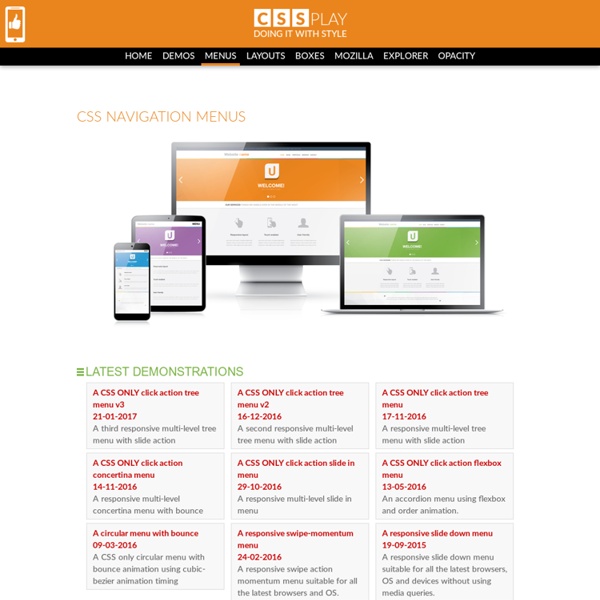
Latest Demonstrations A CSS ONLY click action tree menu v321-01-2017A third responsive multi-level tree menu with slide action A CSS ONLY click action tree menu v216-12-2016A second responsive multi-level tree menu with slide action A CSS ONLY click action tree menu17-11-2016A responsive multi-level tree menu with slide action A CSS ONLY click action concertina menu14-11-2016A responsive multi-level concertina menu with bounce A CSS ONLY click action slide in menu29-10-2016A responsive multi-level slide in menu A CSS ONLY click action flexbox menu13-05-2016An accordion menu using flexbox and order animation. A circular menu with bounce09-03-2016A CSS only circular menu with bounce animation using cubic-bezier animation timing A responsive swipe-momentum menu24-02-2016A responsive swipe action momentum menu suitable for all the latest browsers and OS. A responsive multi-level menu14-05-2015A responsive multi-level menu suitable for all the latest browsers and OS, PCs, tablets and smartphones.

AS3 G94 Circular Menu › Actionscript 3.0 Version of the Circular Group94 Menu I’ve received quite a few requests to update my circular group94 style menu to AS3 (I’m not really sure why I’m still calling it a “Group94 menu”, but it’s a tribute to them that this style of scrolling navigation is often referred to as a “group94 menu” and not an “offset scrolling menu” or something of that nature). Anyway, I have been thinking for some time that I should revisit this script and build a more complete version, where horizontal, vertical or circular are simply parameters for the menu, but for now, this is both an update and a massive enhancement of the AS2 G94 circular menu. If you play with the demo, you’ll notice I’ve added some new features, such as the ability to easily change (at runtime of desired) aspects of the menu like the inner radius, item spacing, visible items and much more. There are also some easy methods for scrolling the menu. Download: Group94 Style Circular Menu Enjoy!

CSS Triangle You can make them with a single div. It’s nice to have classes for each direction possibility. The idea is a box with zero width and height. The actual width and height of the arrow is determined by the width of the border. In an up arrow, for example, the bottom border is colored while the left and right are transparent, which forms the triangle. Demo See the Pen Animation to Explain CSS Triangles by Chris Coyier (@chriscoyier) on CodePen. Examples Dave Everitt writes in: For an equilateral triangle it’s worth pointing out that the height is 86.6% of the width so (border-left-width + border-right-width) * 0.866% = border-bottom-width dafont.com Camping la Joletière How To Create a Pure CSS Polaroid Photo Gallery Magical things can be done by combining various CSS properties, especially when some of the new CSS3 tricks are thrown into the mix. Let’s take a look at building a cool looking stack of Polaroid photos with pure CSS styling. View the Demo Check out the demo to see what we’ll be building. Remember, because we’ll be using a couple of CSS3 properties, users with IE won’t see the complete effect, but fully supporting browsers such as Firefox and Safari will be treated to the whole experience. We’ll use basic CSS to style up the photos into a Polaroid style images, then inject some additional styling with shadows and rotation, then use the z-index property to alter the stacking order of all the objects. Start work by sourcing your images. Next, set up the basic page structure with a container centered on the page. Semantically lay out the collection of images in an Unordered List element, and wrap each image with an anchor to create a clickable link. That’s all there is to it!

CSS3 Create - Démos, tutoriels et expériences CSS : menus, galerie photos, interfaces web. Andrea Joseph (Weekly Story Theme: Romance) There is no other love like an illustrator’s hand and its pen. These two spend hours together everyday, inseparable, and when they are not together, the hand years for the cool grip of its beautiful slender pen. Andrea Joseph hand knows this feeling well, and his hand and its pen have been committed to each other for years now, and now on Creative Tempest they renew their vows. Guide to CSS support in email clients - Articles & Tips Version history 14 November 2017 Outlook.com and the Outlook iOS app added support for CSS background images and some related properties, as well as certain Flexbox and Grid properties. Also added iOS 11 Mail to the guide, with no noticeable differences from iOS 10. 22 September 2017 Microsoft updated the Outlook apps for iOS and Android with more consistent CSS support, including media queries. 13 September 2017 A complete rewrite and redesign of the guide, testing 278 different CSS properties and features across 35 email clients. To accommodate the huge increase in content, we’ve added search functionality and the ability to link directly to individual the email clients and properties for easy sharing.Discuss this on our blog. 2 May 2014 Removed support for various selector options (E) in Gmail and added support for direction, vertical-align and list-style-type in Outlook ’07/’10/’13. 19 September 2013 30 January 2013 1 February 2012 background-image is now supported in Gmail. 10 December 2010

CSS drop-shadows without images Drop-shadows are easy enough to create using pseudo-elements. It’s a nice and robust way to progressively enhance a design. This post is a summary of the technique and some of the possible appearances. Demo: CSS drop-shadows without images Known support: Firefox 3.5+, Chrome 5+, Safari 5+, Opera 10.6+, IE 9+ I’ll be looking mainly at a few details involved in making this effect more robust. After a bit of back-and-forth on Twitter with Simurai, and proposing a couple of additions to Divya’s and Matt’s demos using jsbin, I felt like documenting and explaining the parts that make up this technique. The basic technique There is no need for extra markup, the effect can be applied to a single element. The pseudo-elements need to be positioned and given explicit or implicit dimensions. The next step is to add a CSS3 box-shadow and apply CSS3 transforms. One of the pseudo-elements then needs to be positioned on the other side of the element and rotated in the opposite direction.

Official Stargate Website: Home for all things Stargate - Univer Free “Site Under Construction” Template - OurTuts.com Hello everyone…This is the first post in the new “Freebies” category and I want to celebrate this by offering you something original and special.I`m giving away a free “Site Under Construction” Template ,to use it whenever you have a new website to launch or a re-design of your old website,or for anything else. This template is a simple one page “Under Construction” template that allows you to keep your users informed,while you work at your website.The template has a jQuery slider containing 3 slides:one with your social pages,like Twitter or Facebook,one with a subscribe-by-mail form and another one with an area for writing what you do.I thing it`s very useful.Now you have to convince yourself of its functionality. Main features of the Template jQuery Countdown Script-thanks to Keith Wood.Valid PHP e-mail subscription form-thanks to Abraham Soria from MetaMindVisualjQuery Slider.PSD File included Modern and clean web typeface. Agreements Just change the date with your own date.

70 Must-Have CSS3 and HTML5 Tutorials and Resources CSS3 and HTML 5 are capable of revolutionizing the way we design websites. Both include so many new features and functions that it can be hard to wrap your head around them at times. The inclusion of native support for things like rounded corners and multi-column layouts are just the tip of the ice berg. Below are seventy resources, tutorials, and articles to get you started with CSS3 and HTML 5. CSS3 Tutorials and Resources Get Started with CSS 3 – A basic guide to using CSS3. Cascading Style Sheets Current Work – Details the progress the W3C is making on the CSS3 standard. Border-image: Using Images for Your Border – A guide to the new CSS3 function for adding image borders. Overview of CSS3 Structural Pseudo-Classes – A handy reference chart of structural pseudo-classes in CSS3. Push Your Web Design Into The Future With CSS3 – An introduction to some of the new features in the CSS3 specification. CSS3 Selectors Explained – An overview of some of CSS3 selectors, including selector syntax.

3D Sketchbook Drawings Art & Design Nagai Hideyuki is Japanese artist who has the impressive skills to create 3D drawings. Using light and shadow his drawings give the illusion of jumping of the page when seen from the right angle. Basic Ready-to-Use CSS Styles This is a collection of some basic styles that can come in handy when creating your own style definitions. Learn how to make some useful classes for simple styles and how to apply them to a variety of elements. View demo Download source Today we are going to dig a little bit more into process development. You can also build classes of classes to custom things to suit your needs. This way the .custom class by itself has no point but if you apply it to a .my-class element, you can tweak a little bit the .my-class styles. Now you got the basic idea, let’s have a look at those patterns, starting with the block-level elements. Note that there are no vendor specific prefixes in this tutorial, but you can find the prefixed styles in the CSS. Block-level elements You are creating an image gallery and want to give some subtle styles to the pictures? The Markup For this whole section, I took an a division with the class “block-level” and added the additional classes to it. The Basic CSS Shadows Links

Related: