
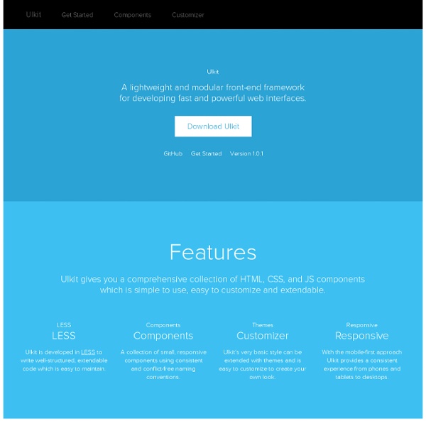
Offline.js What is Offline.js? Offline.js is a library to automatically alert your users when they've lost internet connectivity, like Gmail. It captures AJAX requests which were made while the connection was down, and remakes them when it's back up, so your app reacts perfectly. It has a number of beautiful themes and requires no configuration. Install The easiest way to add Offline to your site is with Eager. Click Install to see a live preview of Offline on your website. Download Offline.js Pick a Theme Indicator Themes Submit a theme! Documentation HubSpot 18 Best CSS Frameworks for Accelerated Development According to Wikipedia, CSS frameworks are pre-prepared libraries that are meant to allow for easier, more standards-compliant styling of web pages using the Cascading Style Sheets language. In this article we have gathered ready-to-use frameworks which will enable you to reduce your task flow and code LESS. We hope you will find the list handy and useful for your development needs. If you know any other CSS frameworks which are handy and useful, give your opinion in comment box, we would love to hear from you. 1. Pure is a fresh one that is created by Yahoo!. Source 2. Fitgrd is not a framework. Source 3. Fries is a solid HTML-CSS-JS framework for creating Android-like UIs both for real-world usage and prototyping. Source 4. Markup Framework, a fresh one, is a collection of layouts, widgets, typographic styles and other UI components which can be used as a base for any web project. Source 4. Source 5. Metro UI CSS is a set of styles for creating such interfaces. Source 6. Source 7. Source 8.
CSS Smart Grid — A Lightweight, Responsive, Mobile First 960 Grid As a Grid System There's only one CSS file to include: smart-grid.css . Place that in <head> your own stylesheet. Wrap your page inside a <div class="container"> . Note that you can use more than one container if your need calls for it: <header id= "hd" > <div class= "container" > <h1> My Page Title </h1> </div> </header> <section id= "main" > <div class= "container" > <p> This is where my content goes. Column Markup Grid columns are achieved by adding a column class to any element. <div class= "container" > <div class= "row" > <article id= "main" role= "main" class= "columns two-thirds" > <p> The beginning of the best article in the history of humanity. If you only have one row of columns in a container, you can ommit the row: <div class= "container" > <article id= "main" role= "main" class= "columns two-thirds" > <p> The beginning of the best article in the history of humanity. Column Offsets Sometimes you need a blank column between content.
11 Water Splash Photoshop Brushes Brushes, Freebies February 17, 2014 Hello creatives! Last week was a showcase of Valentines-themed freebies for your design needs. This week, we will continue to give you guys some love with our awesome sets of Photoshop brushes. Starting off with this amazing set of water splash brushes courtesy of our friend, Filipino graphic artist Niño Batitis! Popular with his awe-spiring digital photo manipulations, Niño have shared to us another awesome set from his collection of Photoshop brushes. Download this amazing brush pack by tweeting or sharing over Facebook. (Email subscribers: if you’re viewing this on your email, visit the actual post to download.) Niño’s latest piece called “Celestial Water Stallion” was created dominantly with different techniques applying this set of brushes. “Celestial Water Stallion” by Niño Batitis SEE ALSO: 13 Photoshop Fire Brushes Tell us your thoughts and suggestions in the comment box below. Author: Kerby Rosanes
Macaw | The code-savvy web design tool. Lena.JS pixel to pixel: grayscale sepia thresholding-128 invert saturation red green blue edge/line detection: roberts sharpen sobel y sobel x highpass laplacian gaussian prewitt y prewitt x Drag and drop filters hereremove all filters 20 Exceptional CSS Boilerplates and Frameworks CSS frameworks have been the foundations of web projects for many years. However, in the age of responsive design, a framework has even more benefits. A well-built CSS framework or boilerplate can streamline the design process, save huge chunks of development time and ensure your website scales properly on all devices. With so many choices available, though, it can be difficult to choose a framework to build on. It's important to consider the following when making a decision: whether you require a grid, and if so, will it be fluid or fixed? What level of customization do you require? This post details 20 CSS boilerplates, frameworks and systems to help you make that decision. 1. Bootstrap is a "sleek, intuitive and powerful front-end framework for faster and easier web development." 2. Catering for four layouts (default, tablet, mobile and wide mobile), with three sets of typography presets, Less is a responsive CSS grid system for designing adaptive websites. 3. 4. 5. 6. 7. 8. 9. 10. 1.
Columnal | A responsive CSS grid system helping desktop and mobile browsers play nicely together. Impallari Type