background preloader

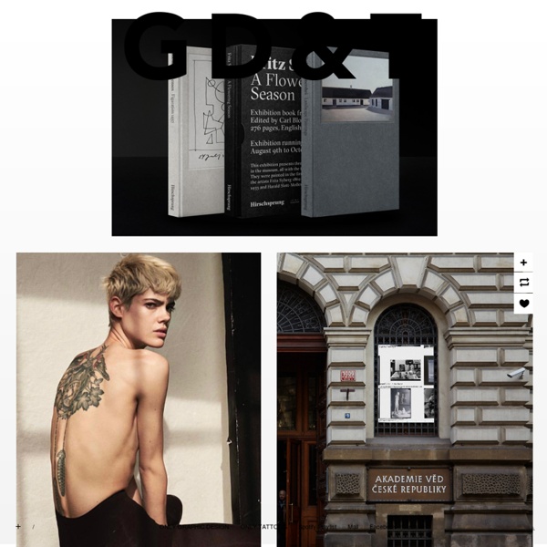
Graphic Design & Tattoos

Graphic Design & Tattoos

Lovely Stationery . Curating the very best of stationery design Core77 / PRINT! PRINT! PRINT! interview with graphic designer david carson different rock stars talked about teachers they had lusted after in school in this beach culture article ‘hot for teacher’. I loved this image of a ‘teacher’ sitting on some books, and the way the type lustfully leans toward her. ray gun magazine – one of my favorites, an opener for a long article and interview with singer songwriter morrissey. reading through the article I found this great quote ‘I have no interest whatsoever in any aspect of whordom’. DB: who or what has been the biggest single influence on your approach to design? DC: again, probably my lack of formal training, combined with my overall life experience. growing up primarily in southern california I think gave me a somewhat more experimental, liberal and open minded approach to design and life. nowadays I usually work on numerous ideas at once for the same topic or project, getting progressively more experimental as I go along. then I go back and fine tuning the ones that feel the most effective. poster for a A.I.G.A.

Fake The Rise And Fall Of Grunge Typography Hop on the nostalgia train for a second. Think back to the 90s. To Nirvana, Linklater’s Slacker, and the flannel-clad rebels on the run from the 80s. It was everywhere—and then it wasn’t. David Carson, the acclaimed graphic designer who created Ray Gun magazine, is the so-called Godfather of Grunge. David Carson’s infamous Zapf Dingbats spread, featured in a 1994 issue of Ray Gun. Some Ray Gun covers. Carlos Segura, a Chicago-based graphic designer and founder of Segura Inc. and such type foundries as T-26, was a close witness to the grunge explosion. Like many other of the 90s’ best things, grunge typography was rooted in angst and discontent. David Carson on “grunge” design and his method. The aesthetic was fueled by raw emotion, but Carson’s tactics were made imitable by technology. Pearl Jam and Blink-182 were two of many 90s bands that adopted grunge typography in their image. From the viewer’s perspective, the appeal of grunge was based on a basic idea: it had not been seen before.

AisleOne - Graphic Design, Typography and Grid Systems Gestalt Theory in Typography & Design Principles Editor’s Note: The following passage is excerpted from one of the readings for Denise Bosler’s online course, Mastering Typography. Mastering Typography takes a comprehensive look at the fundamentals of typography and letterforms. Register here. Gestalt is a form of psychology that focuses on cognitive behaviors. Designers are influenced by the visual perceptual aspect of this, particularly the theory that the whole is greater than the sum of its parts. Five design principles derive from the Gestalt theory: proximity, similarity, continuity, closure and figure/ground. Proximity refers to objects placed close together being perceived as a group. all images from Mastering Type by Denise Bosler Proximity spacing can be as close objects in direct contact, or as far apart as opposite sides of a page. The strongest proximity relationship is when objects overlap, leaving no doubt that they belong together. Shared visual characteristics automatically create relationships.

MAISON NUE - LE JOURNAL [Art] We Love : Jan Dibbets Connu pour ses perspectives corrigées à la fin des années 60, l’artiste néerlandais Jan Dibbets explore les champs de la photographie, du land art et de l’art minimal. [Photography] We Love : Martin Parr Et ca tombe bien , le photographe anglais expose à la Maison Européenne de la photographie à Paris, jusqu’au 25 mai. [Design] We Love : Maxime Velcovsky Maxime Velcovsky est un ceramiste d’origine tchèque. [Art] We Love : Wolgang Laib Wolgang Laib propose une recherche minimaliste dans le champ du Land Art. Il dit lui même : “Pollen is more important than me.” [Photography] We Love : Paul Salveson Between the Shell, le livre de Paul Salveson a remporté le prix Mack de l’année 2013. [Art] We Love Hans Haacke Haas Haacke est un artiste conceptuel allemand dont les œuvres mettent en évidence certains phénomènes physiques et biologiques. Condensation Cube Wide Whit Flow [Photography] We Love Nicolas Coulomb Nicolas Coulomb est un photographe suisse basé à Paris.

Interview: Coca-Cola Design Manager Alex Center | HOW Design Ever wonder what it’s like to design for brands like Coca-Cola, Hershey and Kraft Foods? Or the White House? Come to HOW Design Live 2015 and find out. Register today and use discount code INHOUSEOBS. Over the last six months I’ve had the great pleasure to plan the 2015 HOW Design Live Conference In-house Managers track. I must admit this experience has been quite surreal because the first HOW Design Live Conference I ever attended was four years ago in Chicago. Along this journey I’ve met some truly exciting people. Alex will be sharing his insights on the future in-house with those managers attending the conference. I’m curious, what is your earliest creative memory and how has it manifested into your professional career? My mom was really my first real art teacher. For me, the feeling I get from solving problems and being creative in my professional work is the same feeling I had growing up drawing with my mother. It’s beyond crazy now to see photos of myself from that time.

Ill Studio - Moodcyclopedia Recent Works Contact Moodcyclopedia Self published encyclopedia of influence. Edition of 500. Forewords by Yorgo Touplas. 2011 — Not for sale Previous / Next

Related: