background preloader

21 Fonts That Shouldn’t Be Free…But Are!

21 Fonts That Shouldn’t Be Free…But Are!
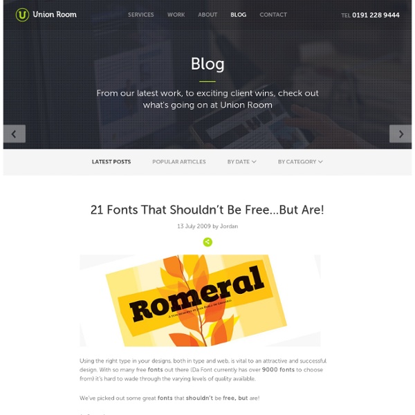
21 Fonts That Shouldn’t Be Free…But Are! 13 July 2009 by Jordan Hall Using the right type in your designs, both in type and web, is vital to an attractive and successful design. With so many free fonts out there (Da Font currently has over 9000 fonts to choose from) it’s hard to wade through the varying levels of quality available. We’ve picked out some great fonts that shouldn’t be free, but are! 1. 2. 3. 4. 5. 6. 7. 8. 9. 10. 11. 12. 13. 14. 15. 16. 17. 18. 19. 21. Resources 50 Incredible Fonts for Professional Print & Web Design | Noupe 30 Fonts That All Designers Must Know & Own | Just Creative Design 37 FREE Must-Have Fonts | Francesco Mugnai 40 Free High Quality Hand Drawn Fonts | Hongkiat.com Thanks for reading, from Union Room Web Design. Back to Blog Related:  Typo

Anatomy of Type | Typography Deconstructed Ampersand A stylized character of the Latin et used to represent the word and. Definition: The typographic symbol used to designate the word and (& ) is the Latin symbol for et which means and. The name, ampersand , is believed to be derived from the phrase “and per se and.” On a standard English layout... Aperture The partially enclosed, somewhat rounded negative space in some characters. Apex A point at the top of a character where two strokes meet. Arc of Stem A curved stroke that is continuous with a straight stem. Arm A horizontal or upward, sloping stroke that does not connect to a stroke or stem on one or both ends. Ascender An upward vertical stroke found on the part of lowercase letters that extends above the typeface’s x-height. Ascender Line The invisible line marking the height of ascenders in a font. Ascent Line The invisible line marking the farthest distance between the baseline and the top of the glyph. Axis Ball Terminal A circular form at the end of the arm in letters. Bar Baseline

5 obscure HTML tags that you should know and even use - Instant With the rising popularity of CSS for styling, many web developers and users alike have become alienated from the good old HTML tags. Only a handful of these tags are used in the markup of web pages today. Most of them have got limited representation and some of them are entirely forgotten. I decided to round up a couple of HTML tags that perhaps should be used a little more often than they actually are. 1. The <abbr> and <acronym> tag describes abbreviations and acronyms. Usage: <abbr title="HyperText Markup Language">HTML</abbr> This is the result. 2. The <q> tag defines a short quotation. Most developers are used to the &quot; entity whenever they need to insert quotations, and all blogging editor automatically converts all typed quotations (“) into this entity. Usage <q>The quick brown fox jumps over the lazy dog</q> Result: The quick brown fox jumps over the lazy dog The <q> tag is commonly associated with the <blockquote> tag. 3. Unfortunately, <wbr> tag works only with IE and Firefox.

40 Beautiful Free Fonts For Creating Attractive Typography Headlines A sweet collection of carefully handpicked high quality free fonts, which are all suitable to be used for creating attractive typography headlines which will attract people’s attention. A collection of amazing fonts which are suitable and perfect for web design projects as well print based projects. There is a misconception by designers that free fonts are usually cheap looking and cannot be used in order to create a good design, but what designers don’t realise is that there is the odd good free font it just takes time in order to find the perfects ones. 1. 2. 3. 4. 5. 6. 7. 8. 9. 10. 11. 12. attempa 13. 14. 15. 16. 17. 18. 19. 20. 21. 22. 23. 24. 25. 26. 27. 28. 29. 30. 31. 32. 33. 34. 35. 36. 37. 38. 39. 40. Which Is Your Favourite Free fonts from the list ?

Award-Winning Newspaper Designs | Inspiration Advertisement Print and Web are different. Traditional layout techniques from print, particularly an advanced formatting, aren’t applicable to the Web as CSS doesn’t offer sophisticated instruments to design such layouts (e.g. text floating around an embedded image; some “floating” techniques provide such results, however they produce bloated source code just as well). At the same time the flexibility of the Web is hardly applicable to print as there is no way to customize a traditional periodical for reader’s convenience. However, there are a number of fundamental principles which are often being used in both media. This issue of monday inspiration series is supposed to provide you with some examples of outstanding newspaper designs which have been rewarded with prestigious awards (see references at the bottom of this post), and demonstrate unusual approaches of newspaper design. Please notice that El Economista (Madrid, Spain) Äripäev (Tallinn, Estonia) De Morgen (Belgium) Mint (India) St.

Tuesday's Tech of the Week: Type & Color Edition Since the world of design is about to get quite a bit cloud-ier with the release of Adobe Creative Cloud, we decided to take today's tech roundup to pay homage to 10 websites, apps, and games that help designers become better designers. As purveyors of color, creativity, and tech innovation, our team refers to almost all of these sites on a weekly basis! First, the world of type. 1. 2. 3. 4. And now, let's tackle color. 5. 6. 7. 8. 0 to 255: Now that you've figured out your color theme, what about all the shades you need to go with it? But what about getting your gorgeously designed websites and apps online? 9. 10. How do you pump up your design skills? As the Creative and Editorial Director of Brit + Co., Anj brings her voracious consumption of all things creative and colorful to DIY projects, gadgetry finds, and, perhaps, one too many spiked sweets.

If you code HTML, Zen Coding will change your life If you write HTML for a living, and you don't know Zen Coding yet, you are missing out big time. This is basically the coolest thing I've seen all week. I have been using it for a few days now; at first it seemed kind of gimmicky and I wasn't sure I could grasp the syntax, but today I really got to explore it, and woah is it awesome. Okay, I'll stop tripping over myself with excitement over here and try to tell you what this thing does, in a nutshell: It expands abbreviations into complete HTML structures (divs, tables, cells, links, lists), and does it in the most freaking intelligent way I have seen in a long time. For instance, that arcane-looking string of text in the screenshot expands with a single keystroke into this: This thing leaves any other tag-completion method I have ever seen for HTML in the dust. There are existing implementations for multiple editors, such as Komodo Edit (which is the one I'm using). There are easy ways to wrap existing lines with tags. Foo Bar Baf

Creating a Vinyl Record In Photoshop In this tutorial, I will explain how to make a vinyl graphic. This tutorial will outline techniques to avoid choppy edges and create proper texturing and lighting. Step 1. Let's start out by creating a new file. I used a 300x300 pixel canvas set at 72dpi (regular settings), and I filled my background with a soft gradient. Create a layer set and call it "vinyl." Step 2 The noise we just added will be used to create the circular texture that is typical for a vinyl record. Step 3 Time to cut out our circular shape. Switch to the Move tool (V) and hit Ctrl+A so that you select the entire canvas. Step 4 Next we will cut out our actual shape. Duplicate the "Shape 1" layer and resize it to about 5% (hit Ctrl+T, and then enter 5% in the size boxes). Step 5 Now that we have our basic shape and texture done, it's time to bring this baby to life. Then set the layer to Soft Light and experiment with Brightness/Contrast. Step 6 Now it's time to make it really pop. Step 7 Conclusion

Use the Best Available Ampersand I love ampersands. And interest in this quirky character seems to be on the rise as of late. Case in point: Just last week, I purchased not one, but two t-shirts adorned with nothing more than an ampersand. That’s telling, no? For much of last year, I had a little portion of a presentation dedicated to using CSS to serve up alternate, compelling ampersands. Guideline 5.1.3 offers this little tidbit regarding ampersands: In heads and titles, use the best available ampersand. Bringhurst explains that frequently the italic version of an ampersand is more decorative and interesting than its roman counterpart, and goes on to suggest: Since the ampersand is more often used in display work than in ordinary text, the more creative versions are often the more useful. So why not apply this to the web? And we’ll build a list of cool italic ampersands that readers might have installed by default, while also specifying the italic version: Mac OS X (10.5) Windows XP Windows Vista

50 Fresh Free Fonts of 2010 Though there's a broad variety of fonts available for download online, designers keep on tracing the fresh ones to enhance their design copy, a website, brochure, or even an advertisement in a brand new an' awesome way. Still, the free stuff could not always boast of good quality – premium goodies always demand some kind of money investment. However, now it's possible to find the appropriate font that's free, clear, beautiful, and effective for design purposes. Many great designers are now offering professional quality fonts completely for free. Today's round-up actually goes outside the standard font variety. We've managed to gather a collection of 50 novelty styled free fonts which you can instantly download and use to add a powerful impact for your designs. Geomancy Kilogram Tribbon Quadranta Adec Teardrop St Marie Dekar Code Cube Piron Glide Planer Paranoid Circled St Ryde Danger Pincoyablack New Garden Titillium Text Sylar Scriber Mentone Circula Sansation LT Oksana Font V4.0 Lintel Frgmnt Amsterdam Sol Pro Zag

Color Palette Generator Color Palette Generator #ffeeff #ffccdd #eeaaaa dull #33aa77 #ffeeee #ffbbdd #ff7799 vibrant URL of image: Make color schemes. If you like this you might also like my logo maker All Tools Biorhythms Business Card Generator Calendars, Printable Swiss Style Color Hunter Color Palette Generator Color Picker Comic Strip Maker Crapola Translator Drawmigo Favicon Generator Flickr RSS Feed Generator Free PDF Cards IMG2TXT Invent-a-Word Landscape Art Bot Logline Library Logoshi Logo Maker Pixel Art Generator Rainbow Words ROT13 Subwords! Reference ASCII Table Current Stamp Price Filler Text & One Liners Jedi Robe Pattern Recipes Special Characters URL Encoded Chars © 1999 - 2024 DeGraeve.com

Create a realistic folded paper text in Photoshop - StumbleUpon Today we will learn how to realize a folded paper text effect from scratch in Photoshop. We will firstly create the background using a couple of patterns, then we will work on the type treatment with the help of the pen tool, layer masks and other useful techniques related to dodge,burn and the transform tool. This tutorial is very simple to follow, so I suggest to everyone to give a try. Preview: Click to enlarge Become a Premium Member and get unlimited access to source files and premium resources for only 7$/month. Step 1 Create a new document in Photoshop. *note for Mac users: ctrl=cmd, alt=option Step 2 Fill the background with a dark green (#41514c). Step 3 To create the textured effect of the background, I’ve used 2 of our soft grunge patterns created by Piervincenzo. Select the pattern2_380_hard and press ok to fill the background. Finally set the layer to overlay with opacity 50%. Step 4 Create another layer, this time fill it with pattern_9_380_hard. Step 5 Step 6 Step 7 Step 8 Step 9 Step 10

36 Font Resources You Should’ve in Your Bookmarks Learn how to earn $125 or more per hour as a freelancer - Click Here Looking for hosting?. We recommend MediaTemple for web hosting. Use Code MTLOVESDESIGN for 20% off When you’re designing a new web template, logo, or software application, One of the hardest thing is looking for that perfect font. A good font can really make or break a great concept. You might be interested to check other Web Design Resource posts: 1. 2. 3. 4. 100 Best Fonts Of All Time 5. 6. 7. 8. 1001 Fonts 9. 10. 11. 12. 13. 14. 15. 16. 17. 18. 19. 20. 1001 Free Fonts Identify a font by appearance Incredible adult web hosting services, also Join HP0-D07 online training program including online 70-642 courses to prepare for avaya certification exam. About brantwilson Brant Wilson is a staff writer for the DesignMag network.

Related: