

Gapminder: Unveiling the beauty of statistics for a fact based world view. Kiln = Journalism + Data + Technology + Design Statistics Canada: Canada's national statistical agency Website Evaluation 2017 Please take a few minutes at the end of your visit today to anonymously tell us about your experience with the Statcan.gc.ca website. Choosing “Yes, after my visit” will open a new window that you can return to once you complete your visit to Statcan.gc.ca. Use of cookies We are making temporary use of cookies Opens in a new window during the evaluation period from January 9 to January 26, 2017 to ensure that you do not receive this invitation more than once. Please see Statistics Canada's complete Privacy notice Opens in a new windowfor more information.
Geospatial - GIS-HTML5 Flightradar24.com - Live flight tracker! Gallery · mbostock/d3 Wiki Wiki ▸ Gallery Welcome to the D3 gallery! More examples are available for forking on Observable; see D3’s profile and the visualization collection. Please share your work on Observable, or tweet us a link! Visual Index Basic Charts Techniques, Interaction & Animation Maps Statistics Examples Collections The New York Times visualizations Jerome Cukier Jason Davies Jim Vallandingham Institute for Health Metrics and Evaluation Peter Cook Charts and Chart Components Bar Chart Histogram Pareto Chart Line and Area Chart Pie Chart Scatterplot and Bubble chart Parallel Coordinates, Parallel sets and Sankey Sunburst and Partition layout Force Layout Tree Misc Trees and Graphs Chord Layout (Circular Network) Maps Misc Charts Miscellaneous visualizations Charts using the reusable API Useful snippets Tools Interoperability Online Editors Products Store Apps
Canadian socioeconomic database from Statistics Canada Website Evaluation 2017 Français Thank you for visiting Statistics Canada’s website. You have been selected to participate in a brief evaluation to help us improve the website. The evaluation is designed to measure your web site experience, please complete the questionnaire at the end of your visit. Privacy Protection Statistics Canada is conducting this voluntary evaluation and will ensure that individual responses remain anonymous and protected pursuant to the Privacy Act. Use of cookies We are making temporary use of cookies during the evaluation period from January 9 to January 26, 2017 to ensure that you do not receive this invitation more than once. Please see Statistics Canada's complete Privacy notice for more information. Assistance
Experiencias | Escuela De Datos - evidencia es poder Este post es una contribución de nuestros compañerxs en LA NACION DATA. En Argentina, donde no tenemos una Ley de Acceso a la Información Pública, LA NACION y tres ONGs ligadas al mundo de la transparencia - Poder Ciudadano, ACIJ (Asociación Civil por la Igualdad y la Justicia) y Fundación Directorio Legislativo sumamos esfuerzos para desarrollar el primer sitio para abrir información sobre el patrimonio personal de funcionarios públicos. En la primera etapa se encuentran disponibles 600 declaraciones de funcionarios de las tres distintas ramas de gobierno: Poder Ejecutivo, Legislativo y Judicial. Se le dio prioridad a los puestos más relevantes en cada poder y a los candidatos de las elecciones legislativas de octubre 2013. La información entregada por la Administración Pública (histórica en poder de las ONGs y solicitada ad hoc para este proyecto) consta únicamente en formato papel. El micrositio Declaraciones Juradas Abiertas nace en un marco político muy particular. Los Chequeatones.
Our World In Data Pathomx 5 Awesome Free Data Analysis Tools: Extract, Clean, and Share Your Data 05.01.2016 by Marisa Krystian Data analysis is the process of cleaning, inspecting, transforming, and modeling data in order to uncover useful information. Data analysis can be tricky! Mr. Mr. Wolfram Alpha This amazing ‘knowledge’ engine brings you broad, deep, expert-level information in an instant. Import.io Import.io makes advanced web data extraction easy, by turning websites into spreadsheets! Panda Project Panda Project makes data journalism easier than ever. OpenRefine OpenRefine is an open source tool for cleaning up messy data. While it’s true these tools make data analysis easier, it is important to note that they are only as valuable as the information you put in and the analysis you conduct. Once your data is ready, you can use data visualization tools like Infogr.am to bring it to life.
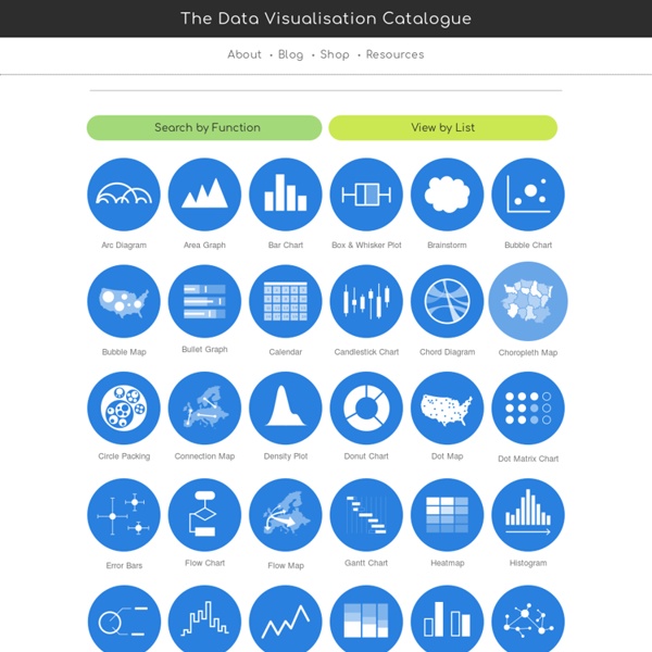
Section Cut | Describe Data Graphically We live in an over-saturated data-sphere. Try reading a government report some time — heavy on the facts but lean on the figures! For most people, synthesizing data through words or tables is actually quite difficult. With the explosion of data since the digital revolution, we’re increasingly faced with synthesizing large quantities information. In this How To, Dan discusses the distinctions between types of data, how to represent them, what it all means, and tips to create your own infographics with the goal of telling a story. Infographics may be generated from one of a few types of data. Infographics by John Bernardo Ultimately, just about all data may be represented numerically. Here are a few examples of simple graphs that seek to tell a story. spatial data: mapIf your data set includes locations in space, mapping is likely the representational tool of choice. Here are a few examples of maps: Here are a few examples of Diagrams: Image Source: Edward Tufte
Index Map