background preloader

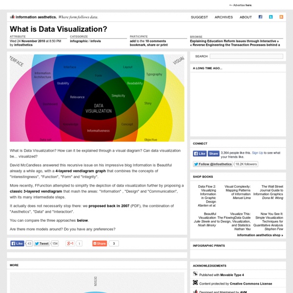
What is Data Visualization?

What is Data Visualization?

10 Best Data Visualization Projects of the Year – 2010 Data visualization and all things related continued its ascent this year with projects popping up all over the place. Some were good, and a lot were not so good. More than anything, I noticed a huge wave of big infographics this year. It was amusing at first, but then it kind of got out of hand when online education and insurance sites started to game the system. Although it's died down a lot ever since the new Digg launched. That's what stuck out in my mind initially as I thought about the top projects of the year. One of the major themes for 2010 was using data not just for analysis or business intelligence, but for telling stories. So here are the top 10 visualization projects of the year, listed from bottom to top. 10. Scott Manley of the Armagh Observatory visualized 30 years of asteroid discoveries. 9. Hannah Fairfield, former editor for The New York Times, and now graphics director for The Washington Post, had a look at gas prices versus miles driven per capita. 8. 7. 6. 5. 4. 3.

Visual subjectivity (II) Time ago, I posted an infographic published on The New York Times, not ellaborated by its infographics team, but by a visual artist called Andrew Kuo, who explained the Lollapalooza Festival of 92 as he remembered it. It was something different, an application of infographics not using data or objective information, but feelings, opinions and ideas. Now I discover through Innovations In Newspapers that La Vanguardia gets into this new adventure with Shakira's concert. Well, it's something you can expect from a department with a chief as Jaime Serra, so involved in visual subjectivity.

Facebook worldwide friendships mapped As we all know, people all over the world use Facebook to stay connected with friends and family. You meet someone. You friend him or her on Facebook to keep in touch. These friendships began within universities, but today there are friendships that connect countries. Facebook engineering intern Paul Butler visualizes these connections: I defined weights for each pair of cities as a function of the Euclidean distance between them and the number of friends between them. In other words, for each pair of countries with a friend in one country and a friend in the other, a line was drawn. It might remind you of Chris Harrison's maps that show interconnectedness via router configurations. In areas of high density it looks more or less like population density.

10 Awesome Free Tools To Make Infographics Advertisement Who can resist a colourful, thoughtful venn diagram anyway? In terms of blogging success, infographics are far more likely to be shared than your average blog post. This means more eyeballs on your important information, more people rallying for your cause, more backlinks and more visits to your blog. Designing An Infographic Some great tips for designing infographics: Keep it simple! Ideas for infographic formats include: Timelines;Flow charts;Annotated maps;Graphs;Venn diagrams;Size comparisons;Showing familiar objects or similar size or value. Here are some great tutorials on infographic creation: Creating Your Infographic Plan and research.If required, use free software to create simple graphs and visualisations of data.Use vector graphic software to bring these visualisations into the one graphic. Ultimately, if you have a little design skill, the very best approach is to create all the simple graphs and illustrations yourself using vector graphic software. Stat Planet Hohli

How to be a data journalist | News Data journalism is huge. I don't mean 'huge' as in fashionable - although it has become that in recent months - but 'huge' as in 'incomprehensibly enormous'. It represents the convergence of a number of fields which are significant in their own right - from investigative research and statistics to design and programming. The idea of combining those skills to tell important stories is powerful - but also intimidating. Who can do all that? The reality is that almost no one is doing all of that, but there are enough different parts of the puzzle for people to easily get involved in, and go from there. 1. 'Finding data' can involve anything from having expert knowledge and contacts to being able to use computer assisted reporting skills or, for some, specific technical skills such as MySQL or Python to gather the data for you. 2. 3. 4. Tools such as ManyEyes for visualisation, and Yahoo! How to begin? So where does a budding data journalist start? Play around. And you know what?

5 Tools for Online Journalism, Exploration and Visualization - ReadWriteCloud In our last post on data journalism, we ran across a number of tools that would be helpful for anyone who is interested in how to make sense of data. The tools represent a renaissance in how we make sense of our information culture. They provide context and meaning to the often baffling world of big data. This is a snapshot of what is available. Factual Factual provides simple APIs for building Web and mobile apps. How To Create a Table With Factual on Howcast Socrata Socrata is one of a handful of companies and organizations that are shaping the open data movement in government. Google Fusion Tables Google Fusion Tables is a Google Labs project. WikiEDData uses Google Fusion Table to map poverty levels in Washington state school districts: "Yellow indicates the latest district poverty levels are below state average, orange means the levels are above state average, and red means that the poverty levels are 10 percentage points or more above state average. Yahoo! Yahoo! OpenHeatMap

Data journalism pt1: Finding data (draft – comments invited) The following is a draft from a book about online journalism that I’ve been working on. I’d really appreciate any additions or comments you can make – particularly around sources of data and legal considerations The first stage in data journalism is sourcing the data itself. Often you will be seeking out data based on a particular question or hypothesis (for a good guide to forming a journalistic hypothesis see Mark Hunter’s free ebook Story-Based Inquiry (2010)). On other occasions, it may be that the release or discovery of data itself kicks off your investigation. There are a range of sources available to the data journalist, both online and offline, public and hidden. national and local government;bodies that monitor organisations (such as regulators or consumer bodies);scientific and academic institutions;health organisations;charities and pressure groups;business;and the media itself. Private companies and charities Regulators, researchers and the media Live data Legal considerations

Clive Thompson on the Power of Visual Thinking | Magazine Illustration: Posttypography When I went online to shop for a laptop this summer, I faced a blizzard of choices. Was an ultralight worth the price, or would a heavier model do? Using one of my son’s Crayolas, I drew doodles of all the laptops and covered them with little icons depicting the pros, cons, and cost of each. In essence, I used “visual thinking”—drawing pictures to solve a problem. My crayon experiment was inspired by Dan Roam, a visual-thinking guru and author of The Back of the Napkin. But dynamic, complicated problems—like global warming and economic reform—often can’t be boiled down to simple narratives. For example, during the health care debate, President Obama couldn’t seem to communicate how the heck reform would work, no matter how many speeches he gave. Unfortunately, picture-drawing is considered childish, which is partly why visual thinking has taken a backseat to verbal agility. Email clive@clivethompson.net.

Data journalism pt2: Interrogating data This is a draft from a book chapter on data journalism (the first, on gathering data, is here). I’d really appreciate any additions or comments you can make – particularly around ways of spotting stories in data, and mistakes to avoid. UPDATE: It has now been published in The Online Journalism Handbook. “One of the most important (and least technical) skills in understanding data is asking good questions. Once you have the data you need to see if there is a story buried within it. The first stage in this process, then, is making sure the data is in the right format to be interrogated. If the information is already online you can sometimes ‘scrape’ it – that is, automatically copy the relevant information into a separate document. Insert: Cleaning up data Whether you have been given data, had to scrape it, or copied it manually, you will probably need to clean it up. Some tips for cleaning your data include: Use a spellchecker to check for misspellings. Like this: Like Loading...

Adventures in information design, WSJ edition | Analysis & Opinion | Last week, Justin Lahart presented an interesting thesis in the WSJ: For American business, it has become a two-track economy.While global players like industrial conglomerate 3M Co. and burger giant McDonald’s Corp. are getting ever-bigger boosts from their operations in fast-growing economies like China and Brazil, companies dependent on the U.S. market are hemmed in by recession-scarred consumers who are hesitant to spend. The accompanying chart was one of the most incomprehensible things I’ve ever seen on newsprint: I doubt that one reader in 20 actually understood, on looking at this chart, the information it was ostensibly trying to get across. There are three axes here, and two colors, and all manner of confusion. The amount of color in a bar represents the proportion of those revenues that come from outside the US. The weird thing is that Lahart’s thesis would come out loud and clear from a simple scatter chart. So, what really happened here?

Data journalism pt3: visualising data – charts and graphs (comments wanted) This is a draft from a book chapter on data journalism (the first, on gathering data, is here; the section on interrogating data is here). I’d really appreciate any additions or comments you can make – particularly around considerations in visualisation. A further section on visualisation tools, can be found here. UPDATE: It has now been published in The Online Journalism Handbook. “At their best, graphics are instruments for reasoning about quantitative information. Often the most effective way to describe, explore, and summarize a set of numbers – even a very large set – is to look at pictures of those numbers.” Visualisation is the process of giving a graphic form to information which is often otherwise dry or impenetrable. Broadly speaking there are two typical reasons for visualising data: to find a story; or to tell one. In most cases, however, the story will not be as immediately visible. Types of visualisation Visualisation can take on a range of forms. Like this: Like Loading...

Topic Maps: From Information to Discourse Architecture From Information to Discourse Architecture Abstract Topic Maps is a standards-based technology and model for organizing and integrating digital information in a range of applications and domains. Drawing on notions adapted from current discourse theory, this article focuses on the communicative, or explanatory, potential of topic maps. It is demonstrated that topic maps may be structured in ways that are “text-like” in character and, therefore, conducive to more expository or discursive forms of machine-readable information architecture. Topic Maps as Information Architecture Topic Maps (in upper case) is a standards-based technology for connecting knowledge structures to information resources. Examples of real world applications are the city of Bergen’s portal ( VIMU, a website on Danish-German border history ( or fuzzzy.com, a social bookmarking site ( Topic Maps as Exposition Space Brutus killed Caesar.

Data journalism pt4: visualising data – tools and publishing (comments wanted) This is a draft from a book chapter on data journalism (here are parts 1; two; and three, which looks the charts side of visualisation). I’d really appreciate any additions or comments you can make – particularly around tips and tools. UPDATE: It has now been published in The Online Journalism Handbook. Visualisation tools So if you want to visualise some data or text, how do you do it? The best-known tool for creating word clouds is Wordle (wordle.net). ManyEyes (manyeyes.alphaworks.ibm.com/manyeyes/) also allows you to create word clouds and tag clouds – as well as word trees and phrase nets that allow you to see common phrases. More general visualisation tools include widgenie (widgenie.com), iCharts (icharts.net), ChartTool (onlinecharttool.com) and ChartGo (www.chartgo.com). If you want more control over your visualisation – or want it to update dynamically when the source information is updated, Google Chart Tools (code.google.com/apis/charttools) is worth exploring. Like this:

Related: