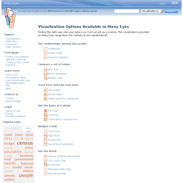


http://www-958.ibm.com/software/data/cognos/manyeyes/page/Visualization_Options.html
Related: DataFederal Government Challenges Post-Safety Datapalooza At last month’s White House Safety Datapalooza, several federal agencies issued challenges to civic minded developers to help the federal government solve real world problems ranging from health care, public safety, education, and more. Many of the previous winners of these challenges have been civic startups who have leveraged open data released on data.gov to help find creative ways to solve problems. Sketchnotes at the Public Data Safetypalooa, courtesy @anadiazhernandz Here’s a list of each challenge along with data resources and some examples of apps that work to solve similar problems. Try to win!
Free Visualization Software Thumbnails: ON off Sort by: name DATE To create a new visualization, choose a base dataset. Loading datasets and visualizations... How to use graphic organizers for teaching writing, learning, and understanding across the curriculum. Graphic organizers guide learners’ thinking as they fill in and build upon a visual map or diagram. Graphic organizers are some of the most effective visual learning strategies for students and are applied across the curriculum to enhance learning and understanding of subject matter content. In a variety of formats dependent upon the task, graphic organizers facilitate students’ learning by helping them identify areas of focus within a broad topic, such as a novel or article.
Screensaver - visualizing the global blogosphere Twingly Screensaver Beta Twingly screensaver is visualizing the global blog activity in real time. Forget RSS readers where you see only what you're interested in. With Twingly screensaver you get a 24/7 stream of all (viewer discretion advised) blog activity, straight to your screen. Alpine Data Science Periodic Table One of the most clever giveaways at the recent Strata Conference in Santa Clara was a Periodic Table of Data Science from Alpine. At the recent Strata Conference (Feb 11-13, 2014 in Santa Clara) there were many creative give-aways companies used to attract prospects to their booth. One of the most clever was a Periodic Table of Data Science from Alpine. It divided data science operators into 7 categories: Load: Hc - copy to Hadoop, Ds - Dataset ...
Catalog The Socrata Open Data API (SODA) allows software developers to access data hosted in Socrata data sites programmatically. Developers can create applications that use the SODA APIs to visualize and “mash-up” Socrata datasets in new and exciting ways. Create an iPhone application that visualizes government spending in your area, a web application that allows citizens to look up potential government benefits they'd overlooked, or a service that automatically emails you when new earmarks are added to bills that you wish to track. To start accessing this dataset programmatically, use the API endpoint provided below. For more information and examples on how to use the Socrata Open Data API, reference our Developer Documentation. API Access Endpoint:
The Daily Graph - AppTrac "The Daily Graph" re-creates charts from The Economist's Graphic Detail blog using standard run-of-the-mill Excel techniques without macros. We do try to milk Excel for all it's worth and apply techniques that may not have been intended in the way we use them. In the end, it's the result that counts. "The Daily Graph" is published whenever we spot an interesting chart on The Economists's blog that looks like it cannot be done in Excel. Typically once or twice a week if we can find the time.The Daily Graph blog comes with a dowloadable version of an Excel workbook so that you can follow what we did... or you can "borrow" our work and use it for something entirely different.
The Mindmapping Toolbox: 100+ Tools, Resources, and Tutorials The Mindmapping Toolbox: 100+ Tools, Resources, and Tutorials Thursday, November 29, 2007 at 1:56am by Site Administrator Sometimes the difference between a successful project and one that spirals out of control is getting all your thoughts and ideas laid out before you even get started. One of the best ways to do this is with mind maps, which act as a visual representation of all that stuff you’ve got floating around in your head. This kind of radiant thinking can be a great way to start out working on anything, from redecorating your house to landing a huge project, and there are loads of resources out there to make mind mapping even easier. Here’s a list of 100 tools, resources, blogs, articles and everything else you might need to get started making a road map of your mind.
Learn how to code in Gephi For developers only. If you're looking for Gephi, click on Learn. The Gephi Development Center is a repository of code, collection of builds, and a library of API references all designed to help you extend Gephi's functionalities and build new cool applications upon Gephi Platform. New to Gephi Development? Start here if you are new to Gephi Development.