background preloader

Google Visual Assets Guidelines - Part 1 on Behance

Google Visual Assets Guidelines - Part 1 on Behance
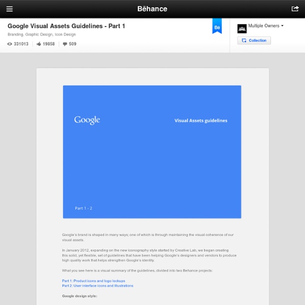
Google’s brand is shaped in many ways; one of which is through maintaining the visual coherence of our visual assets. In January 2012, expanding on the new iconography style started by Creative Lab, we began creating this solid, yet flexible, set of guidelines that have been helping Google’s designers and vendors to produce high quality work that helps strengthen Google’s identity. What you see here is a visual summary of the guidelines, divided into two Behance projects: Google design style: Executive Creative Director: Chris Wiggins Graphic Designers: Jesse Kaczmarek, Nicholas Jitkoff, Jonathan Lee, Andy Gugel, Alex Griendling, Christopher Bettig, Jefferson Cheng, Roger Oddone, Yan Yan, Zachary Gibson Guideline design: Art Director / Team Manager: Christopher BettigSenior Graphic Designer / Project lead: Roger OddoneDesigners: Alex Griendling, Christopher Bettig, Jefferson Cheng, Roger Oddone, Yan Yan, Zachary GibsonContributors: Web Studio, Brand Team, Creative Lab

Google Visual Assets Guidelines - Part 2 on Behance Google’s brand is shaped in many ways; one of which is through maintaining the visual coherence of our visual assets. In January 2012, expanding on the new iconography style started by Creative Lab, we began creating this solid, yet flexible, set of guidelines that have been helping Google’s designers and vendors to produce high quality work that helps strengthen Google’s identity. What you see here is a visual summary of the guidelines, divided into two Behance projects: Part 2: User interface icons and Illustrations Google design style: Executive Creative Director: Chris WigginsGraphic Designers: Jesse Kaczmarek, Nicholas Jitkoff, Jonathan Lee, Andy Gugel, Alex Griendling, Christopher Bettig, Jefferson Cheng, Roger Oddone, Yan Yan, Zachary Gibson Guideline design:

iOS人机界面指南(界面设计基础部分)ISUX原创翻译-腾讯ISUX – 社交用户体验设计部 – 设计你的体验 界面设计基础(目录) iOS7 的革新关键词如下: 遵从:新UI更好的帮助用户理解内容并与之互动,但却不会分散用户对内容本身的注意力清晰:各种大小的文字易读,图标醒目,去除了多余的修饰,重点突出,很好地突显了设计理念深度:视觉层次和生动的交互动作赋予UI新的活力,不但帮助用户更好的理解新UI的操作并让用户在使用过程中感到惊喜 无论你是重新设计一个现有的app或是重新开发一个,尝试一下苹果重新设计系统内置app的方式: 首先,去除了UI元素让app的核心功能呈现的更加直接并强调其相关性。 其次,直接使用iOS7的系统主题让其成为app的UI,这样能给用户统一的视觉感受。 以内容为核心 虽然明快美观的UI和流畅的动态效果是iOS7体验的亮点,但内容始终是iOS7的核心。 充分利用整个屏幕。 天气app是最好的例子:漂亮的天气图片充满全屏,告知用户天气情况,同时也很好的呈现了如每个时段气温等等的其他重要信息。 尽量减少视觉修饰和拟物化设计的使用。 尝试使用半透明底板。 保证清晰度 保证清晰度是另一个方法,以确保你的app中内容始终是核心。 以下是几种方法,让最重要的内容和功能清晰,易于交互。 大量留白。 让颜色简化UI。 通过使用系统字体确保易读性。 使用无边框的按钮。 用深度来体现层次 iOS7经常在不同的层级上展现内容,用以表达分组和位置,并帮助用户了解在屏幕上的对象之间的关系。 通过使用一个在主屏幕上方的半透明背景浮层来区分文件夹和其余部分的内容。 用户在使用备忘录里的某个条目时,其他的条目呈现在屏幕底部的其他分层上,这样用户可以通过滑动展开所有分类条目(译者按:算是一种提示手段)。 日历有较深的层级,,当他们在翻阅年、月、日的时候,以及增强的交互动画给用户一种层级纵深感(循序切换的层次,从年到月到日)。 当用户处于月份视图时,点击年份视图按钮,月份会缩小至年份视图中的所处位置。 类似的过度出现在月份和日期视图的切换时,当用户选择某个日期时,月份视图向外扩展,显示出日期视图。 几乎所有的iOS app都应用了UIKit framework中定义的组件。 UI组件大致分成以下4种大类: Bars:包含了导航信息,告诉用户他们所在的位置并包含了一些能帮助用户浏览或启动某些操作的控制按钮。 除了定义UI组件,UIKit也定义对象实现的功能,例如手势识别,绘图,辅助功能,打印支持。 即时启动 尽可能避免使用闪屏或者其他启动体验。

Startups, This Is How Design Works – by Wells Riley 9 | A Rare Peek At The Guidelines That Dictate Google's Graphic Design In April 2011, Larry Page took the reins as Google’s CEO. He didn’t waste any time getting down to business. On his very first day on the job, Page launched an incredibly ambitious effort to redesign the company’s main products, including search, maps, and mail. He wanted them to be beautiful--Google had never been known for its visual polish--but he also wanted them to be cohesive, more like a true software suite than a jumble of disparate digital tools. The rare glimpse into the company’s design process comes in the form of two documents--"Visual Assets guidelines"--freshly shared on Behance. The more exciting of the two covers product icons. Google encourages its designers to take a "reductive approach" to product icons. The next few parts deal with perspective. With the icon guidelines thus established, we move on to logo lockups, the icon and product name combos that serve as the "brand ambassadors" for the company’s products. These are small, dry details.

The greatest Heist in Indian history..How Indian History was changed and we didn’t even notice. Part 1:The lost eon 6th Century B.C to 1174 A.D | The Kaipullai's Vetti Thoughts : The outer playground of my inner devil Remember those long-staying, TV-remote hogging, serial TV-serial watching distant relatives who used to arrive unannounced when you were a kid. And then stopped you from watching cricket in favour of their crappy TV serial. What were your feelings towards them? Whatever it was, it did not resemble love and affection. However, There is one thing that tops the 'I hate' list by a distance History for most of us, was always a major impediment, an obstacle, an immovable object opposing our unstoppable drive towards knowledge ( Read Maths and Science). How will this dead dude help me get ahead in my life? In our academic pecking order, Maths and Science always figured at the top, subjects that we had to master. Let me begin this by recalling a small conversation with a tenth grader relative of mine This is India’s history from that persons point of view I am not making the above stuff up. Yes IT IS Peruse that list again, in case you did not read it carefully. The Angrez No comments!! Americans

创想变现:斯坦福设计创新课堂ME310分享(上篇)_微软亚洲研究院 编者按:今年6月,微软亚洲研究院人机交互组研究员顾嘉唯,在美国斯坦福大学担任了d-School的ME310设计课程的项目评审。该课程是斯坦福大学的全球联合新产品设计创新课程,学习方式以小组为单位,每个小组由业界知名高科技企业赞助,在为期近一年的课程中完成项目课题。微软亚洲研究院连续两年投资赞助了这门斯坦福ME310的课程,从2011-2012学年开始,中国科学技术大学成为ME310课程第一个来自中国的国际受邀合作大学,组成”微软队”参与课程。顾嘉唯用文字和图片记录了精彩的课程全过程,让我们快来一同分享他的特别经历吧! 作者:微软亚洲研究院人机交互组设计研究员 顾嘉唯 斯坦福大学ME310课程有多特别? ME310 Global是一门斯坦福大学的全球联合新产品设计创新课程,在斯坦福大学是最有影响的课程之一,开设至今已有四十多年的历史。 ME310 Global: 在久负盛名的斯坦福d-school的光环下,这门设计创新课程从开始之初就将由全球知名的设计咨询公司IDEO和Stanford d-school共同提出并倡导的Design Thinking设计思维模式作为指导性理念。 Design Thinking是一种设计理念,设计思维是一种以人为本的,结合人们的渴求,技术的可能性,和商业的可行性的设计师的工具箱。 不同于其他学校里的工程与设计教育课程项目,ME310的课程要求学生设计并完善一整套服务系统及最终量产级别的产品原型,最终不仅满足从最初设计定义的首要功能性,还必须从最终产品可用性、技术必要性、商业合理性、社会影响力、环境资源控制、全球文化适应性、使用与购买人群心理等多方面进行考量。 参与到ME310课程的学生都是来自全世界最好的机械工程、计算机科学与设计学科背景的学生,每年有将近100名硕士以上学历学生参与到ME310的全球课程中,其中包括斯坦福大学的以及来自全球各地受邀请参与的8到10所顶尖工程类或设计类大学。 微软亚洲研究院与ME310课程中的“微软队” 微软亚洲研究院连续两年投资赞助了这门斯坦福ME310的课程,从2011-2012学年开始,在中科大信息科学技术学院院长李卫平教授的牵线下,中国科学技术大学(中科大)成为ME310课程第一个来自中国的国际受邀合作大学,同步设置了相对应的“设计创新”课程。 远渡重洋的项目中期汇报

Complete Beginner's Guide to Interaction Design Interaction design has its origins in web and graphic design, but has grown into a realm of its own. Far from merely working with text and pictures, interaction designers are now responsible for creating every element on the screen that a user might swipe, click, tap, or type: in short, the interactions of an experience. Newsletter Sign Up Original UX articles Curated Resources Never miss an issue! This article serves as a good jumping off point for people interested in learning more about Interaction Design. What is Interaction Design? Interaction Design (IxD) defines the structure and behavior of interactive systems. Interaction design began the day the first screen was designed to hold more than static copy. Interaction design has evolved to facilitate interactions between people and their environment. Common Methodologies Although interaction design spans myriad types of web and mobile applications and sites, there are certain methodologies that all designers rely on. Goal-Driven Design

The Secret Law of Page Harmony “A method to produce the perfect book.” The perfect book. This is how designer-genius Jan Tschichold described this system. Not the ok book, nor the pretty good book, but the perfect book. This method existed long before the computer, the printing press and even a defined measuring unit. And you can still use it. The Secret Canon & Page Harmony Books were once a luxury only the richest could afford and would take months of work to be brought to fruition. And they were harmoniously beautiful. The bookmakers knew the secret to the perfect book. So elegant is this method of producing harmony that a few designers saw to rediscover it. They found the way to design a harmonious page. There’s a dance to all this Let’s look at this dance, shall we? And here it is with them (using the Van de Graaf Canon and Tschichold’s recommended 2:3 page-size ratio, which we’ll get into next). This is where the harmony is found. How is this dance beautiful? A module is to a grid, as a cell is to a table. The J.

Goliath David and Goliath, a colour lithograph by Osmar Schindler (c. 1888) The original purpose of the story was to show David's identity as the true king of Israel.[1] Post-Classical Jewish traditions stressed Goliath's status as the representative of paganism, in contrast to David, the champion of the God of Israel. Christian tradition gave him a distinctively Christian perspective, seeing in David's battle with Goliath the victory of God's King over the enemies of God's helpless people as a prefiguring of Jesus' victory over sin on the Cross and the Church's victory over Satan.[2] Biblical account[edit] David hoists the severed head of Goliath as illustrated by Gustave Doré (1866). David and Goliath confront each other, Goliath with his armor and shield, David with his staff and sling. David hurls a stone from his sling with all his might and hits Goliath in the center of his forehead, Goliath falls on his face to the ground, and David cuts off his head. Textual considerations[edit] Islam[edit]

创想变现:斯坦福设计创新课堂ME310分享(下篇)_微软亚洲研究院 写博客赢法国体验之旅 登录注册 微软亚洲研究院 [订阅][手机订阅] 首页 博文目录 图片 关于我 个人资料 微软亚洲研究院 Qing 微博 加好友 发纸条 写留言 加关注 博客等级: 博客积分:2520 博客访问:4,532,943 关注人气:8,533 天天美食 博主被推荐的博文 微软亚洲研究院的这篇博文被推荐到新浪博客 此博主被推荐的博文: 全部推荐博文>> 如何获得更多推荐? 精彩图文 相关博文 更多>> 推荐商讯 推荐博文 乐视疑遭传统阵营打压,产品战莫 王冠雄 查看更多>> 正文 字体大小:大 中 小 创想变现:斯坦福设计创新课堂ME310分享(下篇) 转载▼ 编者按:今年6月,微软亚洲研究院人机交互组研究员顾嘉唯,在美国斯坦福大学担任了D-School的ME310设计课程的项目评审。 作者:微软亚洲研究院人机交互组设计研究员 顾嘉唯 1.VW/Audi + Aalto【汽车内饰智能控制创新】由Audi奥迪汽车公司赞助,联合芬兰Aalto University大学组队的作品:Audi EVOLVE是一个未来感的可适应不同座舱活动进行自适应灵活转换调整的座舱解决方案。 2.UNICEF + Aalto【社会价值型创新】 由Unicef联合国儿童基金会赞助,联合芬兰Aalto Design Factory设计学院组队的作品:CareSquare是一个专为发展中的国家灾难或传染疾病救援救护的医护人员设计的急救处理背包,使用时展开变成一个医疗箱和工作台以及板凳。 3.SAP + Trinity College【远程会议微沟通创新】 由SAP公司赞助,联合爱尔兰的Trinity College组队的作品:the Water Wall是给异地远程协作的办公环境打造非正式会议的破冰信息交流沟通媒介,通过一面投影墙成水族馆的形式和手势操作进行。 4.Microsoft + USTC 【物理实体界面创新】由MSRA微软研究院赞助,联合中国科学技术大学USTC组队的作品:Family Album是将年轻人通过Windows Phone拍的照片或视频通过一个Fablum分享显示在实体可触界面台灯和家庭相册中,帮助增进家庭中长辈同晚辈的交流机会。 所有八组学生团队都非常出色,顺利地完成了这门九个月的课程和实践项目,这是一个令我印象非常深刻的一周,期待明年的活动! 作者介绍 顾嘉唯 分享:

Related: