

Quick Tip: You Need to Check out LESS.js You might be familiar with such services as LESS and Sass. They allow for far more flexibility when creating your stylesheets, including the use of variables, operators, mix-ins, even nested selectors. However, because LESS was originally built with Ruby, a lot of PHP developers, despite the fact that there are PHP versions available, never used it. Full Screencast Step 1. Reference LESS.js Calculate Customer Lifetime Value in 15 Seconds If you follow this blog on a regular basis, you know that we’re big believers in measuring customer lifetime value. Knowing your CLV is the key to effective marketing. If you know your customer lifetime value and your cost to acquire a customer, you know whether you have a profitable, scalable business or not. Segment these same numbers by customer acquisition source, channel, and ad placement, and you have a recipe for optimizing your marketing. We’ve found that calculating customer lifetime value is one of the single biggest challenges digital marketers face.
Mobile M+: Moving Images Participants Visit Multimedia Gallery How are conditions of today’s ever-changing societies expressed, represented and imagined through moving images? Inspired by the themes of migration and the rise of diasporic cinema internationally, Mobile M+: Moving Images uses Hong Kong’s ‘migratory cinema’ from the 1980s and 1990s, and in particular Clara Law’s 1996 feature film Floating Life, as a starting point to reflect upon the mediated realities of the migrant experience. 2012 New Year’s Resolutions I didn’t really celebrate this year, just like I ended up not celebrating Christmas. It was too soon after being back from San Francisco. I wasn’t in the Christmas spirit, nor in an holidays-and-end-of-the-year mood. And well I also happened to be sick between the 23rd and the 25th of December. But 2012 has come, and with it a lot more hopes and expectations. I realized how fast this internship is gonna go.
Beautiful bits Royal Central School of Speech and Drama - Precedent Life behind the lens at Central Central have the most extensive range of specialist expertise and the broadest portfolio of drama, theatre and performance-related degree programmes available anywhere in Europe and wanted the new website to provide a window into life at Eton Avenue, the home of Central. Our challenge was to enhance the lesser-known courses, modernise the look and feel of the website and recommend ways of improving processes using digital. In order to fully understand what staff, students and prospective students thought about Central, we ran focus groups and interviews to gather information to support our research. The website is responsive and has been built in Drupal using a component based approach and we’ve created a portfolio of individual features that are all interchangeable, meaning that a multitude of page templates can be created, providing the team with greater flexibility.
Home Page Goals When I set out to design a website, I do it backwards. I start with the design of the smallest, deepest element: the story page or search results. Then I work backwards to design their containers: section pages, indexes. Then, lastly, I work on the home page. Issue № 211 I do this because each container needs to adequately set expectations for what it contains. Mind Mapping Software - Create Mind Maps online
Building M+: The Museum and Architecture Collection How do we document and represent buildings, whether still existing or lost, space, or even an entire city? A building or an architectural project can be represented by a multitude of documentation materials, which may include drawings, photographs, models and newspaper clippings. Each of these records tells a story about various aspects of the project. These materials, forming an archive or a collection, are often best kept in places where they can be accessed by the public, such as a library, museum or other research institution. Various types of materials reflect the different features and aspects of an architectural project.
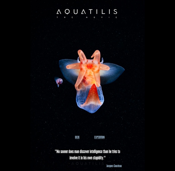
40 Stunning Website Designs with Great Color Schemes Design Selecting a color scheme for a given website design project is not always easy. Sometimes the product or service will help to determine the base or main color, but where to go from there is usually a matter for the designer's imagination and inspiration. There are sites that offer huge selections of color combinations where you can search for a specific color or just browse by categories such as newest, most popular, etc., but sometimes there is just no substitute for browsing other sites for inspiration, where designers have used color schemes that, as a palette may not be obvious bed-mates. In this round up we have selected 40 sites that have some outstanding and/or unusual color combinations, and where the designers have applied a great deal of creativity. Websites with Outstanding or Unusual Color Schemes