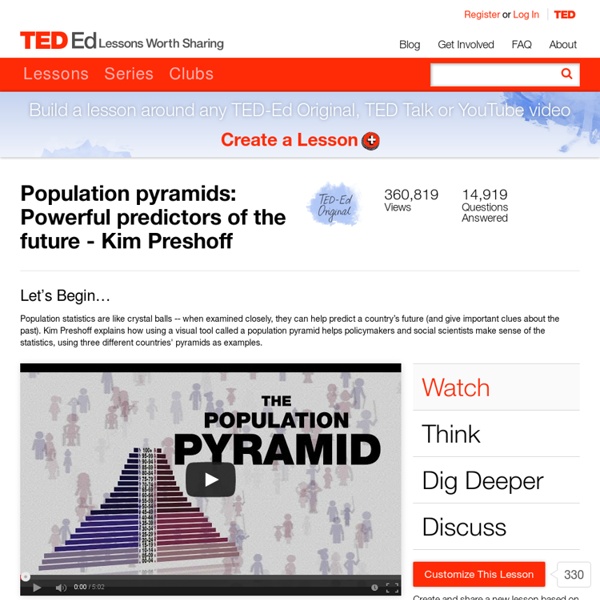
Population pyramids: Powerful predictors of the future - Kim Preshoff
If your selected country was not represented by a population pyramid in the lesson, you may wonder what it looks like. The U.S. Census Bureau has an International Data Base that can help you create one. Is your country a fast, slow or no growth pyramid?The current world population can be seen ticking on the World Population Clock.
7 talks on how we make choices | Playlist
Now playing Over the years, research has shown a counterintuitive fact about human nature: That sometimes, having too much choice makes us less happy. This may even be true when it comes to medical treatment. Baba Shiv shares a fascinating study that measures why choice opens the door to doubt, and suggests that ceding control — especially on life-or-death decisions — may be the best thing for us. (Filmed at TEDxStanford.)
Urbanization and the evolution of cities across 10,000 years - Vance Kite
Starting with those first small farming villages, people have flocked to cities in ever increasing numbers. Urban environments offer the promise of a higher standard of living. Most of the great technological innovations that make our lives what they are came out of the exchange of ideas that result from so many people and ideas being concentrated in one area. This concentration of ideas facilitated rapid, global improvements in living standards which allowed the human population to grow at an unprecedented rate. In 2011 the world population flew past 7 billion people.
Graduation…now what? | Playlist
Now playing Clinical psychologist Meg Jay has a bold message for twentysomethings: Contrary to popular belief, your 20s are not a throwaway decade. In this provocative talk, Jay says that just because marriage, work and kids are happening later in life, doesn’t mean you can’t start planning now. “In your 20s, you may not get married or figure out exactly what career you want to pursue.
40 more maps that explain the world
Maps seemed to be everywhere in 2013, a trend I like to think we encouraged along with August's 40 maps that explain the world. Maps can be a remarkably powerful tool for understanding the world and how it works, but they show only what you ask them to. You might consider this, then, a collection of maps meant to inspire your inner map nerd. I've searched far and wide for maps that can reveal and surprise and inform in ways that the daily headlines might not, with a careful eye for sourcing and detail. I've included a link for more information on just about every one. Enjoy. 1. Data source: Oak Ridge National Laboratory, World Bank. Those dots represent people: the brighter the dot, the more people. 2. Click to enlarge. Human beings first left Africa about 60,000 years ago in a series of waves that peopled the globe. 3. (Wikimedia commons) The Mongol conquests are difficult to fathom. 4. Click to enlarge. This map shows the Spanish and Portuguese empires at their height. 5. 6. 7. 8. 9.
25 TED Talks Perfect For Classrooms
The 50 Best Sources of Free STEM Education Online 12.05K Views 0 Likes Colleges, universities, and other educational forums in your community can be excellent places to learn more about a variety of STEM topics, but there is also a wealth of educational material available on the web for those who prefer to learn at their own pace or take a more individual approach.
Related:
Related:


