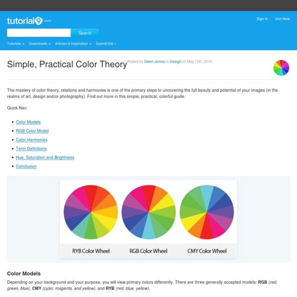
Simple, Practical Color Theory

Color Management: Calibration and Profiling – Graphic design tut
Introduction Welcome to the second post in our color management series. Be sure to check out Part One if you haven’t already done so. Today we’re going to talk about the importance of calibrating and profiling your input & output devices in your color management workflow. Profiling the display When we’re looking at a photo, or anything for that matter, on our monitor display, we’re basically looking at a huge number of pixels, each of which displays a certain color. Furthermore, the monitor display changes the way it interprets color information overtime, so you need to constantly tune your monitor to display color correctly, and this is when calibration and profiling of the monitor display comes into place. Profiling the display has two parts to it. This being said, this process is creating a profile for your monitor that will always work as a link between your computer and your display to make sure the screen is displaying the right color it’s being told by your computer to display.
The Science Behind Design Color Theory
Color Theory has been a subject of interest for years in the art community. The rules and guidelines hold true when working on digital projects just as much as physical items. There is a lot to learn in the subject of color so I’m going to cover just some of the key points. Color Terminology Terms are very important when it comes to working as a designer. Hue is one I’m sure most have at least heard of before. Most web developers are familiar with RGB values for hues. Saturation is another buzz word designers have probably heard of but never truly defined. Color sets with less saturation work best as background elements in a website. Their light-blue background is the perfect level of saturation to fit in a background setting. Tone or value is a term most haven’t heard of. As an example you’ll find more tone in a bright yellow or red than with navy blue. Shades and tints are polar opposites of each other and fit in similar to tones. Relationships for Color Theory Color Theory in Practice
Related:
Related:


