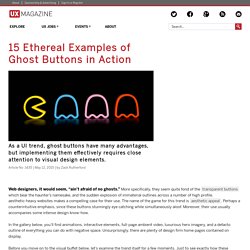

15 Ethereal Examples of Ghost Buttons in Action. Web designers, it would seem, “ain’t afraid of no ghosts.”

More specifically, they seem quite fond of the transparent buttons which bear the haunter’s namesake, and the sudden explosion of immaterial outlines across a number of high profile, aesthetic-heavy websites makes a compelling case for their use. The name of the game for this trend is aesthetic appeal. Perhaps a counterintuitive emphasis, since these buttons stunningly eye catching while simultaneously aloof. Moreover, their use usually accompanies some intense design know-how. In the gallery below, you’ll find animations, interactive elements, full-page ambient video, luxurious hero imagery, and a defacto outline of everything you can do with negative space. Before you move on to the visual buffet below, let’s examine the trend itself for a few moments. Mashing Your Phantasmal Buttons The advantages of ghost buttons are many and varied tweet this The advantages of ghost buttons are many and varied. 1.
YOU i Labs - Home. Designing For The Multifaceted User. Advertisement Designing with users in mind is a tricky thing.

Not only does it require of us a sound understanding of who our users are, but the actual act of translating what we know about them into a well-designed product is not always an obvious or easy path. Currently, our user experience tools tend to focus on “who” users are. I believe this is a hangover from how we traditionally approached marketing and market research. A couple of years ago, I stumbled across a somewhat different method, which has proven useful in a few of my own projects. So, first, let me explain where I think our current toolset falls short, and then I’ll walk you through an example that uses this newer technique. We Are Multifaceted Put yourself in the shoes of a user for a moment. Imagine also, then, that you’ve stumbled upon a blog post on a topic that you care strongly about. 1Acting differently according to circumstance and context is natural. What does this mean for us as designers?
Modelling User Groups. Responsive Typography: The Basics. By Oliver Reichenstein When we built websites we usually started by defining the body text.

The body text definition dictates how wide your main column is, the rest used to follow almost by itself. Used to. Until recently, screen resolution was more or less homogenous. Today we deal with a variation of screen sizes and resolutions. In the heat of the relaunch I wrote a quick blog post on responsive typography, focussing solely on the aspect of our latest experiment: responsive typefaces. To avoid designing different layouts for every possible screen size, many web designers have adopted the concept of Responsive Web Design. Adaptive layouts: adjusting the layout in steps to a limited number of sizes Liquid layouts: adjusting the layout continuously to every possible width Note: Responsive design already incorporates a lot of macro typographic issues (type size, line height, columns width). Choosing a typeface The right tone Serif or sans serif? What size? Line height and contrast. Prototyping. Interaction Design Association - Homepage.
Trends in interactive design 2013.
Touch Application Prototypes (TAP). For iPhone and iPad, using Adobe Fireworks – UNITiD. This tutorial shows you how to use our method to make your Fireworks prototype work for the Apple iPhone and iPad.

We call the method TAP. It is an updated version of our earlier work, found on our website, or at the Adobe Developers Connection. We added quite a lot of features. The most important being able to use page transitions, swipes (by using the jQTouch jQuery plugin) and caching of the application. Other very useful tutorials can be found on Smashing Magazine, part 1, 2 and 3. It is recommended to read through this article to understand what TAP is and what it can do. What is it TAP falls into the category of “Smoke-and-Mirrors”, where technology is used to create the illusion of a working product. Technically, TAP is a library of files containing custom developed PHP and Javascript (JQtouch & JQuery) code that makes the prototype come to life. What do you need Adobe Fireworks.
Building the prototype the first time Rebuilding the prototype Devices Transitions Extra’s Gestures Timers 1.