

Designing A Winning Navigation Menu: Ideas and Inspirations. The navigation menu on a website is like a road sign on a street or a level directory in a shopping mall.
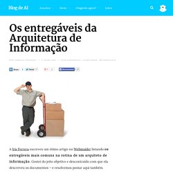
You cannot reach your destination without first knowing where you are. Like in real life, navigation in web design is very important and plays a major role in a website’s usability as well as in user experience. Nowadays you can see plenty of different types of navigation menus with interesting, creative and unusual designs. Website design - Two-level menus: Why? and When? - Showcase - Os entregáveis da Arquitetura de Informação. A Iris Ferrera escreveu um ótimo artigo no Webinsider listando os entregáveis mais comuns na rotina de um arquiteto de informação.
Gostei do jeito objetivo e descontraído com que ela descreveu os documentos – e resolvemos postar aqui também. Não, não é uma lista definitiva. Nem aprofundada. Podcast Archives. The New Spirit of Information Architecture “Un esprit nouveau souffle aujourd’hui”: there exists a new spirit (in information architectur ...

View more Reframing the Problem of Information Architecture We are sure glad that Peter happened upon the book, Careers in Library Science, one day whilst wonde ... View more How to Make IA Good How can you make Information Architecture "good"? Dan Kyln and Bob Royce of The Understanding Group, ... Customer Journey Maps - A 'Quick And Dirty' Technique To Create Them. A Customer Journey Map (CJM) is a very helpful tool that represents the whole interaction with a product or service in a transparent manner.
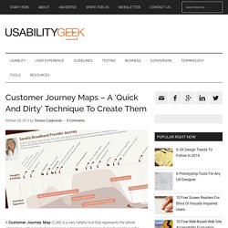
It clearly points out the strengths and weaknesses of each stage of the interaction – particularly those that affect the user experience. In addition to this, Customer Journey Maps also show the possibilities for improvement. Design and conquer. Here are some of my deliverables I have done.
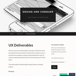
Only those with prior permission from clients are shown here so there is more. I have left out competitor analysis and storyboards for now. To read more about the projects these are from check out Portfolio Work. How to Create Website Wireframes. Web Creator Box shares basic and advanced HTML, CSS, JavaScript or design techniques.
Getting The Website Information Architecture Right: How to Structure Your Site for Optimal User Experiences. 117inShareinShare What kind of content should you have on your site?
How should you structure the menu? What should be the first-level menu items? One or two menus? What should the menu links be called? Information architecture is no joke, yet overwhelming majority of businesses have structured their site using the IMO method – “in my opinion”. If you already have tens of pages on your site, you should do proper information architecture analysis. How to Improve Website UX with Doors Diagram. Information visualization helps websites to increase retention, conversions and other metrics that may suffer from design flaws.
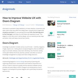
Using the Doors Diagram to visualize a process of a user passing all the way from the starting point to the final goal could help us correct these user experience issues. This diagram is much like a tool in service design, such as customer journey maps and others. Here, we’ll take a look at how it works. Knowledge visualization includes various visual formats — sketches, diagrams, images, objects, etc. In talking about conceptual diagrams, there are different ways to use Gantt, Ishikawa, value chain, Mindmap, tree, flowchart, Sankey, critical path method, five forces, barchart, piechart, and others as tools of knowledge management to analyze and make strategic decisions.
SEE ALSO: Challenges and Opportunities of UX in Augmented Reality The logic behind Doors Diagram is pretty simple. Then the user defines where to go — that is a goal. GoodUI. The NetBeans E-commerce Tutorial - Designing the Application. The application that you design in this tutorial is based on a real-world scenario.
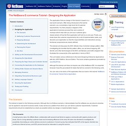
After being introduced to the tutorial scenario, you consolidate a high-level list of customer requirements. You then prepare a diagram of the application's business process flow, and a series of mockups which help both you and your customer get a clearer picture of how the final application will look to an end-user. Finally, you break down the customer requirements into a set of implementation tasks, and structure your application so that the responsibilities and interactions among functional components are clearly defined.
A step by step guide to scenario mapping. 6 minutes read Scenario mapping is a really quick, easy and dare I say it even fun way to collaboratively create, discuss and communicate user scenarios.
Métodos e entregáveis de UX — Fabricio Teixeira. O Processo de Design na PrinciWeb - Usabilidade/UX - Design - Blog Princi Agência Web. Ultimamente, tenho visto muitos artigos mostrando o processo de Design de grandes empresas, como Google, Amazon e até do Governo do Reino Unido. Contudo, muitas vezes esses processos, longos e complicados, não se enquadram nos nossos projetos, que contam com orçamentos baixos e tempo escasso. Em vista disso, resolvi mostrar para vocês como é o processo aqui na Princi, para projetos um pouco mais complexos, como sistemas e portais. Info.thoughtworks.com/rs/thoughtworks2/images/twebook-perspectives-ux-part1.pdf. Effective Samples and Tips. Your use cases are only as effective as the value someone's deriving from them. What seems obvious to you may not be to your developers or customers. The success measurement for an effective written use case is one that is easily understood, and ultimately the developers can build the right product the first time.
A great way for writing effective use cases is to walk through a sample use case example and watch how it can be leveraged to something complex. By absorbing the meaning of use case diagrams, alternate flows and basic flows, you will be able to apply use cases to your projects. In some of the tips below, we'll use eBay features for example use cases.
Course Review: Career Kickstart: How to Get Hired—For Graduates -UX Mastery. HCI Bibliography : Human-Computer Interaction Resources. Using Top Tasks to be Top-Notch: Federal Reserve Board Usability Case Study. In 2012, the Federal Reserve Board used the Top-task methodology to redesign our intranet, called Inside the Board, which had not been significantly updated since it was launched in 1995. After determining the top tasks the audience needs to accomplish on a website, you can run usability tests to gain knowledge and improve the site. The project was wildly successful. Task completion ratings rose to more than 90% after the redesign, from 58% on the legacy site—drastically increasing the productivity of the Board’s employees. Below are the before (58% task completion) and the after (90+% task completion) screenshots of Inside the Board:
UX Process -UX Mastery. 19 common UX problems and how to fix them. A Great Way to Get Experience as an Interaction Designer? Intern. I covered a list of expectations I have for new user experience designers. Some lucky designers graduate straight from school into working at company; the rest of us have to break in the field any way they can. The best way into the user experience field is interning. I know that it may seem like working for free, but the experience is invaluable, and it helps build your network. The Usability Counts UX Resume Template and Career Guide.
How to Tell Your UX Story - UX How. Boston Freelance Web Design & UX. The narrative of UX: storytelling 101 by Juliana Loh on Prezi. Top 10 Skills of Real UX Pros. With the flood of ill-trained people claiming to be user experience (UX) designers, how do you know if you are hiring a UX snake oil salesman or a true UX expert? UX design was largely unappreciated for many years, but the rash of recent successes attributed to good UX design has helped UX become a desirable part of any website design effort.
Unfortunately, opportunists quick to add UX to their repertoire of services are hoping that you won't know how to differentiate their offerings from real UX expertise. I'm not going to pull any punches with this post. Far too many companies are unknowingly hiring wannabe UX designers and not getting the results they expect. The lackluster results produced by these UX snake oil salesmen not only hurt the specific company, but also diminish the perceived value of good UX design, in general. Storytelling ux tokyo-en. Task Analysis: The Key UX Design Step Everyone Skips.
Usability Toolkit. What Does a UX Designer Do? A Step-by-Step Guide - AfterCollege. In “What the Heck is UX?” Histórias de Usuário – Por que e como escrever requisitos de forma ágil? — Histórias de Usuário. UX Links — Hints from the lazy bear. Boston Freelance Web Design & UX.