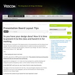

TUTORIALS. A lot of people have been asking me how I create my renderings. Since I am finished with grad school, I decided to develop some tutorials that explain techniques I used throughout architecture school. Many of the techniques only require Sketchup and Photoshop. Others later on will be a little more advanced and involve rendering programs that can be downloaded for free. . Presentation Board Layout Tips. One of the most crucial parts of the design process is the presentation and the selling of your concept.

You have worked on your design process for weeks now and your presentation is where you get to showcase the best aspects, features of your design. You want to make sure you put your design in the ‘ Spot Light‘ 1 ) Plain background colours work best. Use white, grey and on a VERY special occasion black. The content is the focus not the pretty background that you have spent hours perfecting. A good tip for a background – is to take one of your perspective, parraline drawings and change the opacity/transparency value so that it doesn’t detract from the design. 2) Use ONE FONT! The largest of the fonts should be for the title, the second largest (maximum size 12 font) should be for the text in your paragraphs, and the third should be for referencing key elements of your design images. 3) Structure the content of your boards from most important to least!
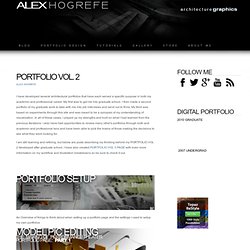
6) Don’t forget to put your name. Nice layout. PORTFOLIO CREATION - PORTFOLIO CREATION. I have developed several architectural portfolios that have each served a specific purpose in both my academic and professional career.

My first was to get me into graduate school. I then made a second portfolio of my graduate work to take with me into job interviews and send out to firms. My third was based on experiments through this site and was meant to be a synopsis of my understanding of visualization. In all of these cases, I played up my strengths and built on what I had learned from the previous iterations. I also have had opportunities to review many other's portfolios through both and academic and professional lens and have been able to pick the brains of those making the decisions to see what they were looking for. I am still learning and refining, but below are posts describing my thinking behind my PORTFOLIO VOL 2 developed after graduate school. An Overview of things to think about when setting up a portfolio page and the settings I used to setup my own portfolios. UG portfolio workshop by Phuc Ly Thanh Hoang Phuc.
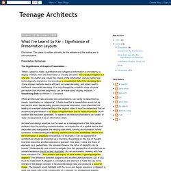
Layout - T m với Google. What I've Learnt So Far : Significance of Presentation Layouts. Disclaimer: This piece is written primarily for the reference of the author and is non-conclusive.

Presentation Techniques The Significance of Graphic Presentation – “When a graph is made, quantitative and categorical information is encoded by a display method. Then the information is visually decoded. The visual perception is a vital link. While architectural data encoded into presentations can hardly be described as merely ‘quantitative or categorical’, it holds true that a presentation would not be successful when the decoding process becomes strenuous, more often than not leading to a warped understanding of the original code. Architectural design solutions can be seen as a rearrangement of the data pattern obtained from the existing context/situation; an introduction of a spatial device that responses and manipulates the existing data trend, forming an information hybrid/ synthesis.
Selection of Images – 2D Drawings or 3D Renderings? Hierarchy of Images. The presentation boards!!! (architecture projects) Pool.