

Art-chitecture. Menu Art-chitecture Share this: Like this: Related ActivityIn "Collage" Royal Academy Summer ExhibitionIn "Drawings" Illustrating a Thought In "Drawings" Leave a Reply Follow Get every new post delivered to your Inbox.
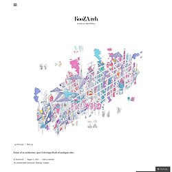
Join 491 other followers Powered by WordPress.com %d bloggers like this: Future of an architecture space.Cybertopia.Death of analogous cities. Future of an architecture space.Cybertopia.Death of analogous cities Egor Orlov Who influences you graphically?
House in Yamasaki with rooftop sheds by Tato Architects. The top floor rooms of this house in Japan by Tato Architects are contained inside sheds that sit on the roof (+ slideshow).
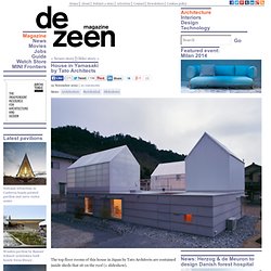
Located in a residential area in Hyogo Prefecture, the house was designed for a family with two children. "The residents requested that, as the area has short hours of sunlight in winter, they'd like to bring in as much light as possible," architect Yo Shimada of Tato Architects told Dezeen. To achieve this, the architect designed two of the rooftop sheds like greenhouses with translucent polycarbonate walls that let light through into the study room and bathroom contained inside, as well as down to the ground floor spaces below. A layer of translucent insulation prevents the bathroom walls becoming too transparent. "There is no problem because they are not clear enough to expose more than the silhouettes," explained Shimada.
The third shed has opaque walls to create more privacy for a guest bedroom. Here's some more information from Yo Shimada: Overhead courtyard. This week in architecture and design on Dezeen. This week world famous architects including Sou Fujimoto and Wang Shu designed bus stops for a tiny Austrian village and Snøhetta's September 11 Memorial Museum structure was inaugurated by US president Barack Obama.
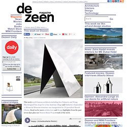
Read on for more architecture and design highlights from the past seven days plus our Dezeen Music Project track of the week. This glitchy remix of Pharrell William’s mega hit Happy is by French producer Aimedeuxhaine. Listen to more Dezeen Music Project tracks » Blue Plan for Copenhagen Harbour by Tredje Natur and PK3. Danish architects Tredje Natur and PK3 have designed a series of artificial islands that will transform Copenhagen's harbour into a recreational area filled with wildlife and water sports (+ slideshow).
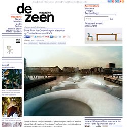
Above: House of Water Commissioned by the city's planning department, Tredje Natur and PK3 were inspired by Copenhagen's long history of artificially constructed islands, many of which served as a navy base in the sixteenth and seventeenth centuries, to create the masterplan. Entitled Blue Plan, it covers five zones in and around the harbour and is conceived as a public recreation area for residents and tourists, as well as an educational facility. Brilliant Bamboo: This Colombian Children’s Center Proves How Participatory Design Can Produce Amazing Architecture. How do you encourage a sense of collective pride and ownership in architecture for the people that will ultimately inhabit your project?

For Daniel Feldman and Ivan Quiñones – designers of El Guadual Children’s Center in Villa Rica, Colombia – the answer was clear. Exercises in participatory design over three years got the whole community involved in the creative process, and resulted in a complex of buildings that everyone feels truly belongs to them. Add To Collection Save this image to a collection. Wooden ribs frame entrance to timber-clad gallery by UID Architects. The second project on Dezeen this week by Japanese studio UID Architects is a small gallery in Fukuyama surrounded by timber fins (+ slideshow).
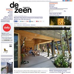
Cocochi Comfort Gallery is built on an exposed site with streets on two sides, so UID Architects added a pergola-like structure to the exterior to create a semi-sheltered space around the edge. "This outdoor area has planting, and becomes a buffering space, helping to wrap up the interior," said architect Keisuke Maeda from UID, who most recently completed a house that uses rectangular arches to frame rooms and terraces. Sliding doors on two sides of the building open it up to the street during warmer months, and flooring from the front path has been continued inside to make the interior and exterior feel like a single space.
This is emphasised by a corner of pebbled landscaping that also extends inside. The building is designed as a gathering space that can accommodate exhibitions, seminars and other functions within its 66-square-metre footprint. Floating fence wraps house and doll-making studio by UID Architects. A narrow white wall appears to hover around the perimeter and garden of this house and atelier – the third project on Dezeen this week by Japanese office UID Architects (+ slideshow).
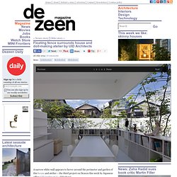
UID Architects – the Hiroshima-based studio that recently completed a house framed by rectangular arches – completed Atelier-Bisque Doll in 2009 on a sloping site in the city of Minoh, just north of Osaka. Rather than enclose the rooms with solid walls, the architects wrapped the building in three rectangular structures, described as "belts", which are raised above the ground to create glazed sections at the top and bottom of some of the rooms. One of the rectangular structures forms the outer fence, which extends from higher ground at the back to lower ground at the front, creating the illusion that it is floating above the street.
From inside, it offers partial views of the surrounding area, in order to make the building feel more expansive than its footprint. Project credits: Kengo Kuma & Associates, A.H. Alonso Hernández Asociados — Granatum. © Kengo Kuma & Associates .
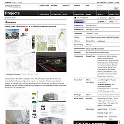
Published on February 17, 2009. OMA- Home. AALU Landscape Urbanism. MVRDV. Projects – Snøhetta.