

WordPress Theme Customization Guide. New to WordPress theme customization?
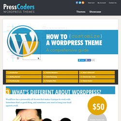
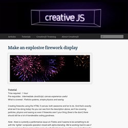
Just brushing up? This tutorial guide will teach you how to customize a WordPress theme the right way. Who is this guide for? This guide is intended for those with some knowledge of HTML and CSS, but aren’t too familiar with the way WordPress themes work. Circular Progress Bar. Make an explosive firework display. Tutorial Time required : 1 hour Pre-requisites : Intermediate JavaScript, canvas experience useful What is covered : Particle systems, simple physics and easing Creating fireworks using the HTML 5 canvas: both awesome and fun to do.
How to Create a Nice and Simple Explosion Effect in HTML5 Canvas. You can greatly enhance the visual quality of your game by using special effects.
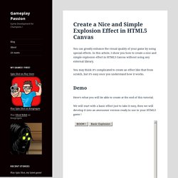
In this article, I show you how to create a nice and simple explosion effect in HTML5 Canvas without using any external library. You may think it’s complicated to create an effect like that from scratch, but it’s easy once you understand how it works. Demo. HTML5 Canvas Experiment: A cool flame/fire effect using particles. Creating a Killer Style Guide. 1.
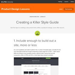
Include enough to build out a site, more or less It's a set of guidelines and coded UI patterns that, in context of template pages, exemplify the site. Your style guide should have enough components to build a page from scratch — within reason. While accounting for every possible scenario is difficult at best, having many pre-built components, written in HTML and CSS, on hand helps keep a product consistent.
How to Create Form Layouts with Twitter Bootstrap 3. In this tutorial you will learn how to create elegant forms with Bootstrap.
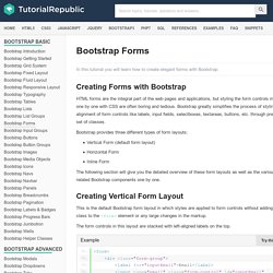
Creating Forms with Bootstrap HTML forms are the integral part of the web pages and applications, but styling the form controls manually one by one with CSS are often boring and tedious. Bootstrap greatly simplifies the process of styling and alignment of form controls like labels, input fields, selectboxes, textareas, buttons, etc. through predefined set of classes. Bootstrap provides three different types of form layouts: Vertical Form (default form layout) Horizontal Form Inline Form The following section will give you the detailed overview of these form layouts as well as the various form related Bootstrap components one by one.
Creating Vertical Form Layout This is the default Bootstrap form layout in which styles are applied to form controls without adding any base class to the <form> element or any large changes in the markup. Espacio de almacenamiento y correo gratuitos de Google. CSS Flip Animation. You've all asked for it and now I've added it: Internet Explorer support!
Annoyingly enough, the change involves rotate the front and back elements instead of just the container. SVG Viewport and View Box. The viewport and view box of an SVG image set the dimensions of the visible part of the image.
The Viewport The viewport is the visible area of the SVG image. DON’T READ this Less CSS tutorial (highly addictive) This article was written in 2011.
Because the web changes quite fast, some information here might be outdated. WARNING: If you like copy-pasting, find-replacing, scrolling in giant messy CSS files, not reusing your code, writing hundreds of times the same thing, you should definitely LEAVE THIS PAGE RIGHT NOW. Understanding Twitter Bootstrap 3 Grid System. The Bootstrap grid system is the fastest and easy way to create a layout.
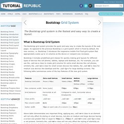
What is Bootstrap Grid System The Bootstrap grid system provides the quick and easy way to create the layouts of the web pages. As opposed to the previous Bootstrap 2.x grid system which is fixed by default, the new version, i.e. Bootstrap 3 introduces the responsive mobile first fluid grid system that appropriately scales up to 12 columns as the device or viewport size increases.
Bootstrap 3 includes predefined grid classes for quickly making grid layouts for different types of devices like cell phones, tablets, laptops and desktops, etc. Radial progress indicator using CSS. CSS radial progress bar - Animate All the Things! Long Shadows Generator - by Juani. Photoshop Secret Shortcuts. It is proven that by using software shortcuts can boost up productivity.
Here are 30 secret Photoshop shortcuts that I’ve learned from years of experience. Well, what I mean by "secret" is that these shortcuts are not documented in the menus. User Interface Design Inspiration - 40 UI Design Examples. User interface design is the design of computers, appliances, machines, mobile communication devices, software applications, and websites with the focus on the user’s experience and interaction. Welcome to Flickr - Photo Sharing. A Summary of User Interface Design Principles. Modern UI Style Design by Microsoft. What’s Modern UI? Modern UI is a new design language created and made popular by Microsoft with the introduction of Windows 8, however the interface was used for the first time with Windows 7 portable devices.
How to Design a Professional PSD layout. Designing websites might look complicated at first sight, but once you understand the algorithm/pattern it gets a lot easier. This tutorial won’t be that long or complicated as usual webdesign tutorials. I want you to get hold of some basic techniques and methods of designing that are often ignored or not known. This design is a great example to show a layout can look professional without being complicated. Also it isn’t cluttered with elements (due to horror vacui), but the space provided is still used correctly.
50 Fantastic Flat Web Designs from 2014. Last month Usabilia asked 100 web professionals for their opinion on the future of flat web design, and a huge 68% said that it is here to stay and not just another passing design trend. So despite our discussion in 2012 about the then new flat design aesthetic, it appears that the future of web design is more than certainly going to be flat.
If you haven’t embraced flat yet, you had better do it now. In January last year we showcased some of the early flat-style converts, and to be honest there wasn’t that many good examples to choose from, we did manage to find 20 though. Fast forward 18 months and every single new web site seems to be flat, or at the very least adopted some flat elements. Due to the sheer volume of these flat sites, compiling this gallery post was a bit of a nightmare. 50 Flat Web Designs from 2014. Formula1Data - Grand Prix du Canada. Add an HTML5 Exit - DoubleClick Rich Media Help. Responsive Banner Ads with HTML5 and CSS3. How to Create HTML5 Banner Animation in Adobe Edge. Top Web Design Trends For 2015. Alsacréations. Agence web, création de site et formations web.