
Lace & Tea :: wedding inspiration: jenny packham fall 2012 Posted on November 7th, 2011 I’m loving this new bridal collection from Jenny Packham. The gowns are gorgeous with some lovely vintage 1920s inspiration throughout. The intricate beading, relaxed silk and soft, feminine silhouettes make this collection a definite favorite for Fall 2012. web authoring with comfort Start your pages from a colletions of ready to use layout, and add content from a rich collections of ready to use elements. Creating your own design from a blank canvas has never been so easy. Drag elements in position, resize and customize, insert your contents. Designers create mockups and prototypes visually producing standard HTML files Developers become more productive, avoiding the tedious part of writing markup. Start your pages from a colletions of ready to use layout, and add content from a rich collections of ready to use elements. Creating your own design from a blank canvas has never been so easy. Designers create mockups and prototypes visually producing standard HTML files Developers become more productive, avoiding the tedious part of writing markup.
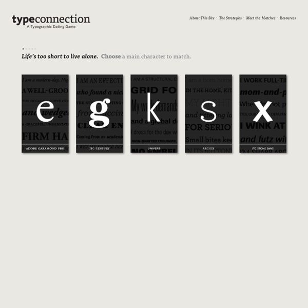
MyFonts: Fonts for Print, Products & Screens Type Connection In the battle of moderns, ITC Century and Futura juxtapose ornament and sleek lines. Century’s buoyant intricacies highlight Futura’s elemental purities, while Futura’s limitless ascenders emphasize Century’s predominant x-height. Their lowercase letters and uppercase G couldn’t be more different from each other, so their vertical axis and roundness introduce cohesion. With the right difference in scale, either face could steal the stage. itc century (Tony Stan, 1975), a modern serif revival, derives from the original Century, Linn Boyd Benton’s custom typeface for Century magazine (1896), as well as Morris Fuller Benton’s Century Expanded and Century Schoolbook. The face is extremely legible thanks to Fuller Benton’s research during Schoolbook’s development, thus the Supreme Court of the United States requires that every booklet-format document be typeset in the family. futura [Paul Renner (1927), Edwin W.
Rui Pereira : product design Wheel of NutritionAre you eating right? The wheel of nutrition is a dining plate that reminds us of the fundamental values of healthy eating. The plate comes in three types: Diet, Extra ordinary and Supersize. These plates have different proportions for people with different needs. The archetype of the ceramic plate is enhanced with explanatory graphics and distinctive colors. This product was developed with Hafsteinn Juliusson for HAF studio, in collaboration with Joana Pais fronteed/iCheck 20 free typewriter fonts for designers Typewriter fonts are a popular choice to incorporate into vintage and retro designs. Courier is probably the best known font of this type but there are many other cool typewriter-inspired designs out there (go here for more free fonts). Here, we've scoured the internet to find 20 free typewriter fonts that will help bring the spirit of the past to your designs. 01. Coming with both upper and lower case letters as well as all the punctuation, numbers and symbols, this is one of the most versatile typewriter fonts we've unearthed. 02. One for the old romantic in you! 03. A thicker, more bold typewriter font, CarbonType is perfect for typewriter headlines and large straps. 04. Typewriter fonts don't need to be literal in our book. 05. This uniquely named font, AFL Font Pespaye Nonmetric, was created by product and graphic designer Burka Demirci. 06. Special Elite takes the vintage style of typewriter fonts and moves it closer to the digital age. 07. 08. 09. 10. Creator of L.C. 11. 12. 13.
DIY home decor Ever since I moved to New York, one of my favorite things to do is create things for our apartment. I love adding dramatic things that change the whole vibe of the room-- and nothing is more dramatic than a chandelier. A couple months back we moved from a teeny tiny apartment around the corner to the one we're in now. Here's my new bedroom in the apartment. I've been looking for a chandelier for a while, so when Lamps.com reached out to see if I wanted to check out any of their items, I jumped at the chance. Chandelier #1, Chandelier #2, Chandelier #3 Normally you're supposed to mount these lights in actual light fixtures, but my dad showed me how to convert these types of lights into lights that you can plug into the wall. -Chandelier -Plug (I got mine in the hardware store, but you can get them on Amazon.) To start, all of the ceiling-mounted lights come with a cord that you can convert into a plug. Next, take the fabric you want to cover the cord and tear it into strips.
|| Dummy Text Generator | Lorem ipsum for webdesigners || Clever and Creative Tea Packaging Clever tea packaging and creative tea bag designs from all over the world. Cigarette Tea Bags Cigarettea are creative tea bags that look just like real cigarettes. Ineeka Tea Bags Cool tea bags that have paper arms on the sides that fold out in order to make them into a single-use filter. tPod Tea Bags Small paper boats attached to tea bags by Elisabeth Soós. Tea Forté Tall polyhedral infuser tea packs by Peter Hewitt, each with a disarmingly natural-looking leaf/sprout tag. Tea Stick Cool tea bags designed for people who do not make their tea in a kitchen: gardeners, builders and campers. T Bag Example of literal design applied to a tea bag by Felix Reinki. Tea To Go Sticks Tea bags are attached inside of the tea stick so there is no need to use the spoon for stirring. Maum Tea Bags Cool tea bag designs look like people with different personalities. Tea Stick Stirrer Designed by Lee Yun Qin, tea sticks can also act as a stirrer, allowing the user to enjoy the tea through stirring it easily.