
HTML5 Please - Use the new and shiny responsibly Transitions CSS3 Beaucoup d'intégrateurs en ont rêvé : animer les pages web uniquement à l'aide de styles CSS, sans apport de JavaScript. Grâce aux dernières évolutions du langage et au module CSS3 Transitions, il est désormais possible de réaliser des transitions basiques à l'aide de CSS dans les navigateurs récents (Safari 4+, Chrome 2+, Firefox 4+, Internet Explorer 10 et Opera 10.6+) La spécification est le document qui définit de manière claire, précise et univoque le langage. Les spécifications des CSS 3 sont découpées en modules. La spécification relative au module est disponible à l'adresse suivante : Remarque : Les moteurs récents implémentent la spécification. Principe de base Le principe de base d'une transition CSS3 est de permettre une transition douce entre l'ancienne valeur et la nouvelle valeur d'une propriété CSS lorsqu'un événement est déclenché : soit via une pseudo-classe telles que :hover, :focus ou :active soit via JavaScript Exemples concrets
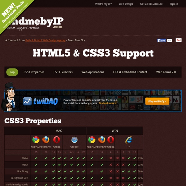
MODX Docs | MODX Documentation CSS3 test Dans la grande lignée des tests Acid ou de HTML5test, il y a désormais le CSS3 test, qui permet de donner une idée du support des propriétés de CSS3. Les résultats annoncés pour les principaux navigateurs sont les suivants, mais peuvent varier selon les configurations. Ils sont donc à prendre avec des pincettes : Chrome Canary, WebKit nightlies, Firefox Nightly : 64% Chrome, IE10PP4 : 63% Firefox 10 : 61% Safari 5.1, iOS5 Safari : 60% Opera 11.60 : 56% IE9 : 39% Note : seules les propriétés reconnues par les navigateurs sont testées, cela n'implique pas qu'elles soient correctement implémentées.
Initiation au positionnement en CSS Pour éviter l'usage inconsidéré des tableaux de mise en page, l'utilisation correcte de chaque élément (balises div, p, h1, ul, li, etc.) ainsi que leur positionnement en CSS est dorénavant indispensable. Les éditeurs HTML visuels n'utilisent qu'une infime partie des possibilités des balises (faussement nommées "calques" en général), ce qui les rend souvent peu compatibles et peu pratiques. Cet article en deux parties explique comment positionner les éléments en CSS de façon optimale. Résumé et pense-bête. Tous les éléments (balises) HTML peuvent être positionnés, décorés, dimensionnés, ... grâce aux styles CSS. Les balises de bloc et les balises en-ligne Ce chapitre sur la structure des balises est primordial, vous devez auparavant avoir consulté le tutoriel sur les bloc/en-ligne. Voici un résumé pour les lecteurs pressés les éléments de rendu "bloc" se placent toujours l'un en dessous de l'autre par défaut (comme un retour chariot). Ancêtre, Parents, Enfants, Frères Le Flux
MySQL :: Developer Zone CSS Débutant : tutoriels sur les CSS3 Réaliser des coins arrondis Arrondir les coins est sûrement l'un des effets graphiques les plus recherchés par les webdesigners. Pour cela, on a longtemps utilisé des images avec plus ou moins de bonheur et de facilité pour obtenir l'effet recherché. Tous les navigateurs récents permettent à présent d'arrondir les coins de cadres, d'images, de tableaux etc. avec une facilité déconcertante. Créer des ombres sur les boites et du texte Ombrer des boites ou du texte sans images c'est possible ! Voici les explications, illustrées de quelques exemples, de réalisations d'ombres en CSS. Images multiples dans un même background La propriété background-image n'acceptait, en CSS 2.1, qu'une seule image. Les CSS3 permettent des background multiples, et maintenant que même Internet Explorer (version 9) l'implémente, pourquoi s'en priver ? Réaliser des fonds en dégradé sans image On peut maintenant s'en passer grâce à de nouvelles valeurs de background : linear-gradient et radial-gradient. Les Media-Queries
TinyMCE Core features[edit] It offers HTML formatting tools, like bold, italic, underline, both ordered and unordered lists, different types of alignments, in-line placement of images and videos, etc. It is highly useful for those who want to allow their users to edit HTML documents online. The different options can be configured at the time of integration with a project, which improves the flexibility of a project. Browser compatibility[edit] API[edit] TinyMCE includes an extensive API for custom integration.[3] Plugins[edit] TinyMCE ships with an assortment of plugins.[4] Because TinyMCE is meant to be a client-side application, it does not include native file managers for various server technologies. Proprietary[edit] MoxieManager - MCFileManager/MCImageManager replacementMCFileManager - Discontinued 2013MCImageManager - Discontinued 2013 Open source[edit] Language support[edit] Product support[edit] Themes and skins[edit] Compressor[edit] See also[edit] Kupu References[edit] External links[edit]
Div et CSS : une mise en page rapide et facile Tout au long de cet exercice, nous allons utiliser deux fichiers : index.html : contiendra tout notre code HTML. style_div.css : contiendra toutes les informations relatives au positionnement de nos différents blocs. Pour inclure notre CSS dans notre page HTML, rien de plus simple, il nous suffit d'insérer le code suivant entre les balises <head> et </head> : Définissons tout d'abord les propriétés de base de nos blocs. Ce petit bout de code définit simplement que pour tous les éléments de type div, le texte sera centré (text-align). Nous allons commencer par créer un modèle de page tout bête, comprenant un bandeau, une zone de contenu, et un pied de page Nous alons définir (parfaitement arbitrairement) des couleurs (uniquement pour bien se représenter les positions) ainsi que les dimensions de nos différents blocs : Bandeau : 600 x 50 px - couleur : #00CCFF Contenu : 600 x 400 px - couleur : #FFCC00 Pied de page : 600 x 50 px - couleur : #33FF99 Télécharger les codes-source de l'exemple
css Zen Garden 3 erreurs à éviter en matière d’approche rédactionnelle Cet article traite des erreurs qu’on peut faire en matière d’approche rédactionnelle sur le web. Il s’agit de 3 idées reprises dans le livre d’Isabelle Canivet, « Bien rédiger pour le web ». Alors qu’Isabelle s’arrête à seulement une courte énumération d’erreurs, moi je vais plus loin dans l’analyse afin d’expliquer et argumenter ses propos. N’hésitez pas à me laisser vos commentaires et à partager avec mes lecteurs les erreurs que vous avez pu voir lors de vos expériences professionnelles, ainsi que vos interprétations. Prendre un rédacteur et ajouter “web” derrière sans le former Cela peut paraître logique, et pourtant il existe encore des rédacteurs qui se disent rédacteurs web pour la simple raison qu’ils savent bien écrire et qu’ils ont une jolie plume. Définition du « Rédacteur web » « Le rédacteur web produit des contenus rédactionnels adaptés au web. Définition du « Rédacteur » (presse) Un rédacteur n’est donc pas un rédacteur web Fixer le nombre de mots ou de signes par page
13 erreurs à ne pas commettre sur un blog WordPress !!! Dans la suite logique de optimiser WordPress, voici un billet pour recenser une partie des erreurs, trop fréquentes, que je rencontre sur de nombreux sites WordPress... La sauvegarde, moi je m'en fous ! Bon, cette erreur là est encore trop fréquente. Cas d'école : Les erreurs à ce niveau là se paient cash, j'ai récemment changé le plugin de cache sur WP Formation et le site a planté... La mise à jour précipitée Yes, la nouvelle version de WordPress vient de sortir! Attention, je ne dis pas qu'il ne faut pas mettre à jour, seulement de prendre les précautions d'usage, à savoir, sauvegarder (et oui encore;), désactiver tous les plugins et enfin, effectuer la mise à jour. Cas concret : Actuellement la nouvelle version de WooCommerce vient de sortir (v2.0.3), bon nombre d'utilisateurs utilisant un thème WordPress premium se sont précipités pour mettre à jour, résultat : des erreurs CSS et une boutique HS. Des permaliens trop complexes Qui n'a jamais vu des URL de type "monsite.com/?
Tagxedo Processing ... Personal $ Svg $20 ✓ Up to $75 merchandises for personal use. Merchandise $ License to use artwork in merchandises (T-Shirt, Mug, poster, etc). Single Use $ License for single-purpose non-merchandising use. Unlimited $ Unlimited personal or commercial use. Custom $TBD Custom license, with terms subject to prior arrangement. Please contact licensing@tagxedo.com for more information By accepting this license, you agree to the Tagxedo's Terms of Service, and you agree that you have acquired the right to use the source image to create the Tagxedo artwork, and that you indemnify and hold harmless Tagxedo and its employees and officers from any harm are liability that may incur. Please contact licensing@tagxedo.com if you have any question.