

UX Design Consultant et Formateur. Tout savoir sur la signification des couleurs. Vous vous questionnez sur la signification des couleurs, que ce soit par simple curiosité, pour créer un site internet ou encore pour le design de votre logo ?
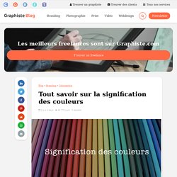
Cela tombe bien, nous vous proposons un tour d’horizon complet des symboliques des couleurs à travers 9 articles sur le sujet. Nous insisteront particulièrement sur l’utilisation des couleurs dans le cadre d’une création de logo, mais ces principes peuvent s’appliquer à n’importe quel autre champ. La signification de la couleur bleue Le bleu est de loin la couleur la plus populaire et la plus appréciée, utilisée par une multitude d’entreprises et de designers. Mais quels sont vraiment ses secrets et ses symboles ? La signification de la couleur rouge Autre couleur primaire, le rouge a le don d’attraper l’œil et de ne pas laisser indifférent. Trouvez le graphiste idéalpour tous vos projets graphiques La signification de la couleur jaune Le jaune est une couleur chaude, à l’instar du soleil ou du sable qu’il évoque à merveille.
Infographie : influence des couleurs sur le taux de conversion. The Most Important Rule in UX Design that Everyone Breaks. In Product Design, and Possibly Life Management There is one principle of organization that every human should adhere to, particularly people who design products.
Day after day, I see companies break this rule, and it is 100% of the time to their detriment. In this article I will explain what that rule is, and what it means to product and service design. I’ll also raise the possible implications of this phenomenon on organizational management, collaboration, and general performance. The psychological phenomenon I will be discussing in this article is known as Miller’s Law. Step 1 Read the italicized instructions before starting. Below is a list of 20 words. Step 2 Now, use your pen and paper to write down as many words as you can remember from the list. If you are like the vast majority of human beings, you will have remembered 5–9 of the words. In 1956 there was a paper written that became one of the most highly cited papers in psychology.
Tools. 8 Effective Web Design Principles to Know in 2019. Your website design is more important for conversions than you think. You can implement every conversion-boosting tactic in the world, but if your web design looks like crap, it won’t do you much good. Design is not just something designers do. Design is marketing. Design is your product and how it works. The more I’ve learned about the principles of web design, the better results I’ve gotten. Free UX & Usability course By Karl Gilis Go from principles to practice. Daniel Korpai. 2019 UI/UX Design Trends You Should Know - Akveo Engineering - Medium. The designer needs to stay on top of the latest design trends.
The work style should change and evolve to keep work fresh and resonate with clients and products. The 2019 year collected a lot of trends from the last year and also add some new ones. So take a look at the juiciest trends for this year that I’ve picked out. Colorful and custom made illustrations Custom illustrations with bold, vibrant colors and funny stylized people are coming back in 2019 and become the main trend of the year. Simple shape isometric illustrations Liquid graphics Design becomes more digitized, and designers and artists following these trends bring complex forms of color to the real world.
Brazen, large typography. (21) New UI Design Trends - Vibrant Gradients & Colored Drop Shadows! How Long Do Users Stay on Web Pages? Share: Twitter LinkedIn Facebook Email Share this article: TwitterLinkedInFacebookEmail How long will users stay on a web page before leaving?
It's a perennial question, yet the answer has always been the same: Not very long. The average page visit lasts a little less than a minute. As users rush through web pages, they have time to read only a quarter of the text on the pages they actually visit (let alone all those they don't). However, while users are always in a hurry on the web, the time they spend on individual page visits varies widely: sometimes people bounce away immediately, other times they linger for far longer than a minute. Leaving Web Pages: The Weibull Hazard Function Research by Chao Liu and colleagues from Microsoft Research now provides a mathematical understanding of users' page-leaving behaviors. The result: the time users spend on a web page follows a Weibull distribution. 99.9% of readers will now ask: What's a Weibull distribution? Scrolling and Attention. People’s behaviors are fairly stable and usability guidelines rarely change over time.
But one user behavior that did change since the early days of the web is the tendency to scroll. In the beginning, users rarely scrolled vertically; but by 1997, as long pages became common, most people learned to scroll. However, the information above the fold still received most attention: even as recently as 2010, our eyetracking studies showed that 80% of users’ viewing time was spent above the fold. Since 2010, with the advent of responsive design and minimalism, many designers have turned towards long pages (covering several “screenfuls”) with negative space. It’s time to ask, again, whether user behavior has changed due to the popularity of these web-design trends. Eyetracking Data About the Study To answer that question, we analyzed the x, y coordinates of over 130,000 eye fixations on a 1920×1080 screen.
Study Results Understandably, not every page is the same length. Scanning & Reading Patterns. "Above the Fold": Does It Matter on the Web? The fold.
It could be called the most important line in the world. If not, it’s at least the most hotly debated.