

Instagram photos and videos. Minigames & Playful Interactions. Spotify Design. 7 best practices for using photography in UI design. Anastasia Marinicheva is UI/UX Designer with a heavy focus on awesome interfaces, creative solutions, and great user experience.
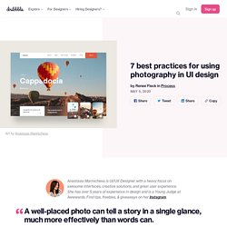
She has over 5 years of experience in design and is a Young Judge at Awwwards. Find tips, freebies, & giveaways on her Instagram. Minigames & Playful Interactions. UI Dashboard Inspiration of The Week #1 - FreeUI.Design: UI Design Freebies - Free UI Kit, Icons, Mockups. 4 Ways To Communicate the Visibility of System Status in UI. Visibility of system status is one of Jakob Nielsen’s ten heuristics for user interface design.
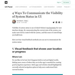
By communicating the current state of the system, you make users feel in control with the system, and this sense of control helps you build trust. Here are four visual feedback methods you can use to communicate the system status: Where I am No one likes to be lost, but it happens both in real and digital worlds. New Volume - The Lucky Ones (Game) Design Furniture. 2000+ Free Line Icons for Designers and Developers - LineIcons. Digital Design Days Live Online 6-8 May, 2020. - Free animation files built for Lottie, Bodymovin. Where your designs become real native apps. Kits de diseño de interfaces de usuario, iconos y plug-ins gratuitos.
For XD Plugin. React for Designers. Framer X vs ProtoPie vs Flinto vs Atomic - Prototyping Tools Review. World of prototyping tools is on fire right now.
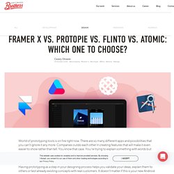
There are so many different apps and possibilities that you can’t ignore it any more. Companies outdo each other in creating features that will make it even easier to show rather than tell. You know that case. 7 free icon sets to download on Dribbble. Did you know that Dribbble has some new expanded Shot filtering capabilities?
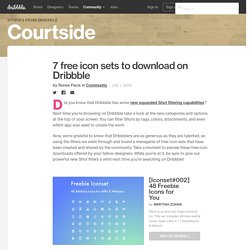
Next time you’re browsing on Dribbble take a look at the new categories and options at the top of your screen. You can filter Shots by tags, colors, attachments, and even which app was used to create the work. Now, we’re grateful to know that Dribbblers are as generous as they are talented, so using the filters we went through and found a menagerie of free icon sets that have been created and shared by the community.
Take a moment to peruse these free icon downloads offered by your fellow designers. While you’re at it, be sure to give our powerful new Shot filters a whirl next time you’re searching on Dribbble! Find more Community stories on our blog Courtside. 7 Practical Tips for Cheating at Design - Refactoring UI - Medium. When there are multiple actions a user can take on a page, it’s easy to fall into the trap of designing those actions based purely on semantics.
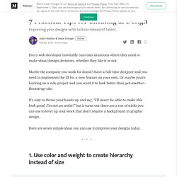
Frameworks like Bootstrap sort of encourage this by giving you a menu of semantic styles to choose from whenever you’re adding a new button: “Is this a positive action? Make the button green.” Surfaces. InVision DesignTalks: DesignTalks: Future of UX Design. (15) InVision Design Talks — Are We Not PMs? Product Design 10 Years On with Roy Stanfield. Design Systems for People - invisionapp. Skip to content Design Systems for People Yili Lou 7 days agoMay 30, 2019 Hi there, I was wondering if I'm able to get the list of exercises/activities and PDFs of worksheets that are shown through the video.
Thanks! Reply. How Animation Brings Products to Life - invisionapp. The future is dark. – By Digiti. Dark mode is here and it’s here to stay Our daily screen time is going up every day, and every day, new screens are added to our daily routines, from the moment we wake up till we got back to sleep at night.
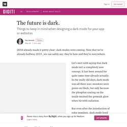
This is rather new, our eyes are not used to so much screentime so late in the evening. This is where dark mode comes in. With the introduction of this feature in both macOS and Material Design (and most likely iOS) we believe it will become a default feature in all apps, both mobile and desktop. Zalog/placeholder-loading: Simple and flexible, css only, content placeholder loading animation.
All in One Bookmark Links for Designer - Evernote.Design. Accessibility Before Aesthetics. It’s time we start addressing accessibility before aesthetics in our design processes to create meaningful products for our diversified societies and cultures. Before diving into the why, how and what of it, let’s revisit the definitions of these terms to set the context. Accessibility As the definition goes, it’s simply the quality of being able to be reached or entered.
In terms of Design, it however refers to the characteristic that products, services, and facilities can be independently used by people with a variety of disabilities. Aesthetics As the definition goes, it’s a branch of philosophy which deals with questions of beauty and artistic taste. While these various studies may prove the concept legitimate enough, but does it address the aspect of accessibility? Premium UI Kits — UI Place. Product Designer. Modal & Nonmodal Dialogs: When (& When Not) to Use Them. To better understand the difference between modal and nonmodal dialogs, let’s look at what the terms “dialog” and “modal,” mean.
A dialog (or dialogue) refers to a conversation between two people. In user interfaces, a dialog is a “conversation” between the system and the user, and often requests information or an action from the user. User-interface modes are special states in which the same system has somewhat different user interfaces. Each mode may come with different commands, or the same command (or action) can produce different results depending on the mode of system. In other words, in different modes, the same input will have different results. With this understanding of “mode” and “dialog”, we can easily define modal dialogs. Definition: A modal dialog is a dialog that appears on top of the main content and moves the system into a special mode requiring user interaction. User Testing Feature Preview - iPhone testing and playback. Resizer. The World's First Design to Code Platform. Sizzy. Ant Design - The world's second most popular React UI framework. Our collective responsibility to design more inclusively.
UI Interactions of the week #142. Figma 101 Email Course. UI Interactions of the week #138. Estos son los Finalistas de los Interaction Awards 2019. Invision Studio Windows, c'est par ici ! - Explore the power of InVision Studio. Meet Overflow. Creating Usability with Motion: The UX in Motion Manifesto. Maze. Weekly Inspiration for Designers #178. Creating Usability with Motion: The UX in Motion Manifesto. Animation in UI Design: From Concept to Reality. Motion design doesn't have to be hard – Google Design. Motion helps make UIs expressive and easy to use.
Despite having so much potential, motion is perhaps the least understood of all the design disciplines. Marvel + Sketch Prototyping. The Design Genome Project. What is the difference between Interaction Design and UX Design? This is a question we hear a lot.
Unfortunately there’s no simple answer to this question. Firstly, that’s because there’s no globally agreed definition of the two terms. That means that our explanation often needs to change depending on the user’s perspective. Secondly, it’s also because there’s a lot of common area between the two fields even when using the most common definitions. Some simple definitions: Figma, faster □ For design tools to be effective, speed is essential. If there are delays in the wrong places, it totally ruins the illusion that the tool is an extension of your mind and body.
Imagine the frustration of trying to pound in a nail when the hammer trails behind your hand by half a second. We want Figma to be an extension of your creative mind. To meet that goal, we need to remove as much friction as possible from the process of placing your ideas into a visual space to discuss, collaborate on and convert into working software.
Figma Templates, UI kits and Freebies - Free Figma resources. Figma Templates, UI kits and Freebies - Free Figma resources. The ultimate guide to proper use of animation in UX. Made with Studio #24 – Muzli - Design Inspiration. Sketch2Code - Transform sketches into HTML using AI. Creating custom dashboards for CX data — a UX case study. Project Kickoff When jumping into a fun project like this, it can be agonizing not to open your preferred design tool and start throwing concepts together. I’ve certainly been guilty of getting into the details too early. Over time I’ve learned to restrain, at all costs, especially when it comes to the more conceptual, less formalized and pliable ideas. Once you have established designs (especially ones in high fidelity) it’s hard to backtrack and shift away from what you already have.
Also, when showing other team members your early ideas in a very polished format there is a chance it is perceived as more refined and finalized than it actually is, thus impacting the feedback you receive. So, before we got ahead of ourselves, we needed to first ask ourselves some questions to better understand the problem we were trying to solve: What is the root of the problem for our users?
Ideate, Iterate, and Validate These early design stages are my personal favorite. ¿En que consisten las técnicas de diseño Pixel Perfect? ✅ Behind the scenes of Oscar Health’s design system. Oscar Health is a tech-driven insurance company that interacts with a wide range of users and stakeholders. Oscar builds digital tools for our members, providers, brokers, employers, and our own internal employees.
As a small design team, designing each of these digital experiences in parallel can be a challenge, but our continued investment in our own design system, Anatomy, has helped us rise to meet these challenges. Mobile Design Patterns and Interactions. How to get users hooked on your interfaces – Muzli - Design Inspiration. AirDroid Web. Virtual Whiteboard & Remote Collaboration tool.
Introducing Userflows - Made with the Marvel API □ Create user journeys, in seconds At Marvel, we spend a lot of time thinking about how we can increase your design productivity. We’re always looking for ways to save you time, whether that’s automating the entire design-to-development process or simply one less click when prototyping. That’s why we’re excited to introduce our new tool, Userflows, built with the Marvel API. With one click you can transform Marvel prototypes into user journey maps.
It automatically generates a birds-eye view of how users will move from screen to screen, helping you tell a better story to developers, stakeholders and clients. If you’ve ever had to manually create user flow diagrams, you’ll know how much time and effort they take. Sneakpeekit - Printable Sketch Sheets for Design Wireframing. How Learning to Code as a Designer Built Trust on My Team. Solis. 3 rapid prototyping exercises to improve your UX skills. Diving In with InVision Studio.
Diving In with InVision Studio. App Prototyping Tools For Designers. 10 Best App UI/UX Design For Windows. Handoff by Marvel. Capptivateco/capptivate: A kinetic pattern library that captured and preserved delightful iOS animations. UX in Motion. Creating Usability with Motion: The UX in Motion Manifesto. Floating live chat design and animation of @qiscus using this cool @InVisionApp Thanks @brandtnewww for the tips! Haha… A Beginners Guide – Prototypr. Publishing Prototypes for Multiple Audiences - Axure Blog. Publishing to Axure Share is a handy way to share the HTML output of your Axure RP prototypes with your teammates and stakeholders. You click the “Share” button in Axure RP, hit “Publish”, and get back a shareable link to the prototype.
Bing, bang, boom! But did you know that you can publish the same RP file to multiple Axure Share project IDs? This can be helpful when you need to maintain different versions of a prototype for different audiences, such as your design team, your developers, and your stakeholders. Origami Studio — Getting Started. Proto.io - Prototypes that feel real. Ideo’s AI Machines Explore A Future We May Or May Not Want. Talk of artificial intelligence is often wrapped in confusion or paranoia or both.
3 rapid prototyping exercises to improve your UX skills. Introducing Marvel for Dropbox Paper.