

60+ Free Realistic Poster & Frame Mock-ups For Graphic Designers - 365 Web Resources. If you like the previous post about 15+ free flyer and brochure mock-ups & templates, I think you might also be interested in this awesome collection of free poster & frame mock-ups & templates.

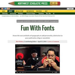
This hand-made collection includes more than 10 high quality, fully editable, print ready mock-ups for graphic designers to showcase their posters, flyers, pictures, and artworks in a realistic style. All the mock-ups are available in layered PSD format, so that you can simply add your creativity via smart objects in the Photoshop. Download High Quality & Premium Poster Templates From $ 1 April 25, 2016 Update: Free Poster Mock-ups 22/03/2016 update: 2 Poster MockUps PSD 17/03/2016 update: A1 Poster on the Desk Mockup The mockup presents a clean scene with a poster on the desk. 16/03/2016 update: Photo Frame Mockup Scene A photo frame mockup scene in PSD format. Fun With Fonts. Know the nuts and bolts of typography to add personality, distinction to your publication, blog or newsletter When you talk about type, beginning with a video such as the one above is a great way to entertain and interest students in the study of typography.
Once they are hooked, spending time learning the nuts and bolds is the next step. Minnesota adviser Laurie Hansen at Stillwater (Minnesota) Area High School offers this typography lesson on fonts — the Font Fashion Show. Here’s how Laurie does it: I know there’s a few yearbook advisers out there who do the font fashion show. Dive Into Typography. Typography Essentials - A Getting Started Guide. What is typography?
And why is it so important to graphic designers? As long as you spell everything correctly and make sure the message is what the client wants to see, why does the font style make any difference? Because everything you touch, see and create is impacted by the use of writing styles and techniques. There are a lot of reasons why designers need to have a solid foundation when it comes to the use of typography. Typography. In philately "typography", especially in the case of 19th century stamps, refers to letterpress printing.
10 Common Typography Mistakes. The goal of this post is to help designers and clients understand the importance of good type skills, while avoiding some of the common mistakes.
Please keep in mind that most of these mistakes are subjective and can be changed varying on the project, goals or circumstances. Below is a list of 10 common mistakes used in type design/layout that can make a large impact in the effectiveness and appearance of your designs, in addition to saving you time and money when dealing with printers. 1. Not enough leading Leading/linespacing can improve the overall readability of large blocks of text on a page, making it easier on readers to follow lines of text without losing their place. 2.
Tracking/letterspacing is applied to a group of letters. 3. While tracking is applied to a group of characters, kerning is the adjustment of space between two letter pairs. 4. Reading many long lines of type causes eye fatigue. 5. 6. 7. For example, try printing a medium blue text on top of a medium brown box. 8. Designing with crap cc. 10 Educational Videos To Introduce You To Typography. Broadsides. 50 Totally Free Lessons in Graphic Design Theory - Envato Tuts+ Design & Illustration Article. 1,200+ courses and ebooks Design, code, video editing, business, and much more. Graphic Design Art Lessons. Twenty design projects, suitable for high school students ho have a basic knowledge of graphics software and hardware: 1.
Found-Object ABC (or Number) Photography Students use digital cameras to search out (scavenger-hunt style) the ABC's or numbers in found-objects - for instance, the support bars on the side of a swing-set could appear to be a letter 'A'. Students use Photoshop to enhance each photo, emphasizing the letter or number they are showcasing. Finished photos may be printed or turned into a digital collage. 2.
I took my Graphic Design students on an excursion into our city park and downtown area. 3. Students love to take photos of themselves - instruct them to take unique digital photos of themselves, exhibiting unique angles and backgrounds. 4. Broadsides. What are the branches of Graphic Design. Current community your communities Sign up or log in to customize your list.

Graphic design. Graphic design is the process of visual communication and problem-solving through the use of typography, photography, iconography and illustration.
The field is considered a subset of visual communication and communication design, but sometimes the term "graphic design" is used synonymously. Graphic designers create and combine symbols, images and text to form visual representations of ideas and messages. History[edit] Teach Yourself Graphic Design: A Self-Study Course Outline - Envato Tuts+ Design & Illustration Article. 1,200+ courses and ebooks Design, code, video editing, business, and much more.
Adobe Photoshop, Illustrator and InDesignGraphic, Logo and Print DesignSketch, Adobe XD & FigmaWordPressJavascript, PHP & PythonAdobe After Effects & Premiere ProMuch More Millions of creative assets Design templates, stock videos, photos & audio, and much more. 11 killer tips for a successful Tumblr blog. Tumblr provides a simple and highly effective platform to share ideas, inspirational concepts and to showcase awesome work to a thriving design community.

But with the number of Tumblr blogs approaching the 100 million mark, how can you ensure your blog stands out from the pack? It may seem an overwhelming task, but there are things you can do. For instance, Tumblr showcases interesting blogs in its prestigious Spotlight categories and your blog posts can get featured by 'tag editors' to appear in popular feeds, such as 'Design' or 'Illustration'. Likes and reblogs Two years ago today I set up a Tumblr blog called Type Worship.
After a few months Type Worship was included in Tumblr’s Typography Spotlight section, after which it grew so fast I had to turn off email alerts for likes and followers. Resources and Templates for InDesign. 18 rules for using text. We visited The Visual Communication Guy and found this – one of the best infographics we've seen that provides designers with 18 rules for using text – so we had to share it with you.
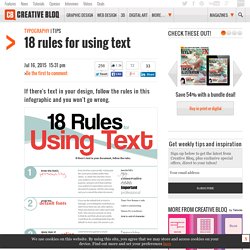
The use of typography can be confusing – which font do you choose, and what size? If you follow these 18 rules you won't go wrong and quickly start to see a world of difference in your designs. Subscription offer Like this? Try these… Free Template Maker. Tucson High School Graphic Design. InDesign: A Flyer.